Hi,
I’m designing and advertisement for an air condition installation company. Which one of these ads would be better.
I can’t decide between the ideas… but here are my thoughts on the design of both:
Both are at a great start but I feel like tweaking the color and text styles a bit will make a big difference…
The title can be bigger and in a bolder more eye-catching font
I think you should either add another brighter colour or change one colour to be a bit brighter, because there are too many dull beiges, browns and blues used (unless colors are different in this screenshot) so the overall design is lacking some contrast.
The words perfection and precision are very similar in meaning. I’d rather write only one of them (with another one of their specialties) - though this probably isn’t your choice to change.
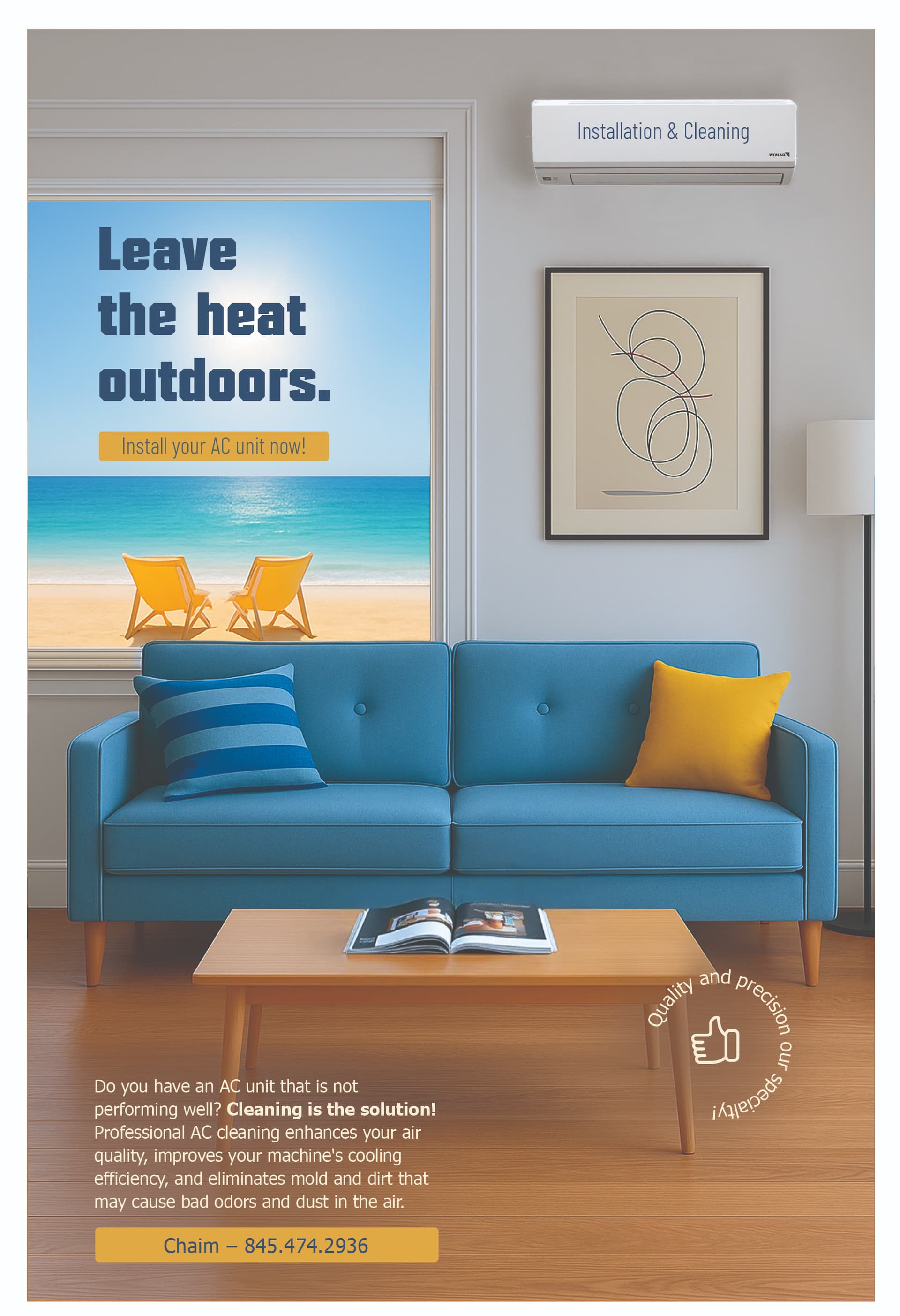
Also, it’s slightly unclear if they are selling acs or doing repairs. I’d include clearly somewhere something like ‘ac installation and repairs’… Again, don’t know if this is up to you or not ![]()
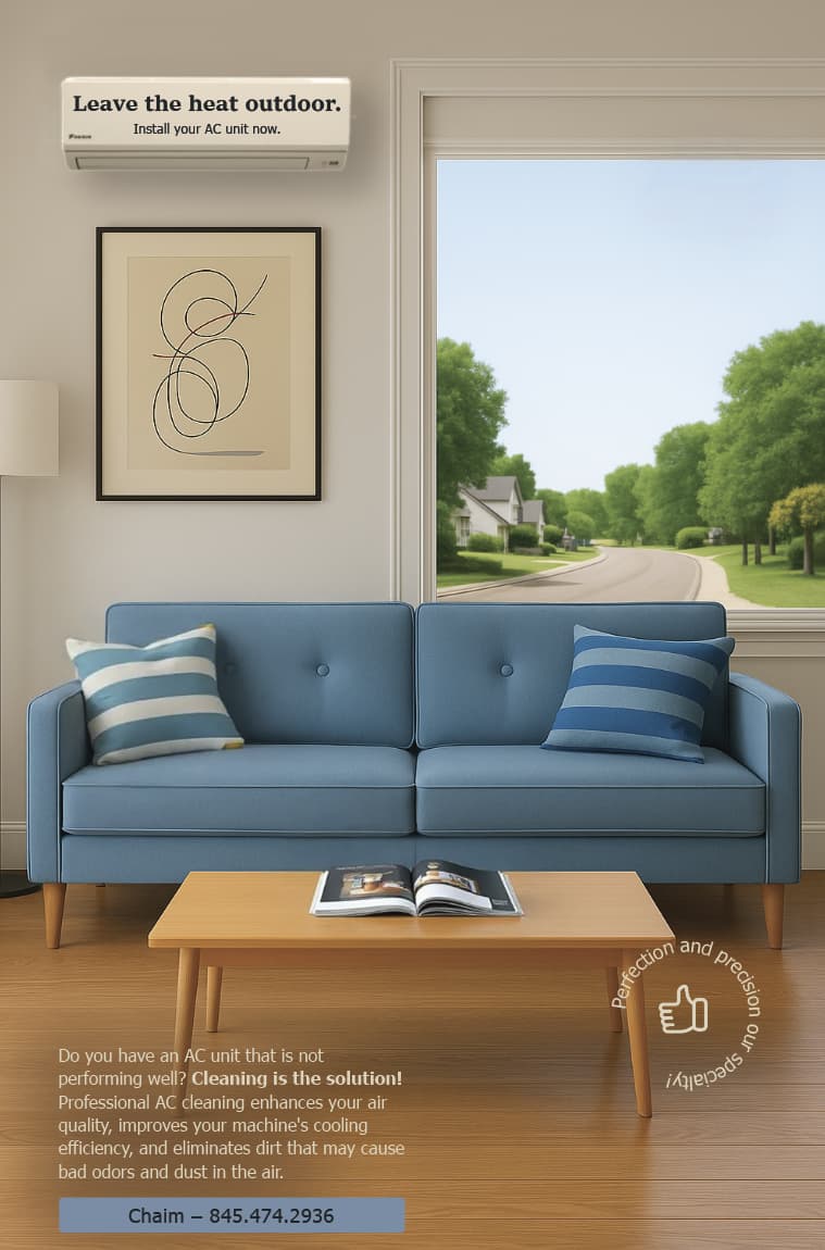
I’d go for option 2 - number 1 has a slightly negative connotation. For number 2, can you make the headline much bigger? Maybe put the line “leave the heat outdoors” into the window, and leave the subtext on the AC unit. Otherwise, looks really clean and sharp!
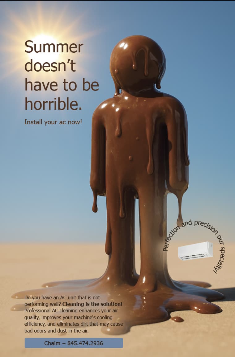
I love the idea of the first one! but I would use a different word instead of ‘horrible’ so it doesnt sound negative.
If the melting man is scaled smaller, then the title can be bigger and the small info will be clearer.
Also you dont have to have the full sun on, rather just have the suns rays coming over the image.
I would also add a fresh colour in like RivkyH suggested
I prefer the second one in terms of concept. I agree with Avigayil that the first one feels a bit too negative. The idea has potential but the image would have to be more eye-catching and the text worded in a less negative way.
The second one feels more positive and professional, but can you make the outdoors look quite a bit hotter with stronger sunlight/contrast/shadows and possibly other things that make it look hot rather than pleasant, and contrast that with cool, calm colors indoors.
Try a thinner, cleaner font for the text (should say outdoors with an “s”) and might be better with the text elsewhere, though you would have to experiment with that.
I love the concept of the first one, but not the headline. The headline is very negative. I feel like you can develop it better to be much more eye catching.
Maybe you can write something like:
Don’t melt in the heat!
and in parenthesis, (Even though you’re not made of chocolate : )
or whatever, something that has a better connotation than horrible…
I’d move the melting choco guy more to the right and fit the headline on the left, going downwards.
Also change the headline to a more interesting, bolder font. Then on the bottom, move the contact info to the right, it’s too much on the left with the body text.
Also, don’t leave the headline in black!
I agree with @RivkyH to work on creating a better color scheme.
Thanks for all feedback.
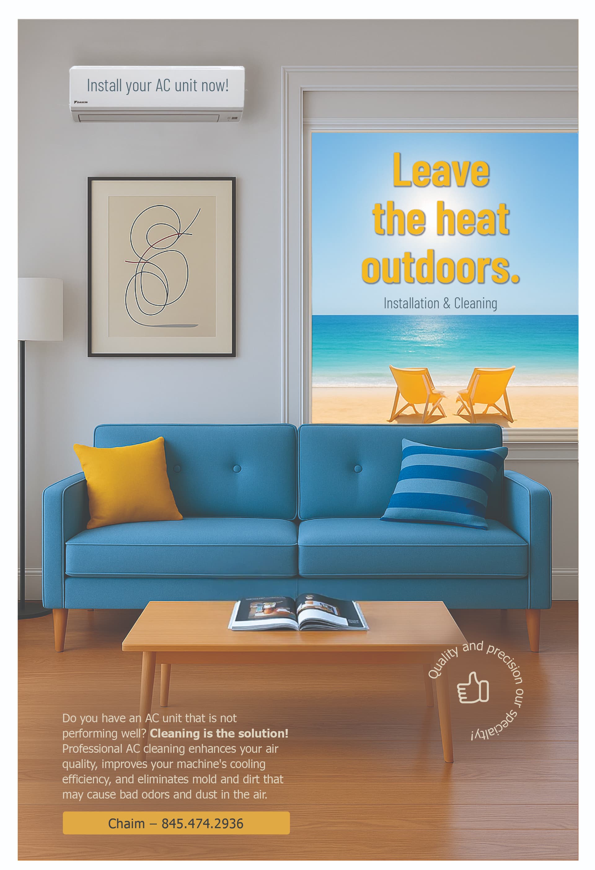
Can you flip the image so the window is on the left as our eyes are not used to reading english text on the right side. Here our eyes are drawn to the swiggle image first adn then the text. The title should have a more interesting font, I would also left align it not center it. I’m not crazy over the drop shadow on the yellow, can you use the blue for the color and then put a yellow box under the “install your AC…”
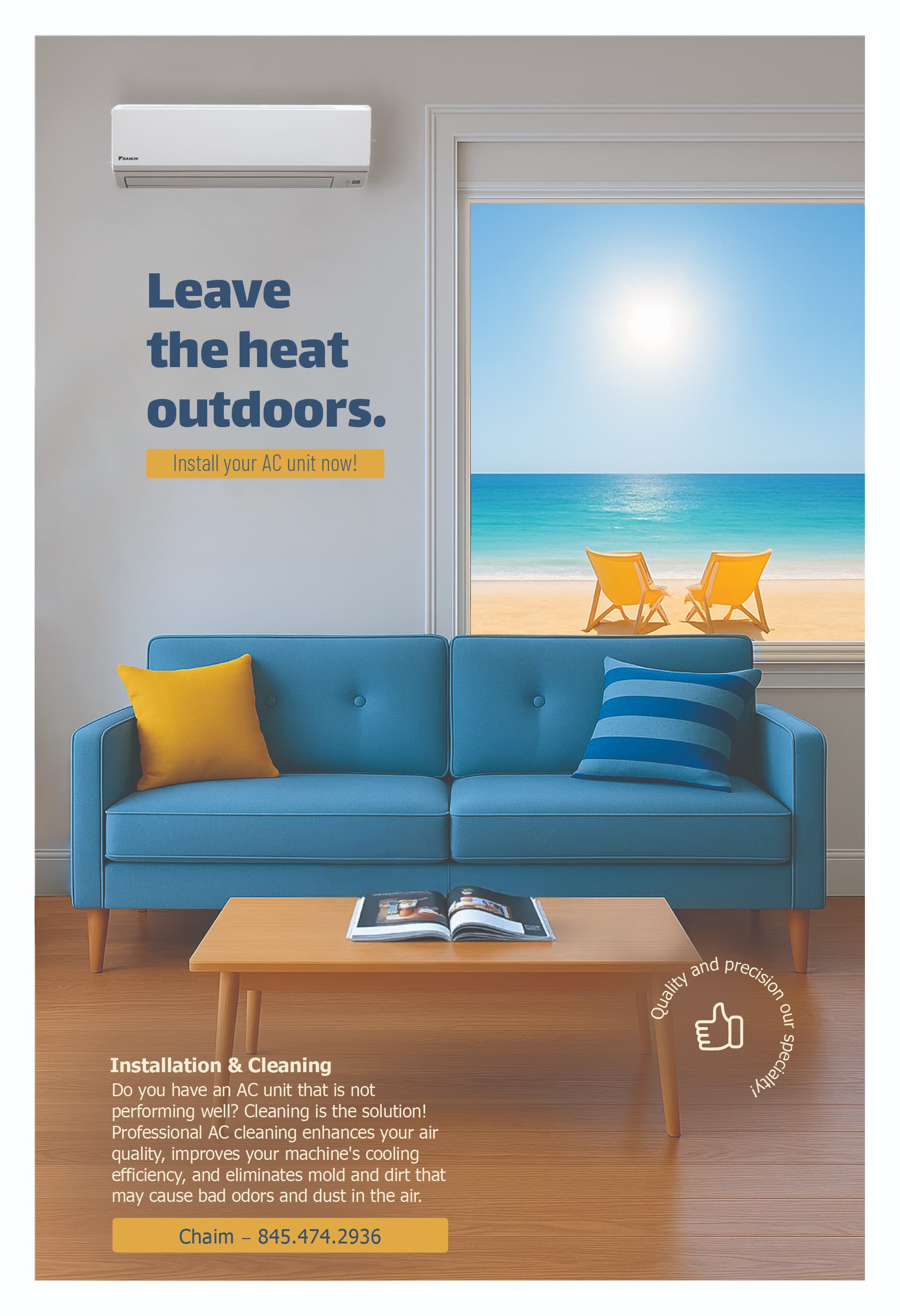
Really liking the second one great work!
Just a sugestion…
Could you try narrowing the window a bit? To give the heading some more breathing room on the left and also align the heading with the a/c and the small text at the bottom
Maybe also move the quality & precision stamp onto the window so that there is more space for the bottom paragraph text to stretch out a little – right now it feels a bit squashed to the left and looks like a lot of text…
Agree, I like the second one.
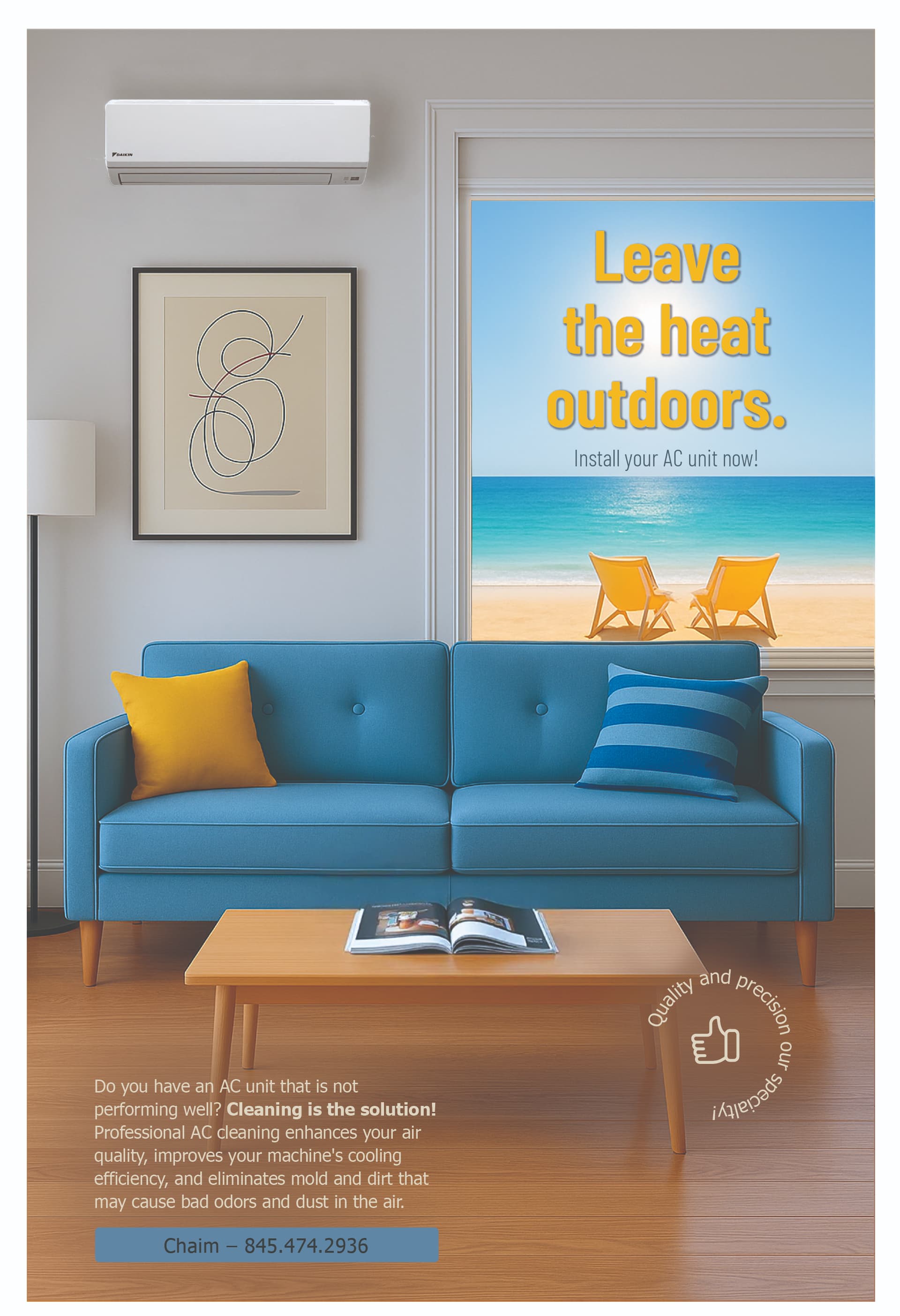
Agree with @Esther_R comments.
About the window, if you do that you can also make the headline somewhat bigger.
They look much better. The second one is most likely the better option as it is less busy, but if you try the following suggestions you can then see which version it looks better on.
For the bottom text, try making the line length a little longer so you have fewer lines and can start under the table leg, and also it will help the balance it a bit-rather than having all the text heavy on the left side, it will move a bit to the right side and feel less columnar.
Also, I’m not crazy about the position of the circle text. It might work better inside a colored circle background and/ or positioned either a bit highter up or more in the corner, or to the top left of the small text unit once you make the edits mentioned. I think you would have to experiment with it a bit. Nice job.
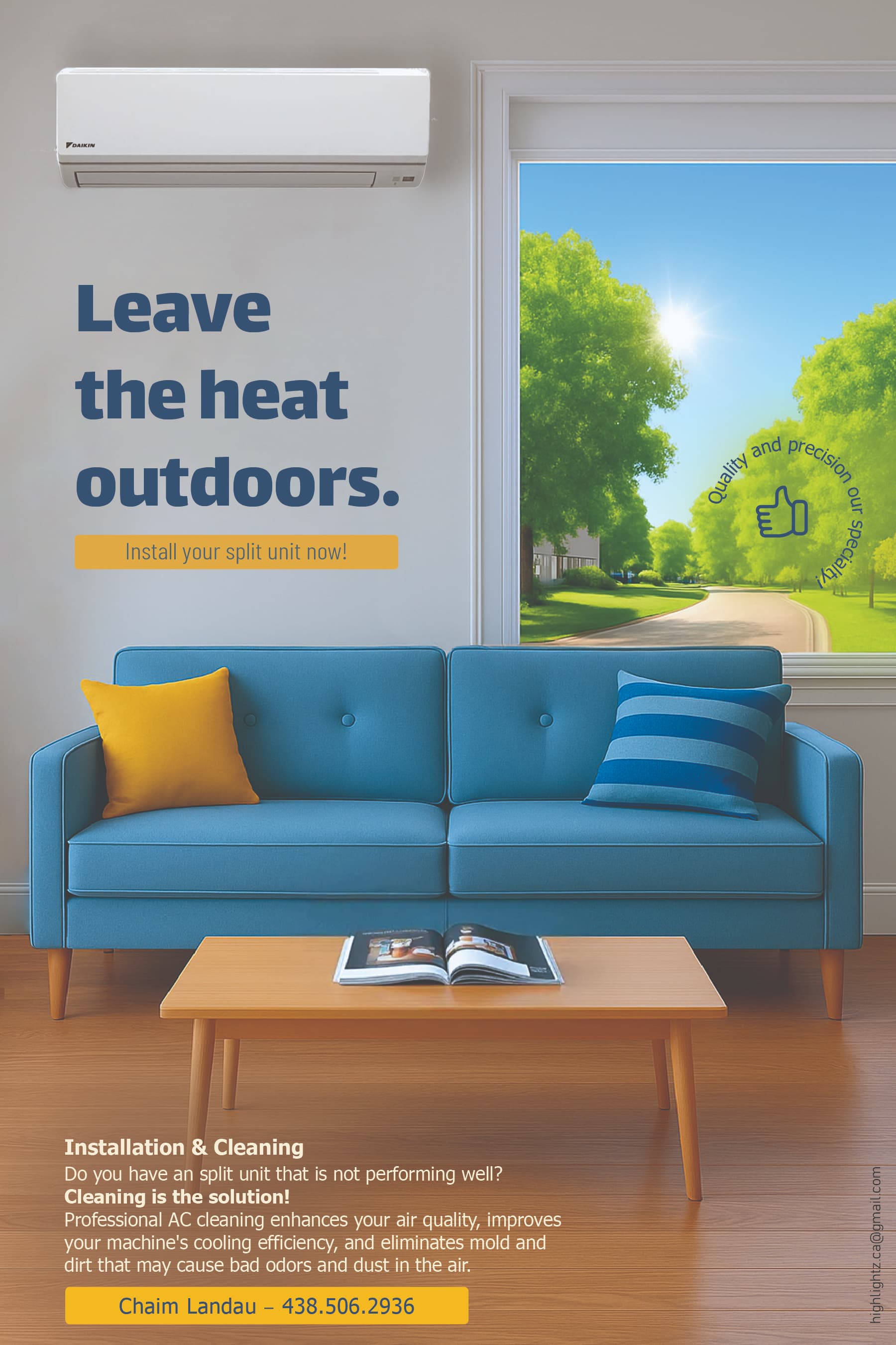
what a wonderful improvement!!! looks great