Hi I’m working on this ad and I was wondering if anyone has any ideas on how I could make the text pop more or fix the bottom, just to make the ad look more complete. Somethings bothering me about it and I just cant place it.
Also which option do you think I should work with?
All advice welcome!
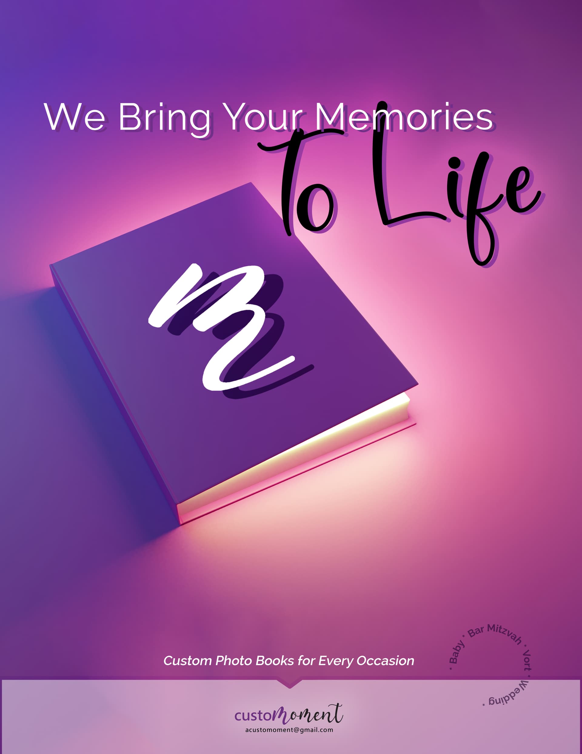

white background on bottom banner?
I like the top ad better.
Maybe a white banner would make it come more together as @schlomithsassoon suggested but I do like it as is
Same here, I like the top one too Great job!
I also think changing the banner to white will help. Maybe put all the info you have at the bottom into the banner instead of scattered around. so on one side Custom photobooks… in black and underneath that in purple baby . Bar mitzvah etc and on the other side your logo.
you could also consider having the banner not touching the edges of the page, although it’s more typical it might look better and that way you could also make the two sides not equal so it fits the content.
Nice! its always so hard to come up with ideas for yourself. (easier to do for everyone else!)
I would make the bar mitzva etc in white in bolder and closer to the middle.
You could also see how it looks with the info on the bottom bigger. Gluck
Thanks so much for all your ideas!
I’ll play around and let you know what I come up with
Thanks!
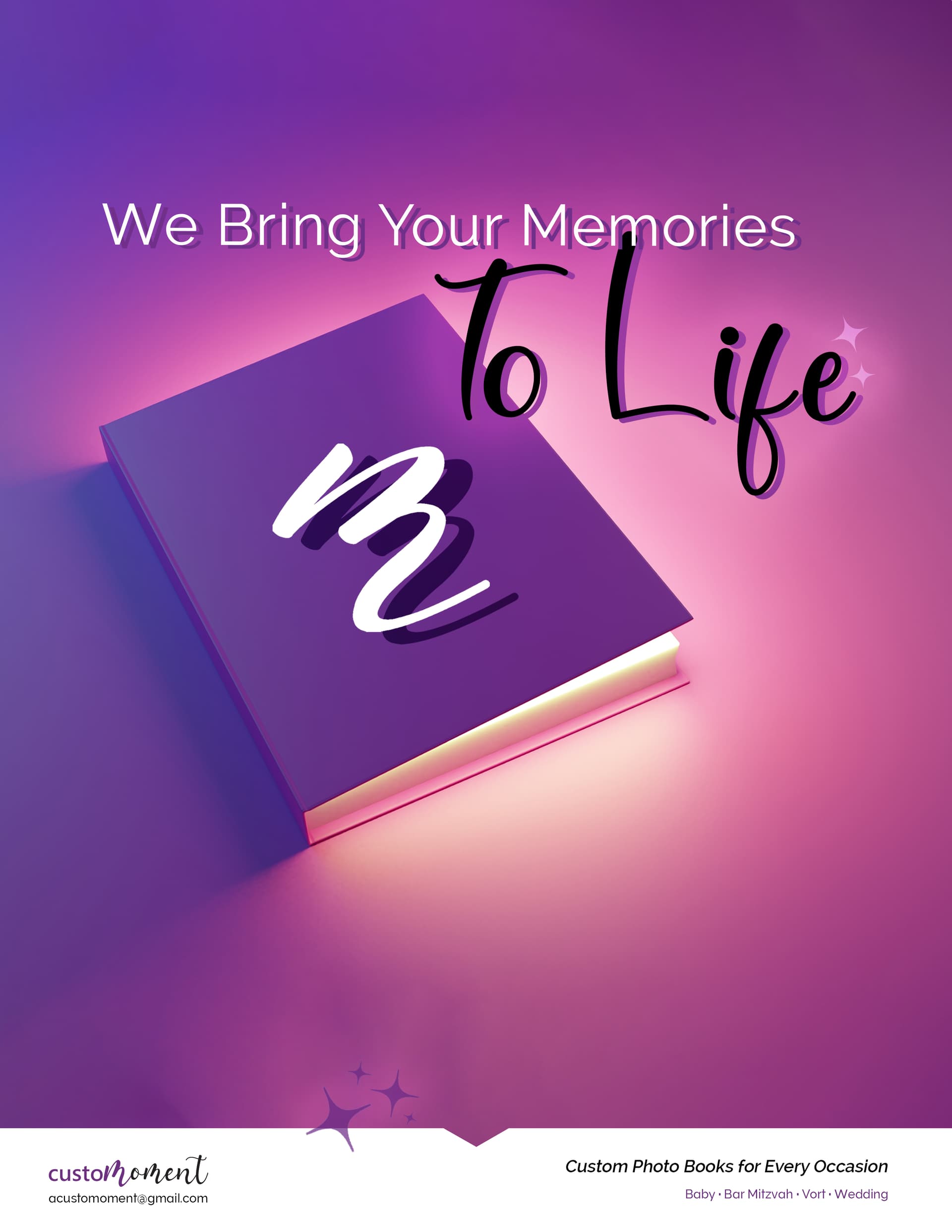
I think it looks very sharp. just not sure i like the sparkles at the bottom.
Love this ad btw, it has such a magical feel!
looks amazing!!
I like the addition of the sparkles!
Love it! If it’s not too late, I wonder how it would look if you would move the white on the bottom with the info up a little to show some purple below. It seems like 2 separate things now. I almost missed it cause it blended with the white on the rest of my screen. Also might be nice to have it a little closer to the book.