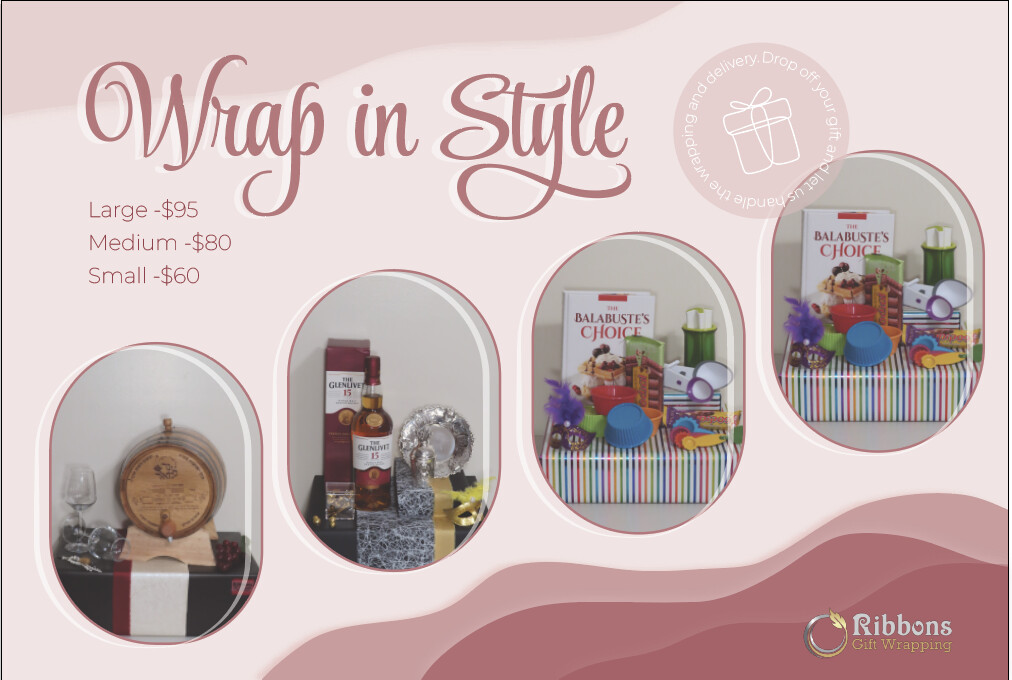
I’m doing this ad for a gift-wrapping place and would love to hear some critique, especially text and logo placement. Thanks!
really nice!
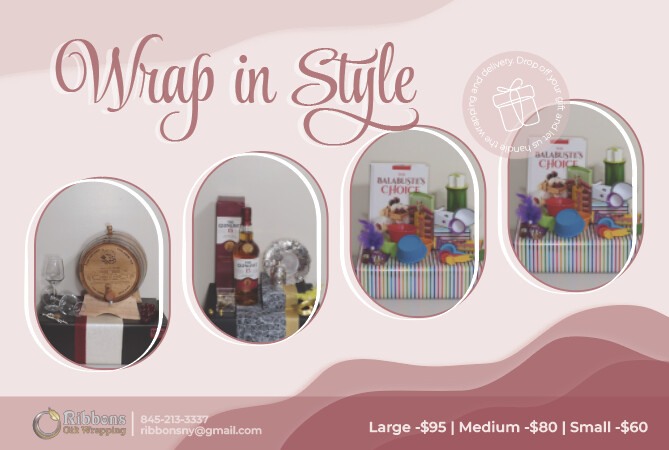
I would put the pricing underneath the “windows” and have it in a line Large $95 | Medium $80 etc
Thanks!
Hey like the idea of putting on a line, but where, on the maroon area?
or if you raise the boxes a bit?
under them
I’ll try it thanks
very clear and visually appealing!!
really nice!!!
the logo is not so clear now, can the wrap in style and boxes be brought up a little bit? it seems bottom heavy now
Nice!
Can you take away the bottom bar? But leave the information where it is.
And then lower the windows a bit.