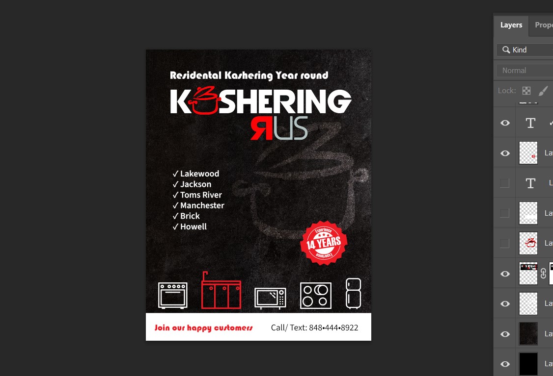
I created this ad but I feel like it’s missing something. Is it too empty? any Ideas?
I think it could use a bit of copy - about what they do, what they kasher, why are they different, specifics of what they offer…
I think the blended styles of images are throwing me off a little and giving it that unfinished look- the chalk pic in the background and the icons on the bottom look like 2 different styles being mixed…I would try to keep it to one look… but I like the overall coloring