Hi, I am creating an advertisement (maybe I will post that for more feedback soon!) introducing a new small yeshiva. If I write on top “grand opening”, underneath it should be the name of the yeshiva written in a nice font with no connection to the logo? Or it should be the words from the logo? Any suggestions?
Hi,
Its hard to picture what you’re saying without seeing the options. What does the logo say on it? The Yeshiva’s name?
Maybe you can post the ad so we can see what you’re talking about and give additional feedback.
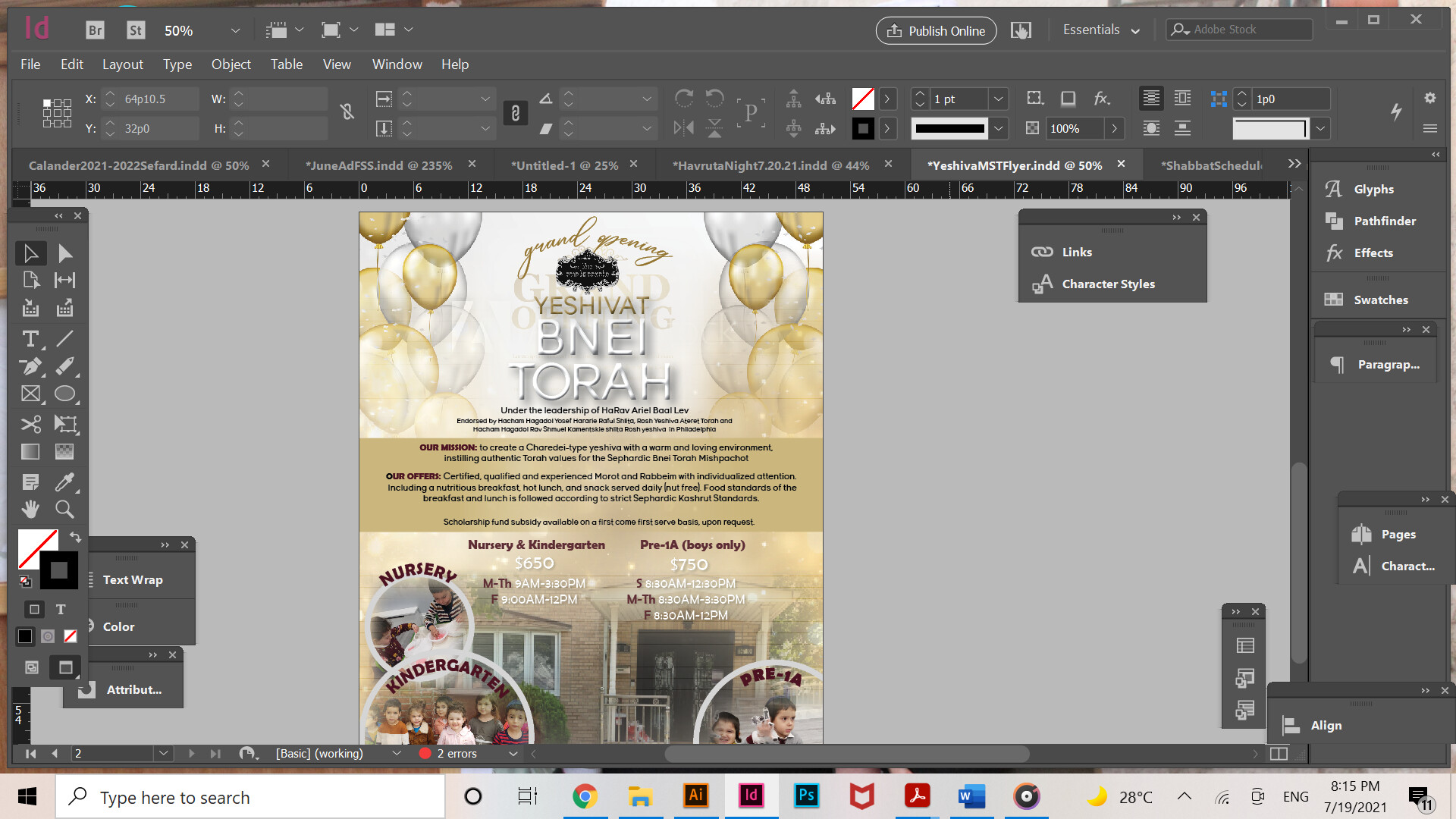
Okay, here we go- I know it needs a lot of work
Really nice! the main text in the box looks a bit squashed and small to me. Also the white amounts and lines underneath are hard to read on this background. Probably better to keep dark font.
Grand opening on top can be more grand! diff font and space out
Good luck
Overall, it looks nice! I really like the color scheme you used!
I agree with Schlomith that the grand opening should look more bold and grand - maybe make it a focal area with the Yeshiva’s name…
If this is a new Yeshiva, then where are the pictures from? Maybe you should remove the pictures so you have more room for the text and bigger focal area or maybe just remove the background picture as it adds a lot of busyness to the design and just move everything down to give it more space and the prices should “fit” into the space between the circles… Once you make some more space, make the text a tad bigger (in the gold box) and increase the leading - I hope I’m being clear 
Also, Kamenetsky was spelled wrong…
Good Luck!
Send an updated ad for additional critique!