
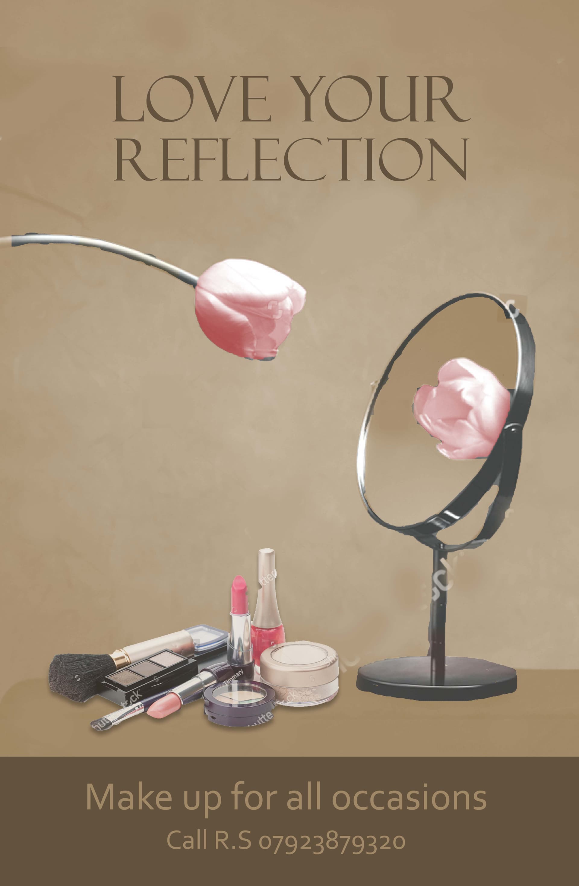
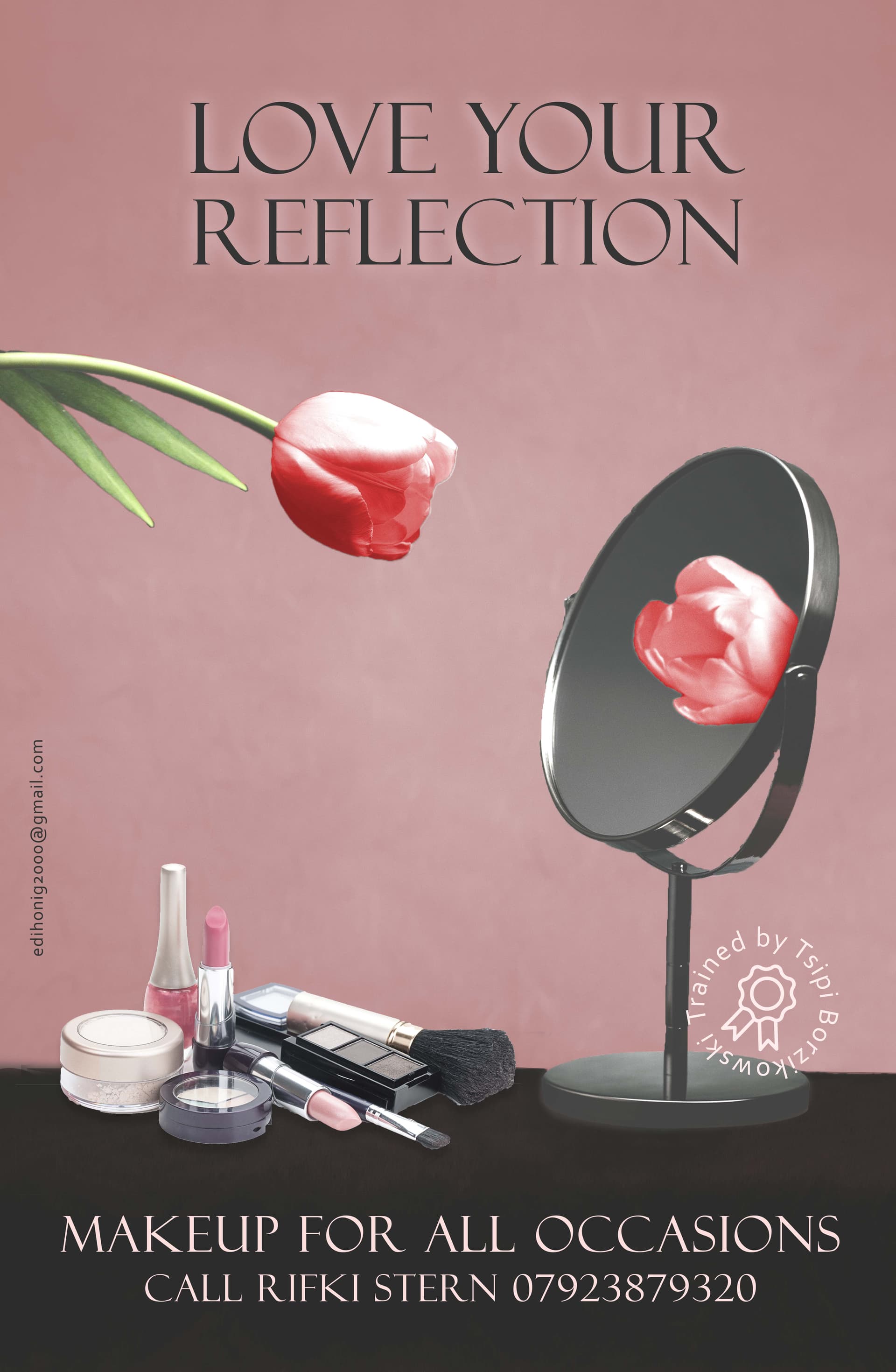
Hi, I would like to have some feedback on how to make this ad more attractive.
And is the image I used strong enough to portray the message I’m trying to show.
1 Like
It is really nice!
I love the mirror concept =)
(Make up is spelled: makeup)
The top is so elegant and has personality. I would add more elegance to the bottom to match it up.
Maybe take out the bar all together and just have the text.
Cute concept:)
I’m wondering if the background would look softer and more feminine if you changed the browns to a more softer peach/tan kinds of colors.
Thank you for all your feedback!
Its a black and white picture so its quit hard to colour every part of it in a different colour, I was wondering if this is also nice or is it to boring?
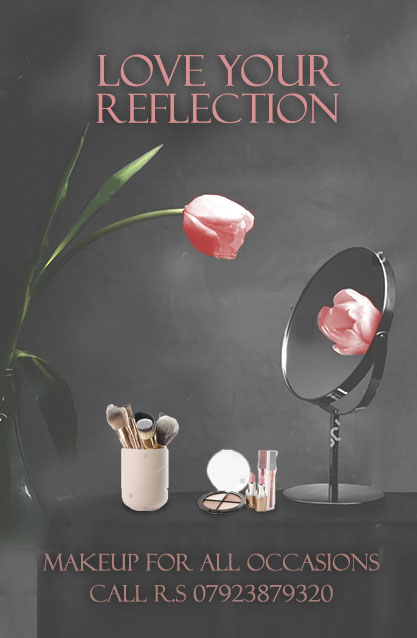
I liked the set up of the first one better (I hope you saved your previous versions!!)
This one is more elegant, but not strong enough of a contrast.
Try the first one with a more feminine color background, and the text for the bottom of the second.
What do you say to this? I’m wondering if it needs a darker colour at the bottom to make the ad more stable…
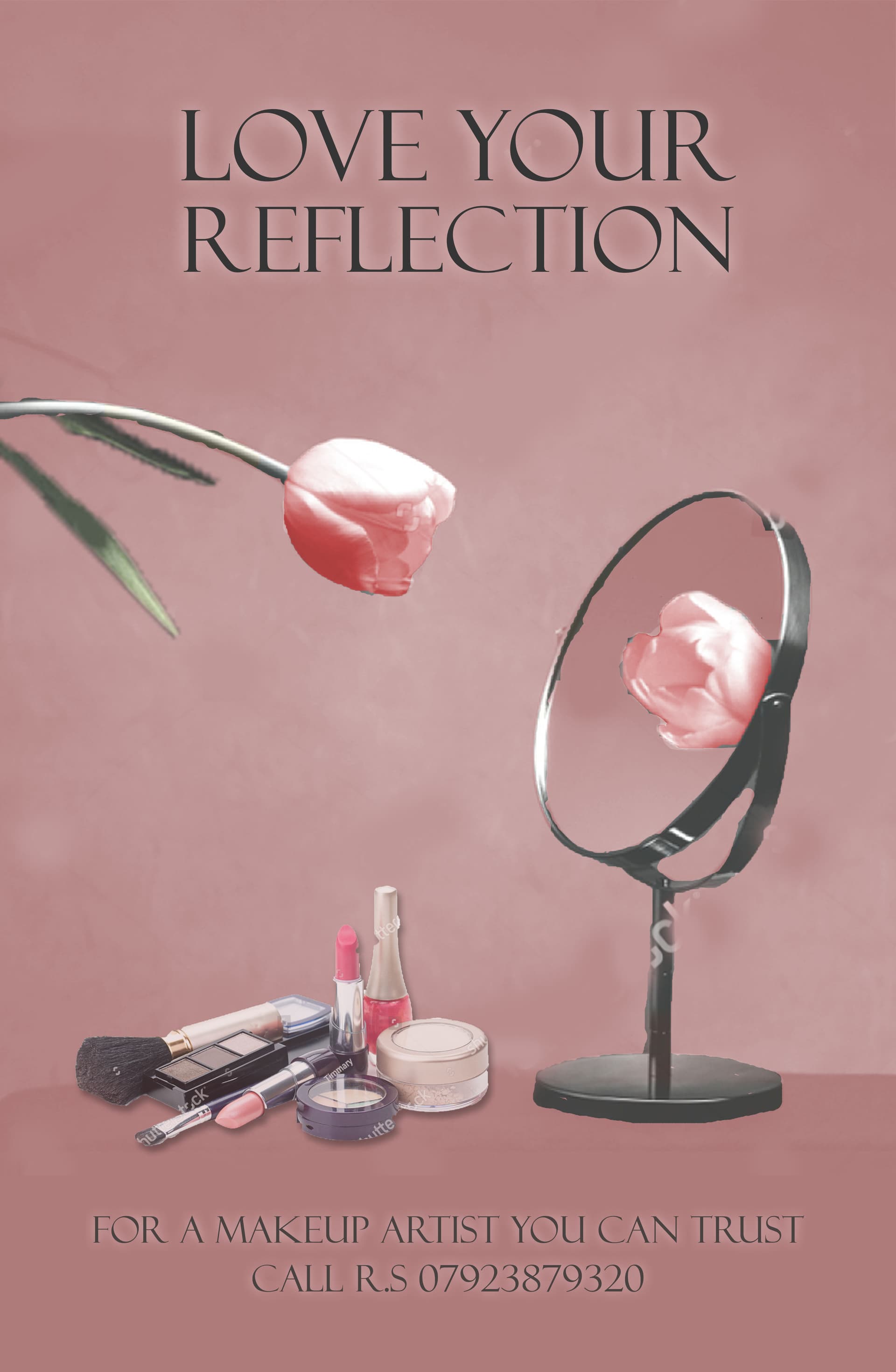
really nice- how about taking the white glow off from the bottom text and see if that helps the contrast?
I like the pink the best. The bottom is hard to read though.
I would put the bottom text in white.
You could maybe enlarge the makeup products slightly - overlap the bottom of the mirror
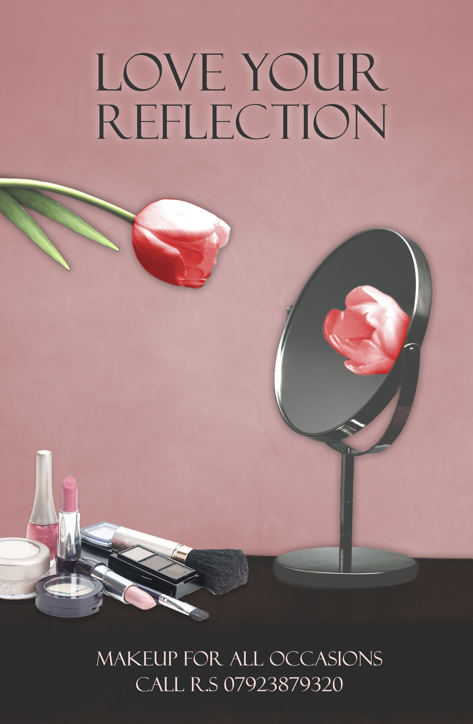
Stunning!
I would remove the shadow from the flower.
There is something that is bothering me… the angle of the mirror is not in the same perspective as the makeup. Look at the base of the mirror, and the circle of the round makeup. They are not the same angle.
Add tracking to the text at the bottom.
Love it! Black make up brush can use a little touching up by taking away the extra white
3 Likes
Great job! Looks really beautiful!
1 Like