Advert feedback

Hi!

Im in middle of making this ad for a client and they think they know better about graphics and keeps on making me change things that make it look so bad:

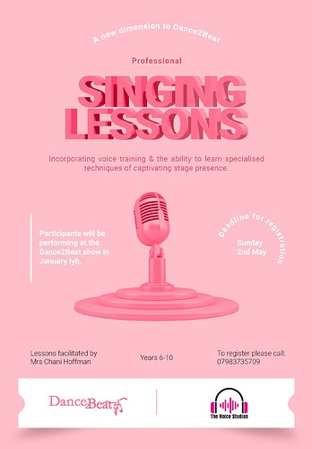
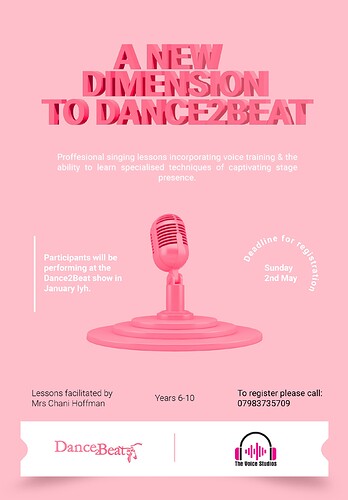
See first is the original version which i think looks rly good! and then below are more what the client wants but i cant let such a thing go to print! there is no hierarchy in the first and the second title doesnt come in - please tell me if im right!

And please if you have any advice on the first ad! but its a rush job so needs to be in by tom…

Really nice ad!
I don’t see a problem with any of the versions - the changes are all pretty small…
I think there is an issue of hierarchy - there are too many different groups…
I would suggest:
all the top info should be a little closer as it looks like four sep groups.
The mike pic is great focus and good visual pathway… - maybe enlarge just a bit
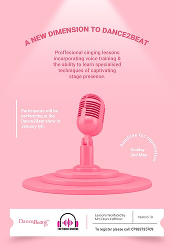
I think you should take all the info in black and put it in the right side of the white box and move the logos to the left side…
and the deadline for registration - you can either keep where it is or try to put it closer to the white box…
Hatzlacha with your client :wink: - hope she likes the final one!

ok so heres the final - had to compromise a lot🙈

Thank you Breindy for your help! love how it looks in the white box!

and heres what i wld still use… wonder what you guys think is better?

I definitely think the second ad has a stronger focus but the first one isn’t terrible.
You’re welcome!

Looks great! I like the structure of the first one better but I would make the top text smaller.
Also “professional” is spelled like this (for the top ad)

Thank you! idk how i didnt notice that spelling mistake!

I honestly like the focal point how you had it better…

just seeing this!
I love the overall look of this- likeyours better :slight_smile:
great job!