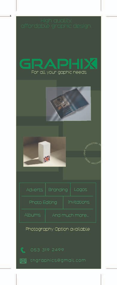
hi i am just starting out as a freelance designer and would like some crit on the advert thanks
https://assets.adobe.com/id/urn:aaid:sc:EU:8582b4bc-6c49-4e75-9931-8a0abb7eefb3?view=published
hi i am just starting out as a freelance designer and would like some crit on the advert thanks
https://assets.adobe.com/id/urn:aaid:sc:EU:8582b4bc-6c49-4e75-9931-8a0abb7eefb3?view=published
really nice! i like the use of mockups with shadows, adds a lot of impact. logo & name is bold and memorable.
just the light green on dark green is hard to read…can you try white for some of it? i can barely read ‘high quality line at top’ which is a bit ironic  also maybe post a higher res version/a png for us to preview as this low res jpeg has pixely text
typo under logo - says gaphic.
hatzlacha!
The words adverts, branding, logos are not centered, is that on purpose?
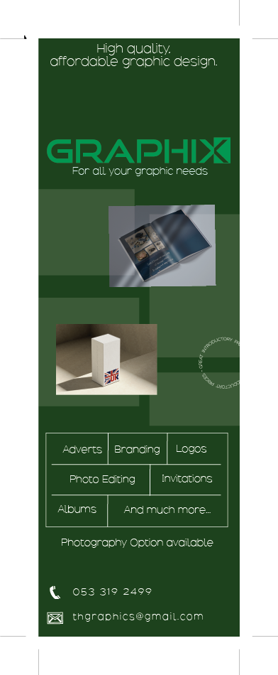
that’s better!
although is this going into a printed publication? i would be a bit worried the light text on dark is still going to get swallowed up and not be easily readable… do you see what i mean? maybe you have a home printer and can do test print?
i think darker was fine - better contrast.
it’s just in general whenever you have light letters on a dark background and they are at a small font size and are thin you have more risk of them not being read clearly. for me if they are not sharp on screen then even more so in print they may not be.
happy for others to weigh in!
I also preferred when the background was a darker color…
Just the white should be a medium instead of regular or even bold for some part if you think it will work better…