Hi, I’m in the middle of the self placed computer graphics course and was asked to help a friend with this advert. Does this look OK? Any comments/ advice?
Thanks!
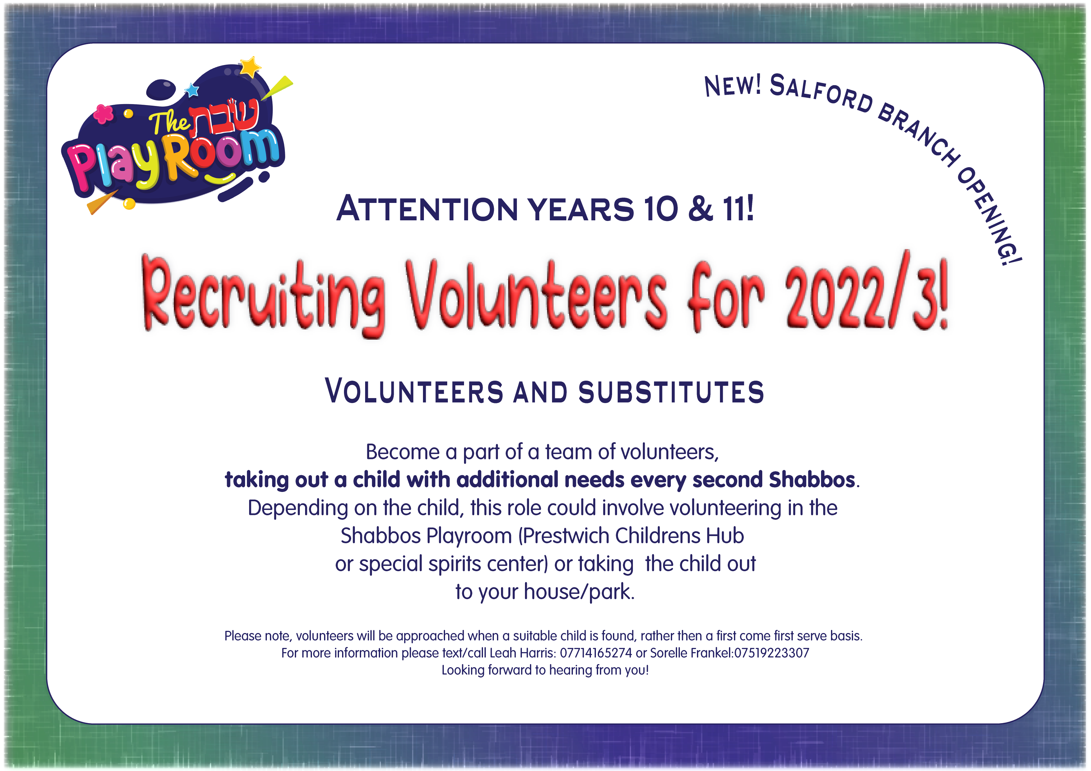
Advert for the Shabbos playroom-01|690x488
Nice start!
I personally don’t like the font used in the words “Recruiting Volunteers for 2022/3!”
I feel like you could use something cuter to match the logo. See attached for an idea…
Bodo Amat font
Also, Attention years 10 and 11 doesn’t need a stroke - it would look sharper without the yellow stroke.
and the font on the bottom should prob be the same as the font from “become a part of a team…etc.”
Maybe you can match the colors of the background to the colors of the logo. I would add some line spacing.
I would write 2022-23 or '22-'23


I love how you matched the background to the logo.
Job well done!
thanks 