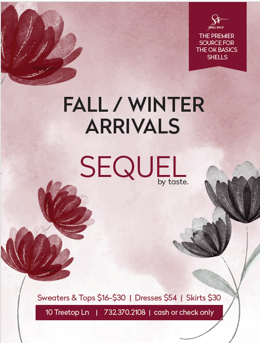
Anyone know what’s putting me off with this ad? I cant place what’s not adding up. I always do the ads for this brand but never got stuck before. (Maybe I need fresh eyes and a good night sleep ![]() )
)
All Ideas are welcomed!
Anyone know what’s putting me off with this ad? I cant place what’s not adding up. I always do the ads for this brand but never got stuck before. (Maybe I need fresh eyes and a good night sleep ![]() )
)
All Ideas are welcomed!
I think the flowers are calling more attention than the words - maybe make them smaller or less opaque and the words more prominent…
The grey is looking very sad, there is nothing that draws my attention to excitement
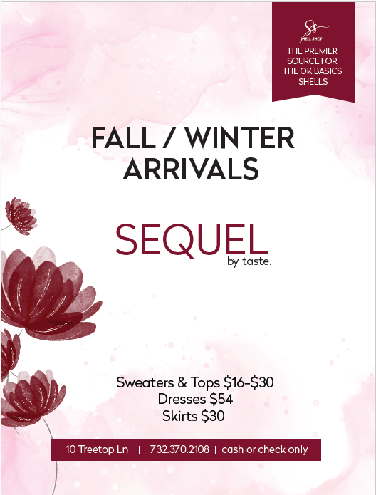
it looks much much better now!!!
Thank you, I must have had midnight fog. lol
Things always look better after a good nights sleep! LOL
The darker maroon background also made it more moody, the lighter background now looks much better.
One more suggestion: The fall/winter arrivals and sequel logo are sorta competing, I’d make one significantly the focal point and the other smaller.
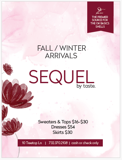
Even when I do such ads that are simple and straightforward, I still find it helpful to look for inspo in magazines for similar ads to see ideas for these little details. Sometimes these little tweaks are what make it really pop.
Thank you!
LIke it much better now!