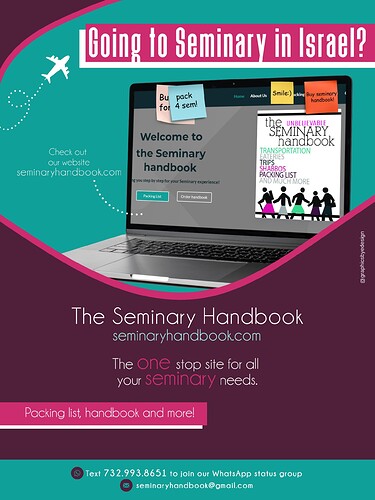
Hi! I’m making an ad for this seminary handbook website. Any thoughts?
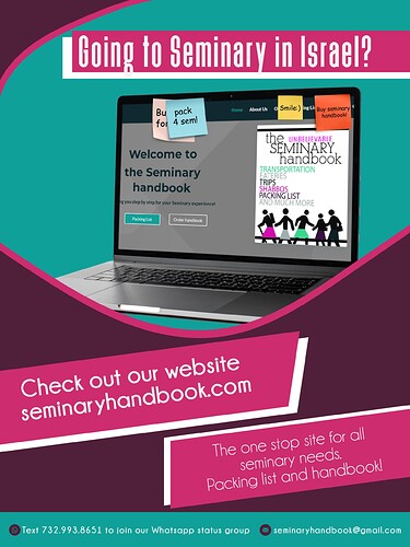
Really nice!! I love the organic shape you created for the focal point.
I like how the the G from Going is bleeding off in the white but I think it would look better if that whole sentence was completely white - it looks like a really light grey to me…
The boxes “check out…etc.” and “The one stop site…etc” I feel are too big… Either you can make them smaller or you can reposition them… like I’m thinking take the box away from “check out our website…etc” and put those words to the left of the laptop - maybe have a “messy” circle around it or nothing around it… and then with the words “The one stop site…etc” you can also take out of the box and center in the maroon… You would probably have to make it bolder if you put it straight onto the maroon…
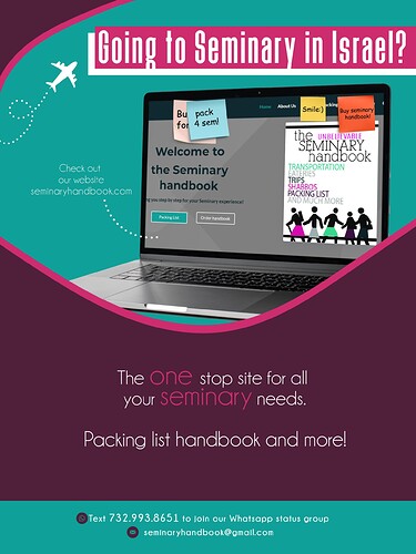
Hows this? I changed the layout a little.
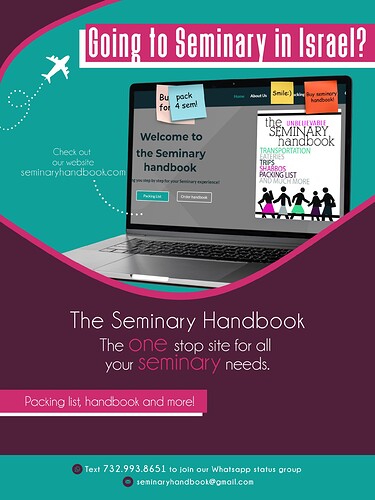
I still might want to add a little bit more text on the bottom.
Much much better!!
I was actually thinking you should do a dot dot thing pointing to the computer, but I didn’t know how to write what I was envisioning so it’s funny you did it… and I liked that you included the airplane…
The bottom also looks good. just make sure it’s 100% in the middle - it looks closer to the right side than the left but it could be an illusion…
Put a comma after (packing) list.
Also, I think the contact info (on the bottom green) looks neater on the first draft…
wow- you’re so talented!
I love all these!
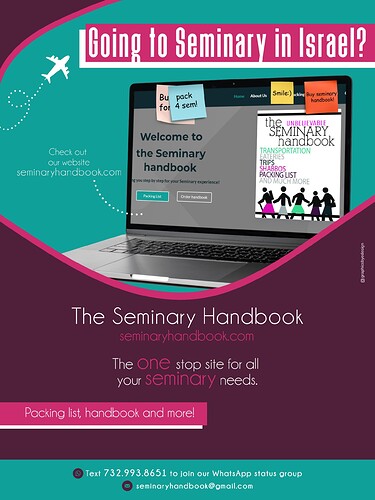
i think the last one is my fave…
I love the last one
Yes, this last option is really nice!
Nice job 
i love the last one best too!
gorgeous!!
can’t wait to see my sister get it  (shes going next yr
  )
)
Cool! Original color scheme - love it.
If you didnt send this out yet, one point:
From a marketing perspective, I would probably emphasize the name of the website more (bold and increase size), since it’s essentially the point of your ad.
