Hi
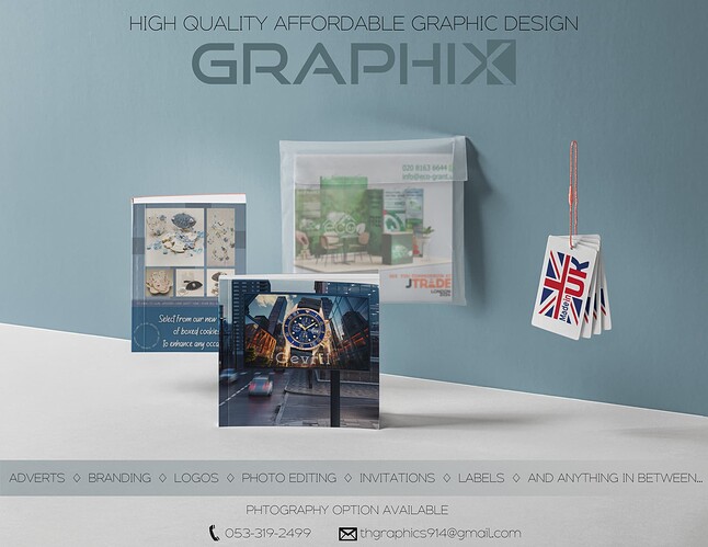
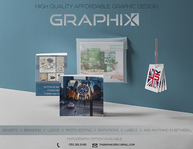
Made this ad…
like it but not sure if its to plain…
any crit??
TIA
Nice job, I would try adjusting the colors to something more vibrant, and maybe adjust the levels to add contrast…
Can you make the page bigger, this way giving you more space on top and on the bottom. The info is to close to the edge, I think it will look better with extra space.
I like your logo, I think it can be made smaller and make high quality affordable graphics the main bold point.
The text doesn’t have much contrast with the background, it’s not thick enough. I would try white.
The left book is floating mid air, I would change that to a floating flyer instead, it needs a grounding shadow. The phone icon can be moved nearer to the phone number
spelling of photography should be corrected
Agree with Tali.
Try changing the fonts/ colors for better contrast


