Hi,
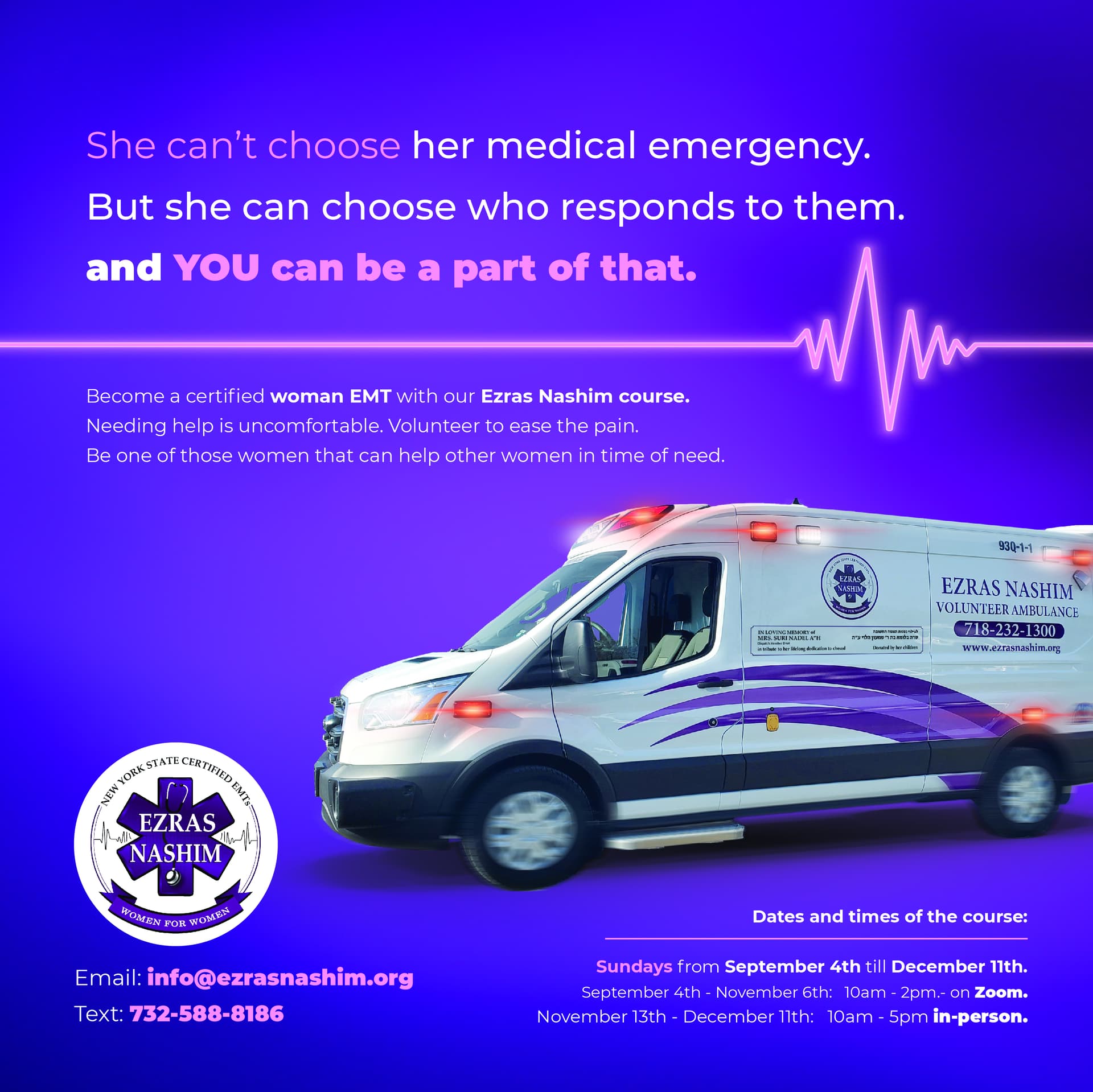
I am designing this ad for a EMT course and would love feedback!
Thanks in advance!
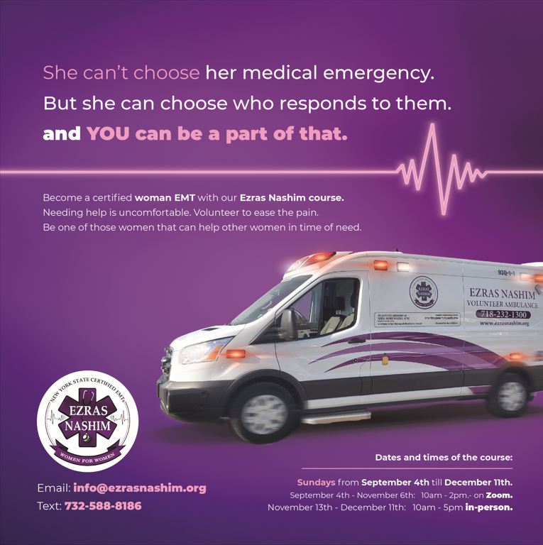
Really nice job on the layout! For the first line, “she can’t choose her medical emergency…” I would make it one sentence instead of starting a new sentence with “But she can…” Not sure if you have that option.
Love it! so neat and clear. I wouldn’t change anything.
wow it looks soooo nice!!
i think it’s amazing!! well done!
Beautiful!
Thanks! This is updated version. Client doesn’t like where the logo is.
Any suggestions where else I can put it without messing up the ad?
It’s a really nice ad, great job!
I think that’s the place where the logo fits best…
Also probably either write ‘medical emergencies’ or ‘responds to it’.
I like the background coloring better from the first
I agree with She I, I think the logo placement is perfect as is, but it could be that it would be better if it was smaller. I did like the halo effect under the ambulance that you had on the first draft
Just came here to say that I saw this ad today, and it came out great! Nice job, @Tali!!
Thank you - I appreciate 
Just wondering, I gave them a JPEG/PNG ad for a flat fee.
Now they want the PDF file and the ad in Canva format so they can edit further.
What do I charge for an open file?