
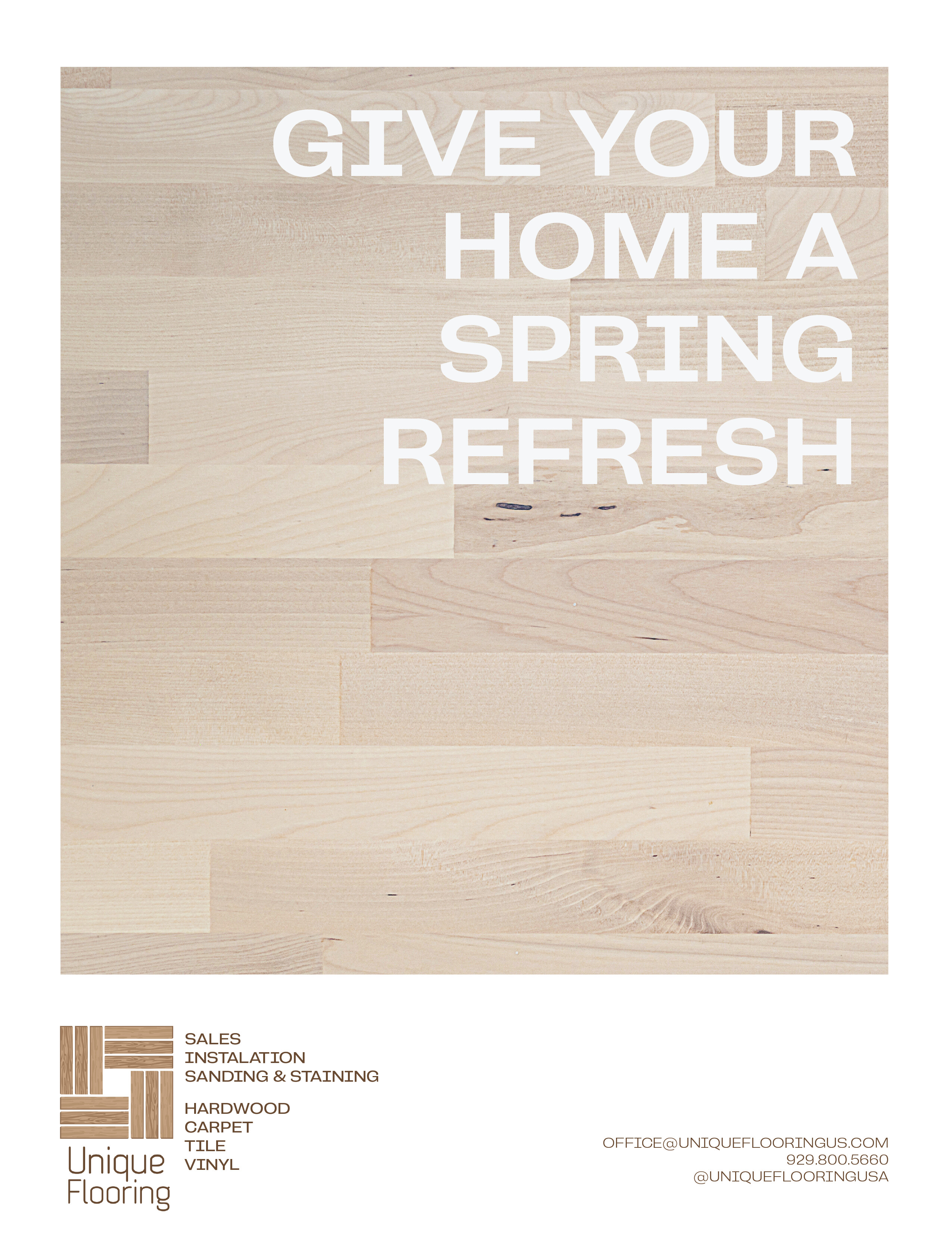
I am working on an ad for a flooring company. If anyone has any feedback/ ideas I would appreciate it. These are very rough drafts and not all the info is on them but I am playing around with some ideas
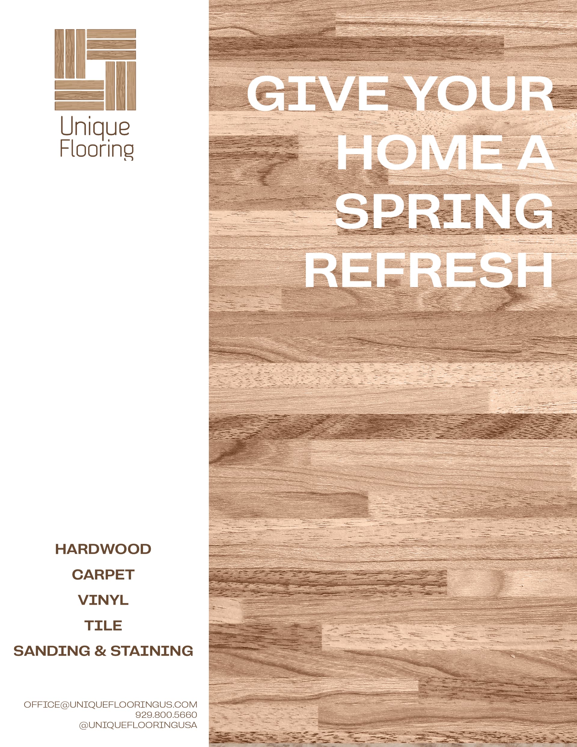
I like the first one the best
1 Like
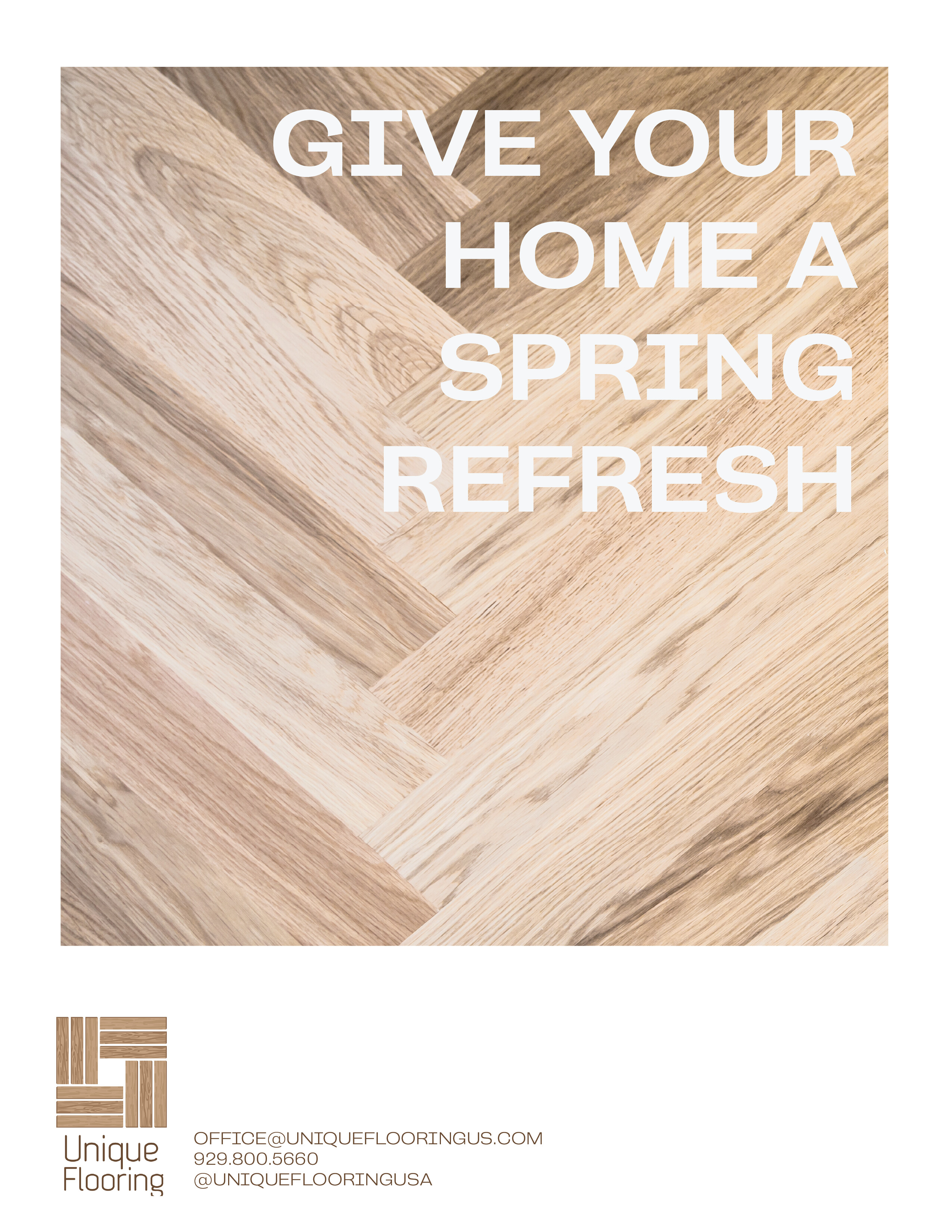
like the third one
1 Like


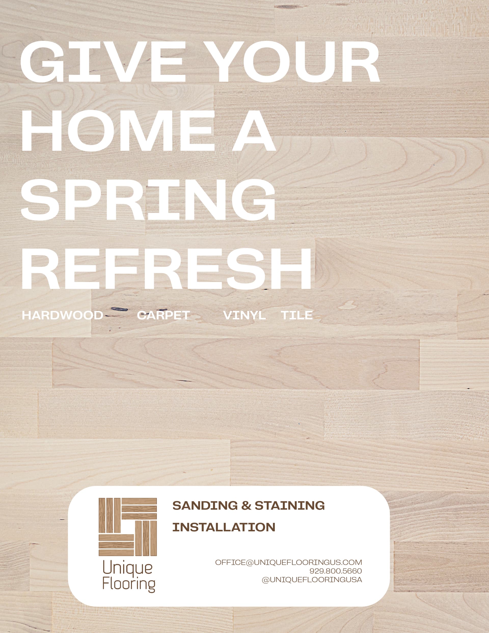
switched it around because the client wanted an image of a room. any thoughts on how to formant the info on the page. I’m not liking it how it is. also might put free consultation on there somewhere. thank you
if you want some inspo… I think if you change the white to another color like the wood of the chairs and then do white text you might like it better.


Thank you so much
I have to keep part of it white because the logo is on a white background and can’t be cut out but I will use these as inspo
You definitely can, its also really an easy logo to just recreate if you want.
1 Like

How about making it related to each other? Like three areas of a business card type idea… if you get what I mean and then align it according to the bottom of flooring so it stays aligned and looks organized. Thoughts?

any critiques
Love this last one.
could you align the logo to the bottom sentence of “reach out…etc.”?
1 Like
its perfect now!
1 Like