Hi
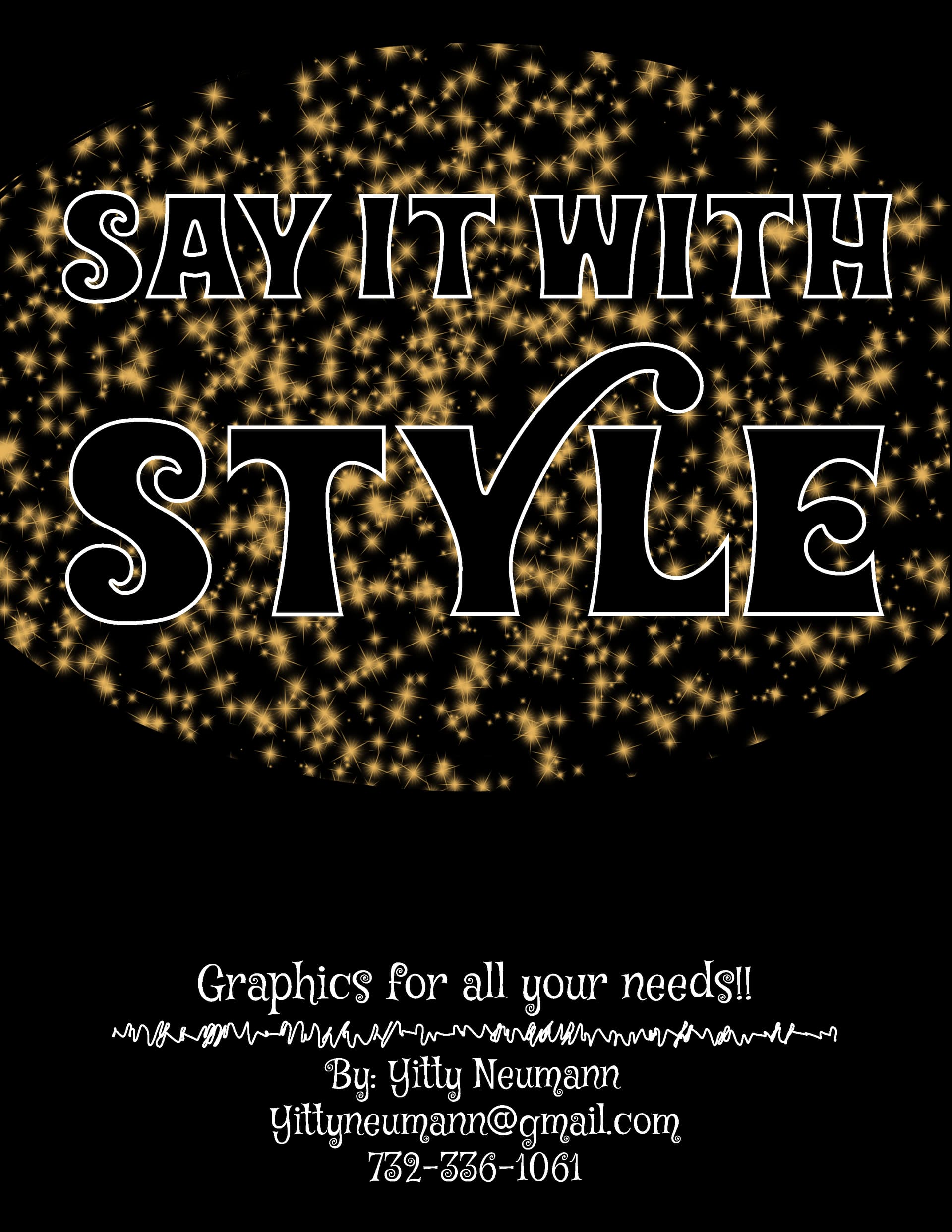
I’m making an ad to put out to start a graphics design business.
I’m not sure if it looks professional yet nice and friendly enough to send out or if I should still be fixed up…
All critique and suggestions are welcome:)
Thanks
Yitty
Hi
I’m making an ad to put out to start a graphics design business.
I’m not sure if it looks professional yet nice and friendly enough to send out or if I should still be fixed up…
All critique and suggestions are welcome:)
Thanks
Yitty
I think the font is a bit too “fun” on bottom. It would look great on a camp flyer but I would keep it more formal on a graphic ad.
I would play around with the text a bit more as well or add something on it that stands out, since thats what you are representing.
One more point, I think “For all your Graphic needs” sounds more correct