Hi,
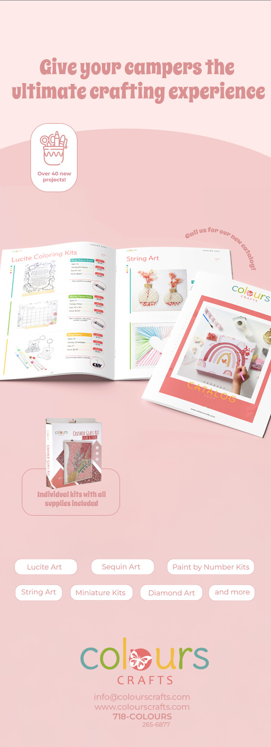
I’m having a hard time with the bottom layout of this ad. Any ideas?
Thanks!
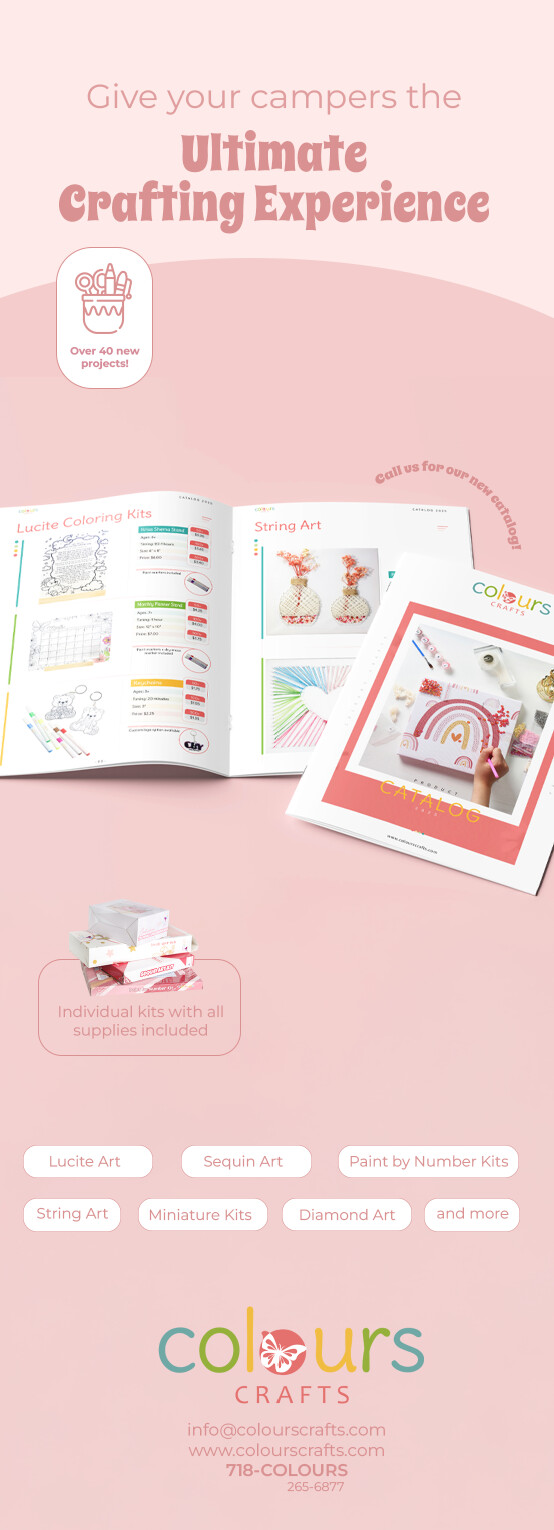
I think it looks great!
So cute!
Look at other half page ads for reference and inspo…
I love the advert, I would work on the title. I feel it is too close to edges and can maybe be separated into two different fonts eg Give your campers in smaller and the body font you used for the rest of the advert, followed by ‘ultimate crafting experience’ in larger in the font it is in now…
Just a thought…
These ads always look so good in print!!
I would also fix the title. Maybe you can try putting it on three lines.
“Give your campers
the ultimate
crafting experience”
Maybe you can have the text in the white boxes to be white text and white outlines instead of filled in.
It’s great!
It could just be your screenshot, but make sure it’s centered properly.
Maybe give the white bars more margin on the sides of the ad by moving them closer together.
Make sure each item/word in the boxes are centered horizontally and vertically. The ‘over 40 new projects’ as well.