Hi, I’m in the middle of designing this ad but feeling a bit stuck.
Does it look attractive at all? Any and all opinions and ideas welcome!
Hi
I love how you played around with the tittle.
When I feel stuck, I like to look for more inspiration to figure out a better layout and if there is anything to do to make it more attractive.
I like to look through The Monsey View | Our Town's Weekly or View Issues – BP Weekly
If the ad is specifically being a landscape, then look at half page ads.
Please share what you come up with 
Thanks! Yes I usually do look at the advertisers but I totally forgot about the Monsey view!
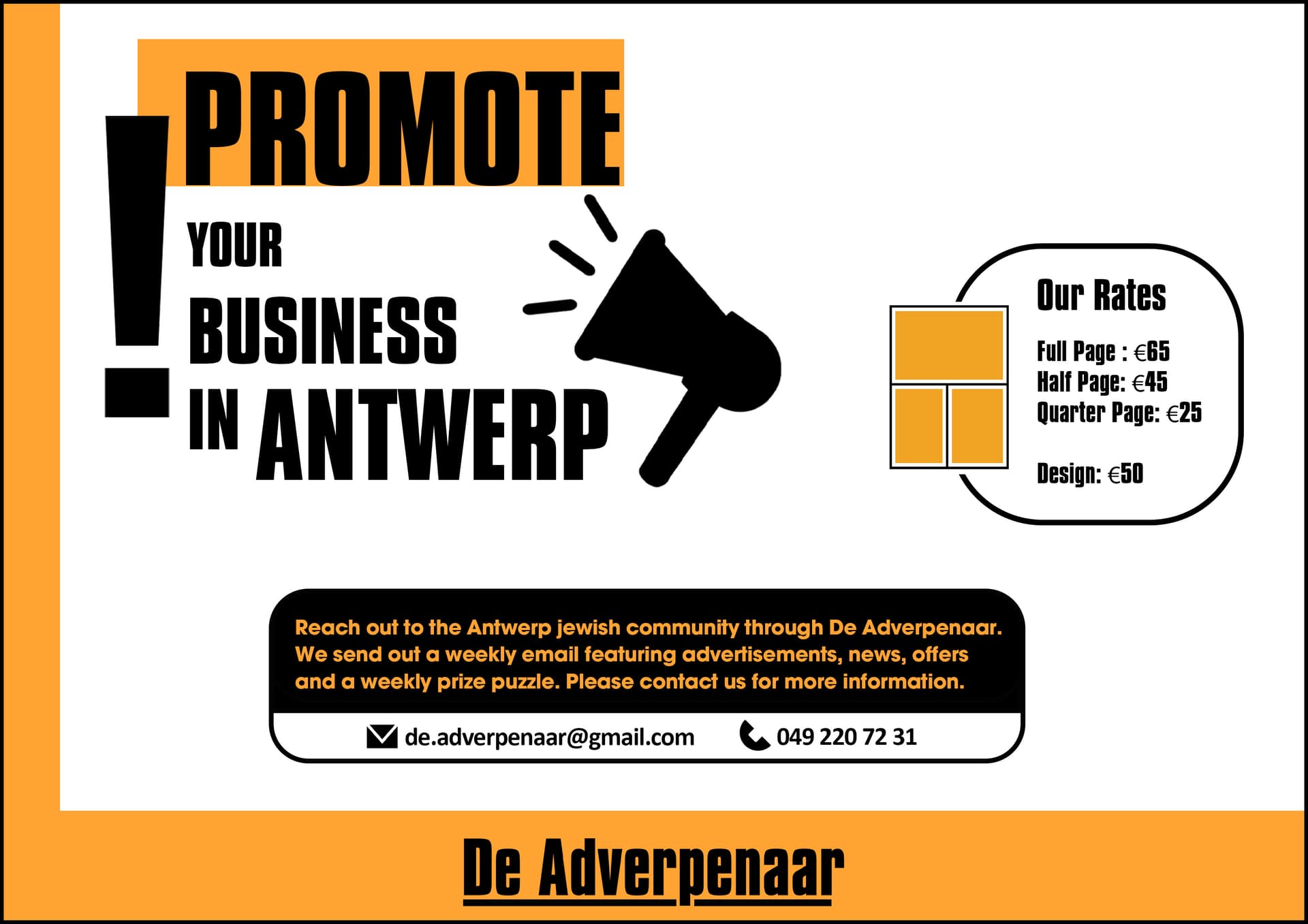
How about this one?


I love it!
I vote for the second one
It looks like a screenshot, but make sure you are not too close to the edge.
I’m not sure about the “our rates”, but I’ll let someone else chime in.
Yup, second looks clearer. Nice layout!
Nice job.
How about putting this add on a billboard mockup?
I like the second one. looks very sharp!
I think our rates would look nice on the side of the text “Reach out…”
left align the text and place our rates next to it. Makes sure the whole thing is centered to the page.
Thanks everyone! I had to give it in already so it stayed like it was.
I like the idea of putting it on a billboard mockup!
Just saw ad in print now, looks great!
Now I’m playing around with a new version. I liked the idea of putting it on a billboard mockup, thanks for the idea! Any advice/critique for this version?

4 Likes
looks great!