Ad Critique Please!
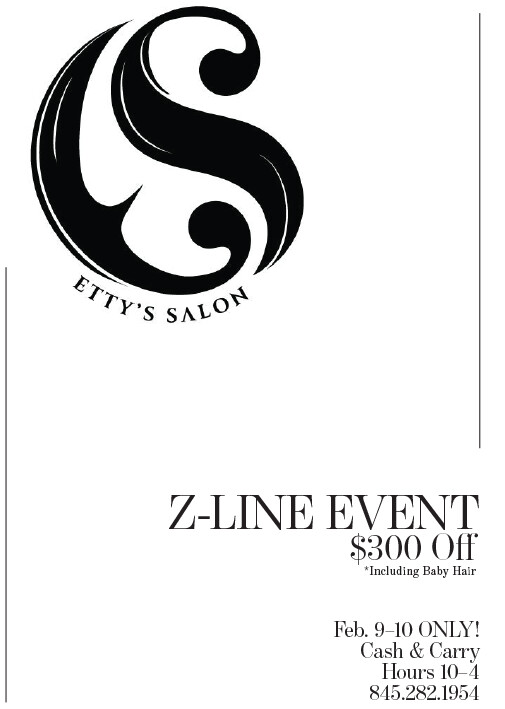
I like the simplicity of this…the empty space actually draws attention to the ad. It is well balanced, but should have clearer hierarchy between the two elements, i.e. one obviously more dramatic than the other rather than both basically equal visual weight. You could accomplish this by enlarging the logo a bit more, and making the text block a bit smaller, so proportionally there is more of a difference. You could also accomplish this other ways, such as adding a black strip on the bottom half and putting the text in white, and making it all smaller, but not sure if that would “ruin” the clean look.
For the contact info, you should increase the leading, space between lines, a little bit, and increase the tracking, space between letters, in the phone number a little bit. I would also bold or semibold the line with date, so it feels about as strong as the larger text above. Good use of en dashes!
Overall nice job!
Very clean!
I would try adding a subtle texture to the background, At the moment it looks great but the white and black is harsh for a beauty salon
I agree with Alyse that the leading needs to be worked on the bottom
Updated version on behalf of student…question was asked as to where/how to add color and better organize the text?
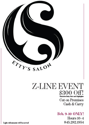
I would add the color also to the large event name and the $300 off. That text up there still looks a bit squished, the leading can be opened up a bit there as well, on the top three lines. Keeping the proportions the same as they are now, I would shrink everything down a little bit so there will be a little more space between the logo and the text, and so you will have enough room between once you open up the leading a little bit as noted above. For the light refreshments text, maybe that could be grouped with the cash and carry and cut on premises, since those are all event “features”, and possibly set in white text on a colored circle, at an angle. If you do that, it would also open up the text more on the right side, as it is getting a little busy there was lots of info.
I agree with Adina that you might want to try some softer colors, the pink that you are using would look nice with a light beige/tan possibly in the background, and a deep chocolate brown instead of black for the text. Or you can keep the black text and use a softer, lighter gray texture in the back, possibly a dark gray instead of black for the text.
Also, the logo looks a bit pixellated, do you have a vector version?
Just some ideas…but overall it is eyecatching and clean.
First she said that she likes black and white but then she asked me to add color. The reason I chose this maroon/purple as the second color is because her salon has one wall painted like this. The rest is more in the grey family. She doesn’t seem like the type to go for soft or pink. My original did have some texture in the background but she didn’t like it.
what about using this maroon/purple as background and the text, logo and lines in white?