Hey!
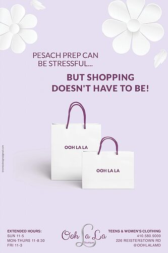
Does anyone have any thoughts or ideas on how to improve this ad? Or is it good as is?! The client wasn’t sure if maybe we need to change the wording to make it catch more attention.
Any feedback much appreciated!!
Why dont you try making the background a darker purple so its a higher contrast?
Thanks for the idea!
I think the purple in the background is ok, as it makes the darker purple in the front pop, and darkening it would lower the contrast with the words. Mostly I think it look good, but the top two text phrases should be the same size and the same tracking, just different boldnesses…right now it looks too disjointed with the different tracking on the two. I would also tone back the other text just a bit, keeping the top lines, the text on the bags, and the logo the strongest. Maybe just bump the opacity down just a bit on the other text blocks.
Nice job.
