Hi, I attached an ad, would love to hear some critique if anyone has a chance!
Thanks alot!!!
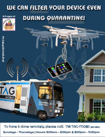
A bit too busy for my taste. i would def. take off the grey box behind the words filter and quarantine. i think the bus has to be smaller. look at the proportions of the house / drone / bus.
good luck!
schlomith
Thanks!!
I changed it and think it looks much better!
if there is anything else i should change i would love to hear!!!
The blue background of the first one is better.
I like the red stripes on the second one.
Title should be bigger.
I wouldnt mix vector and real image (house and bus).
Also try to get the angle of the bus right. he is driving down into nowhere. The botton of the house of the first one is also hanging in nowhere.
maybe try to put that logo into the top left corner and then put title in middle of the whole page.
Good luck!!!
THanks!!!
It definitely looks better now… I knew something was off just couldn’t figure out what…
and you were totally right about the pictures, they were like just floating around, but i think thats taken care of.
anything else i should change you can let me know:)…
BTW does it look to busy agian?
Much better. i liked the first font better. Make the drone smaller, add margin to the title. give the title more space. add spacing between the lines.
The logo still bothers me - its stuck there in the middle of nowhere. did you try to put it in the corner?
THanks so much!!!
My client actually loved the ad!
(I couldnt figure out what to do with the logo, but he liked it like that…)