Hi,
Any critique or comments on this ad?
Thank you
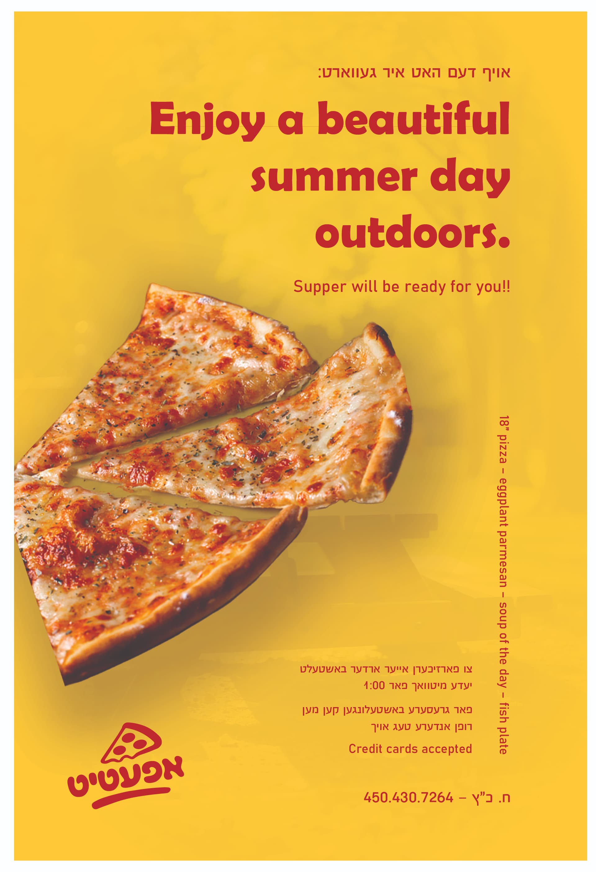
Hey, you’re doing great, Chany! I love the background picture. Few points:
- I once heard that studies show that yellow is the most hated color. I don’t know if it’s true, but the yellow doesn’t give off the right vibes for this… I would change the background color to something more summery/ soft, like green.
- Info needs pointers for each information piece or a square underneath low opacity.
- I would straighten the logo.
Hatzlacha!
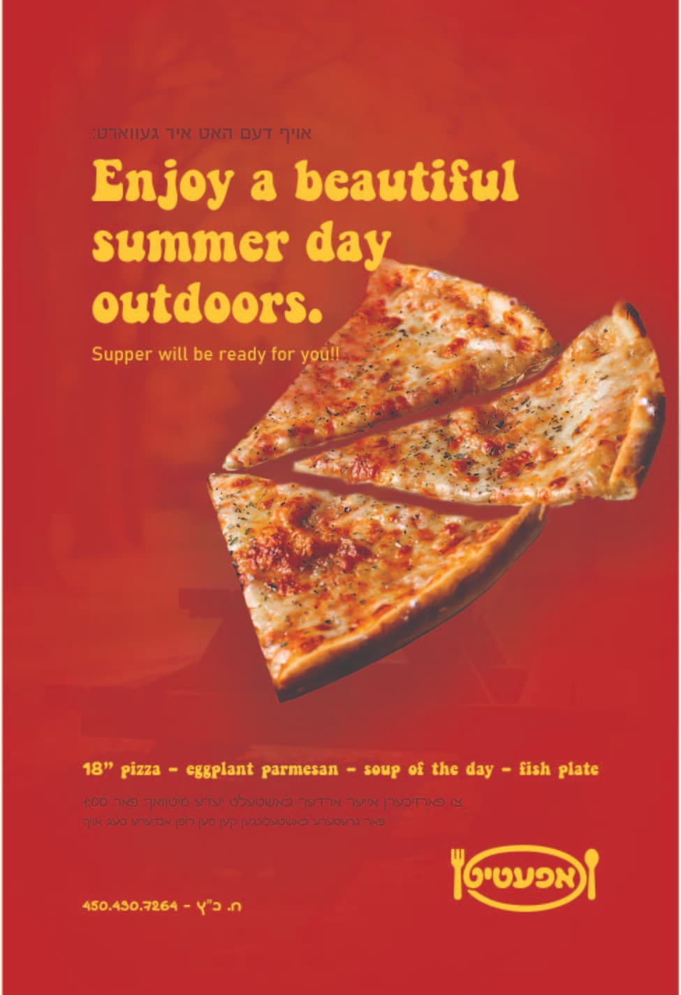
red is the color for fast food… so leave the red, maybe a diff bg
but this add is really nice!
Also, yellow sometimes prints completely off…
Wondering if you can invert the red and yellow… Make the background red and the logo yellow… I’m not sure how it would look but just a thought.
I’d switch the headline font to something more rounded to match the font you used in the logo… And tighten the leading there.
Can you bring the pizza more inwards? Now it’s leading me off the page. Or maybe turn it?
The sideways text just seems to be plunked, I’d try to figure out a better layout for it.
As @Leah1 said, i would also straighten the .
Also i wouldn’t put the vertical text like that…
the logo tilting the same way as the pizza looks off.
Also the pizza is turned off the paper, we want it drawing the eye into the paper
Like it!
I’d probably make the title bigger for more impact, as well as change the font to something more unique, maybe something similar to the logo font style, or just not a very typical font like this one.
Also, all the text at the bottom looks quite similar, I’d make some info bold/highlighted/underlined/diff colour, to add some interest.
The logo is great!
Would love to see final.
Not done yet… Still working on the logo ![]()
![]()
Hi everyone,
Do you have any comments, critiques, or suggestions about this ad?
Does the pizza’s position make sense? Does it make sense over the outdoor background? Any input is appreciated. Thank you!
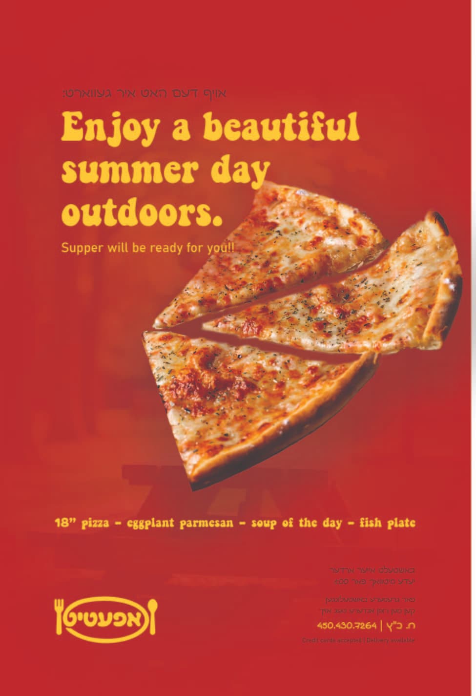
Looks nice; the dark writing is very hard to read. Maybe change to white?