Hi,
Any critique please?
need help with the center text
thanks
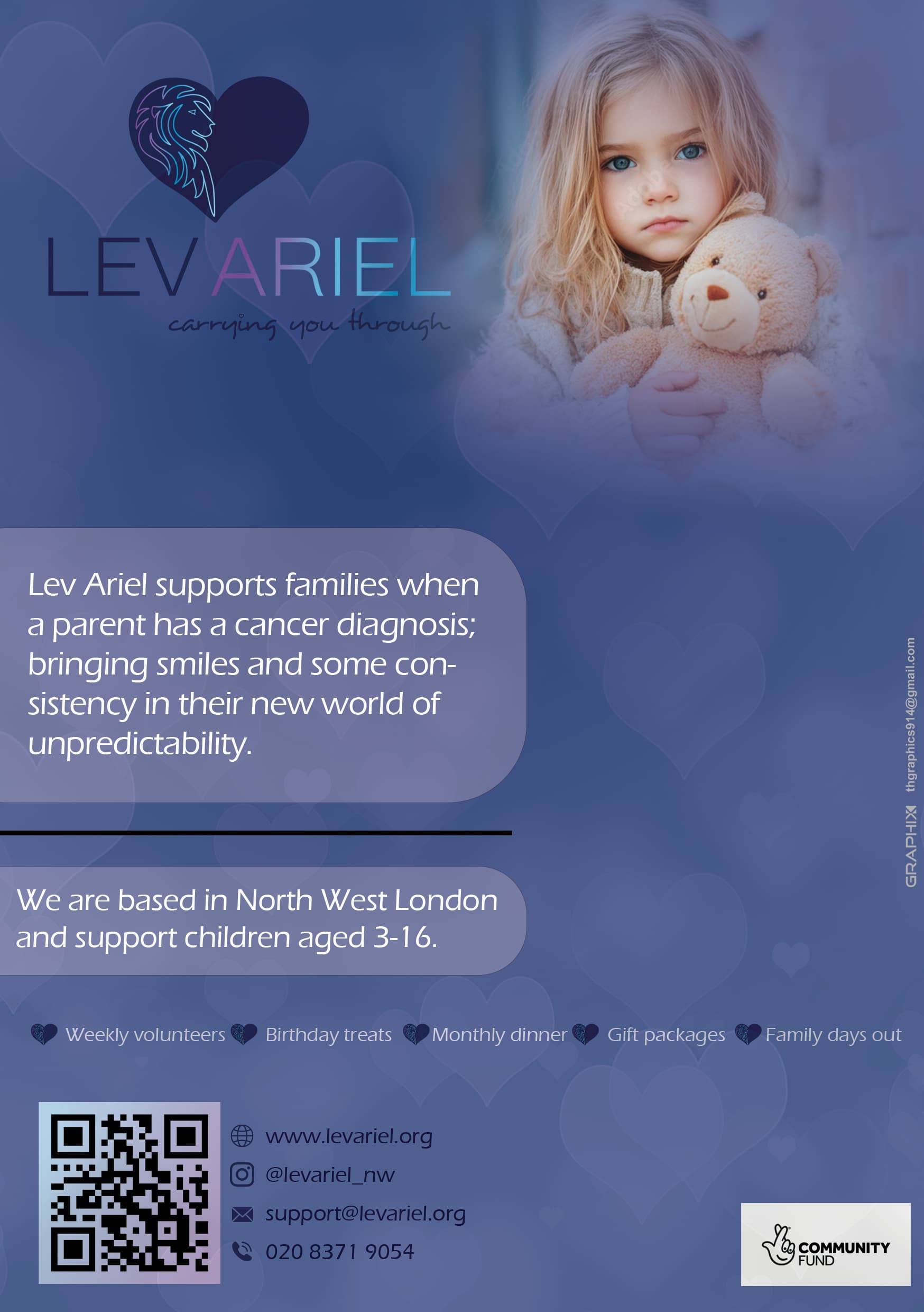
Such a soft vibe ![]()
I’d say to take out the black line. No need for it.
Give the ad a much bigger margin- it will give it more white space and look that much better.
Take out the hyphens.
Make the logo, the text, the bottom text and the qr all left aligned.
You may have to but the bottom text into two lines.
Love the look and agree with all comments above.
you could also put a drop more space between the square and icons.
All the hearts should be the same distance to the wording as each other (The heart near monthly dinner is closer to the words than the others). I think the hearts can be made smaller.
Thanks so much
and what do you think about the centre text?
how can i change it?
Nice! I think the contact info needs more contrast against the background, it’s quite unclear now.
Sorry, the problem was the way I was viewing it. Looking at it again it is clear enough ![]()
What are you looking to change in the centre text?
i dont think its placed well…
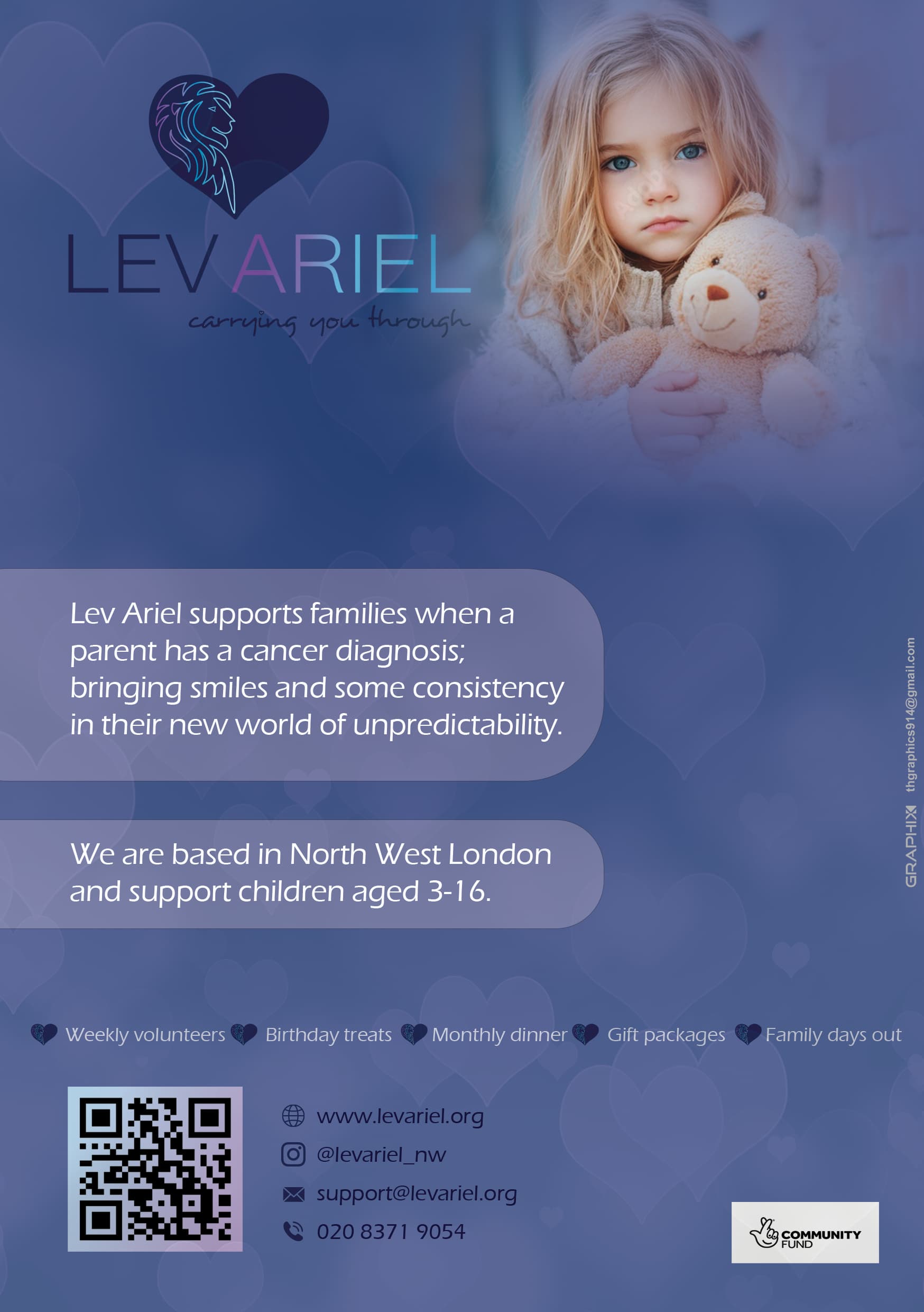
I feel like the text is squashed into the box and pushed to the side. Open it, give it space, make more prominent looking. There is enough room on the page.
I would work on the layout so that you have a clearer hierarchy.
Center the photo at the top, have a nice margin around it. Remove the text from the boxes and center them underneath the child. I would change all the font to something clearer, like Poppins. Do regular weight for the first sentence and bold for the second. Stack the info that is between the hearts, 3 on first line, 2 on second, now they are too close to the edge. Put the Lev Ariel logo much smaller on left at bottom of the advert. information can be spread out over 2 lines, web and insta on top and phone and email underneath. I would remove icons because they’re competing with hearts on top. QR code half the size and community fund logo you should download from here the black one: Download our logo to tell people about your National Lottery funding | The National Lottery Community Fund
Love the vibe!
i would make the picture almost the full page, logo on top middle in smaller and the info on the bottom under the picture in the two squares.
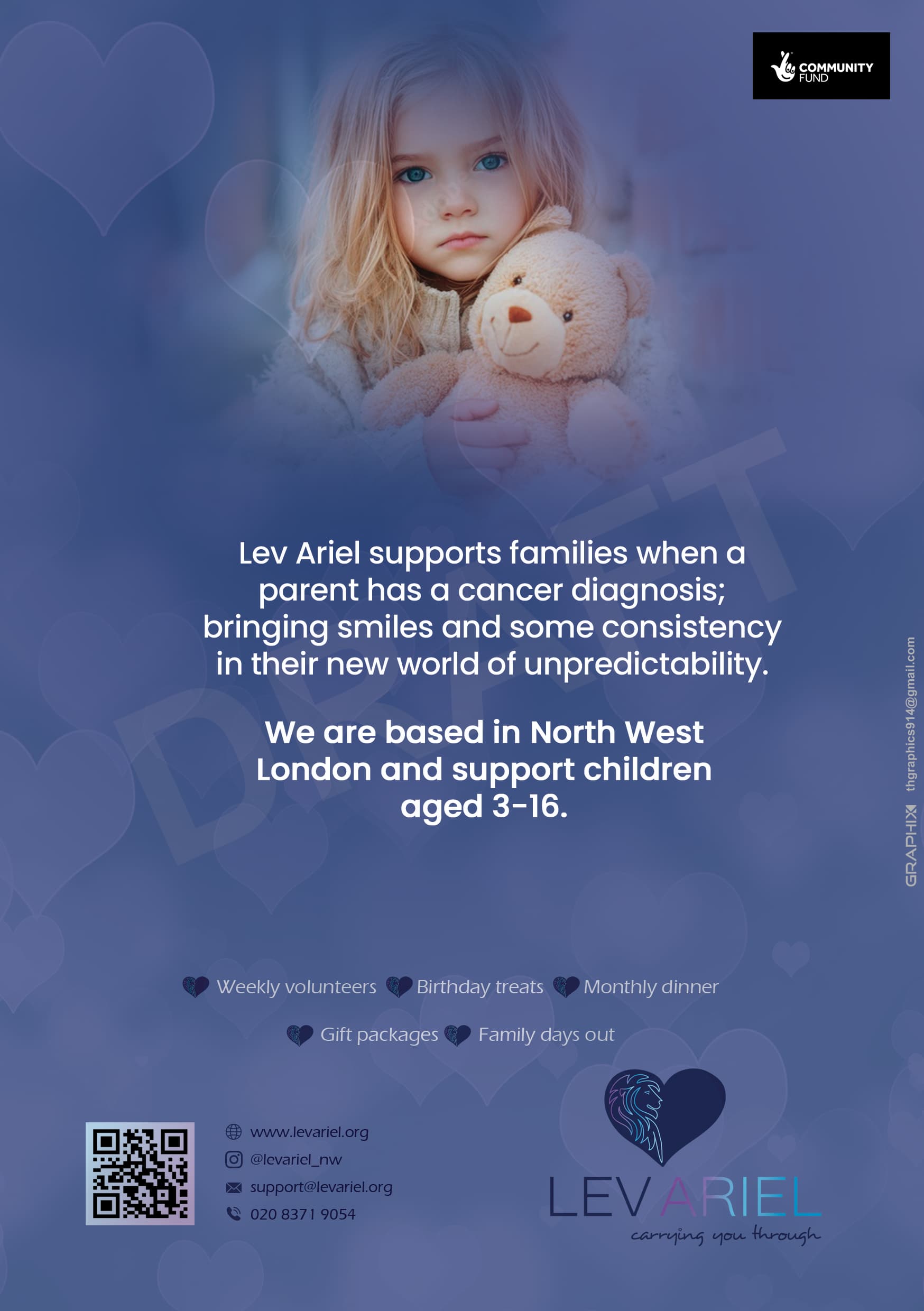
Much better! bring up the text "weekly volunteers…etc. a little
I would switch the logo with the barcode and info - I feel like it just makes more sense that way because we read left to right… (and switch the black logo on top to the left side too)
The middle text looks a little plopped onto the page - make it a drop smaller, maybe justified…
your email is too close to the edge of the page…
Agree with @Breindy-S’s comments. Would also change all the other fonts to Poppins. I feel like this advert could do with a title and then the paragraphs of text a little smaller underneath it. Make the contact information white, it’s hard to read. The community fund logo should be at the bottom of the ad. Ideally if you can get it isolated off the black background, it’ll look a lot better.