Which background should I use? Any other advice? TIA
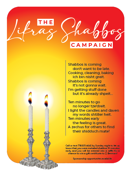
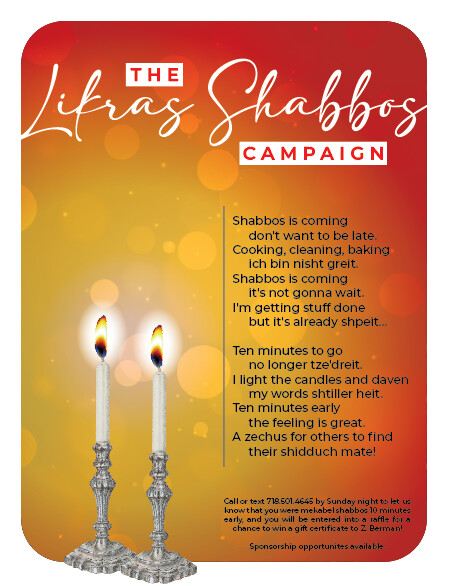
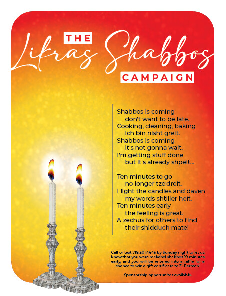
I like the 3rd one best. Are you able to see what it would look like with all the shabbos is coming… text left aligned?
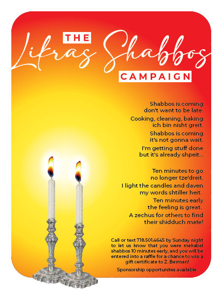

I personally would do more muted softer colors like mauve and grey
This looks right aligned I would align it on the other side.
They wanted it to be a bright and fun ad, that’s why I did these colors. Also how would you do the glowing effect that I did with mauve and gray?
lol you’re right  I tried it fully left aligned without the indents but it ended up looking like body text and not like a poem