1 Like
Cute!
o’s at the nd seem far apart- maybe add something to them? Check that the color prints correctly
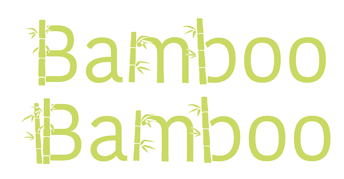
I don’t even know if the leaves are necessary! The sticks itself say a lot…
and might be too detailed when in small.
Maybe make the gaps between the bamboo bigger so the logo is scalable.
so cute!
Agree. Or maybe leave some but take off most of them.
It’s really cute BTW!
thank you !!what would be good by the oos?
make them a little closer and maybe turn them each at a tilt?

