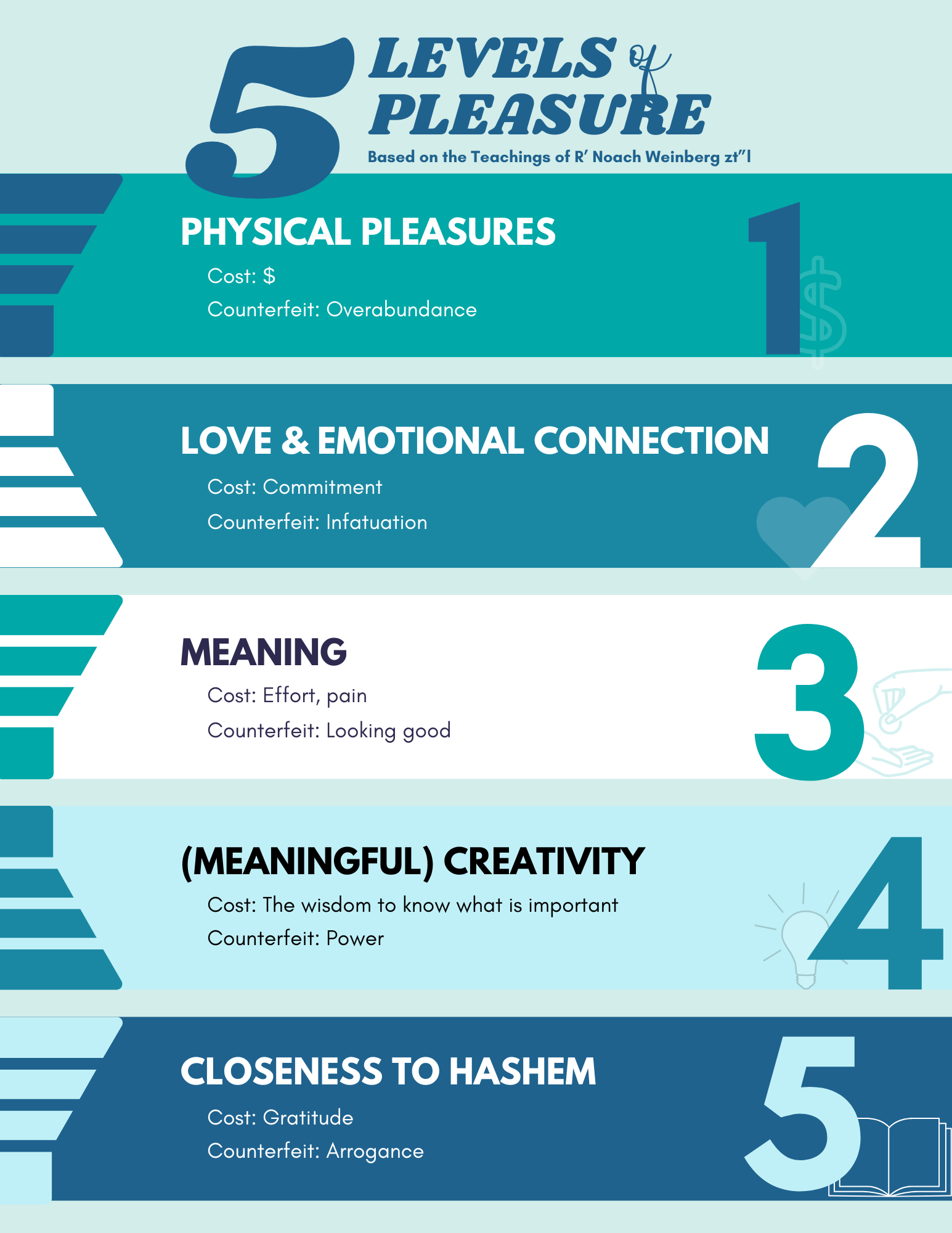
Hi, which version is better, with the graphic icons or without? Is the title too close to the 1st level of pleasure? Any critique is welcome. Thanks!
Really nice!
I like the icons
for the lightbulb can you remove the white fill?
and the title is a drop close. If possible I would try moving it further
i like the icons too!
love the flyer!
I would the designs coming in from the left (on each bar) to make sure they are exactly aligned with the bar…
I like without the icons
I actually think you should move the numbers to the left side because we read from left to right and dont have the 5 so big in the title (also match the 5 to the 5 from the numbers or write out five in the level pleasure font…
Also its making it very busy to have the bars and I think its enough that you already have the different colored bars and numbers…
maybe if you take off the bars - you can have the icons there…
hope I’m being clear…
Very nice! I love the concept!
I think I like it with the icons, but I would match their sytles. The heart is filled in, but the others are outlines. I would pick one style and do that for all of them
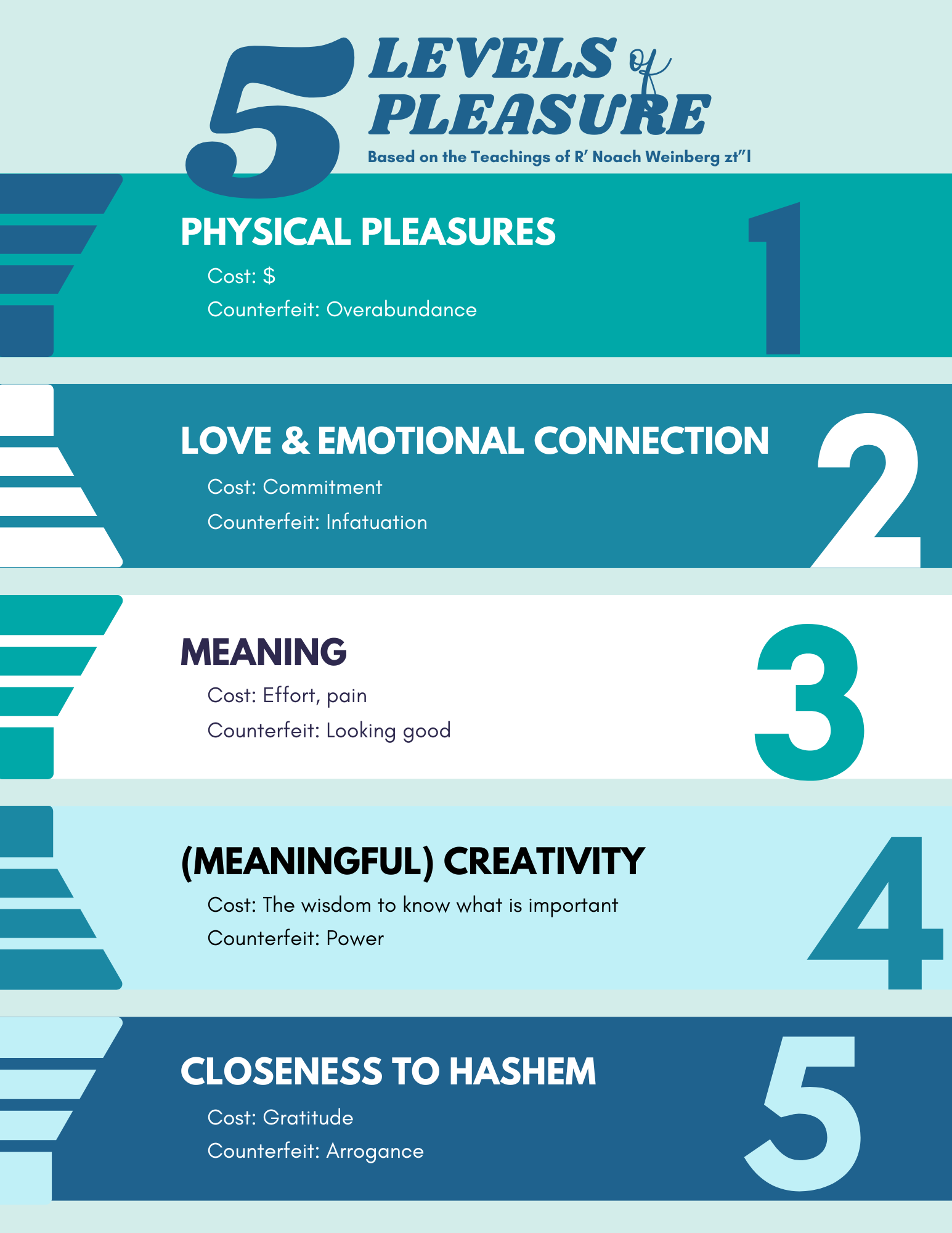
Thanks for all the feedback! Attached are versions without the bars and with the #s on the left. Which do you like best?


I like the numbers on the right
I like the numbers on the left but I dont like how the numbers compete with the 5 from 5 levels of pleasure - I would write out the word five and put all that text on one line and then the “based on the teaching…etc.” under that…