
Hi I’m making a quarter page ad for clothing store, can anyone help me place the lines “private…” and “we carry…”?
Also I would appreciate any advice on the ad overall
thanks everyone!
1 Like
Hi looks nice! I love the color:)
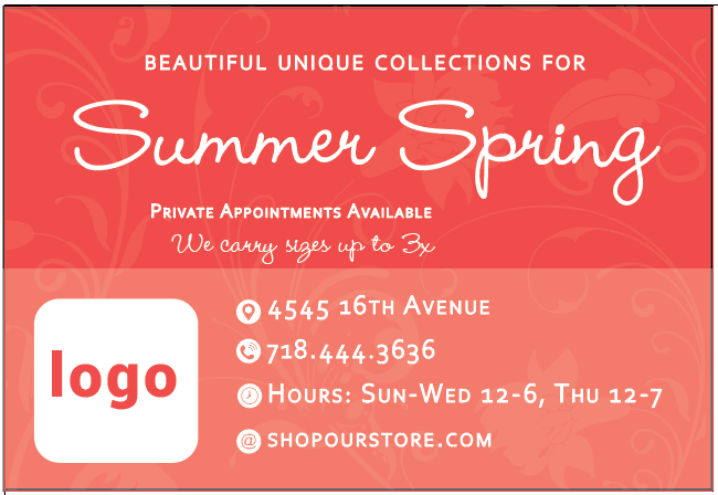
If you can combine phone phone number and address on the same line that might free up some space for you. Another idea would be to turn it into a sticker/stamp/badge idea with a dainty icon in the middle, and write “private appointments avaiable” on the circle around it.
I dont know what 1/4 page size in the publication looks like so could be you have more space then it looks. On my screen and from how you laid it out, i assume its a business card size. But if its larger you can easily scale down text and youll have lots of empty space to work around with.
-side point, i think the “16” is subscripted along with the TH. Select the 16 and then turn the setting off in your character panel.
Much hatzlacha! Your doing great!
Summer Spring seems like one work vs two seasons. Would it be possible to place in an and or separate them so they stay seasons?
I like the idea of “private…” surrounding the logo.
I feel there are too many font treatments. Maybe “we carry…” is in a smaller font size but still in the same font style as summer/spring. Seems so but I feel it makes it too busy. To make the font stand out, maybe italicize it or bold it, but stay in the same font style as the rest of the ad. We typically aim to make each font relate to the other fonts. If summer spring somehow relates to we carry size 3x, then keep it that way. But I feel in this example, grouping is important.
Otherwise, nice seeing your work!
Nice. Can you align everything within the margins? The logo should align with Summer. I would try to add a contrast color. The private appt line and we carry… should be aligned center to the top summer spring and beautiful unique, meaning the whole top should be centered.
Is private appt the same font as beautiful unique?
thanks @malkysalzer,
yea its the size of a business card
its the logo that I should put on the sticker?
and do I put the phone icon in the middle of the line if I combine it with the address?
thanks for realizing the subscript!
I just did any font because I wanted to put all the info on it before I post it so you get to see what needs to on it… just typed it up you should see the words, thanks for the advice @ShoshanaElisheva
1 Like
@malkysalzer would you mind showing me a sketch of the sticker with words around it, I’m trying it out here and its not really looking good… tnx!
My pleasure. Hope it was a help.