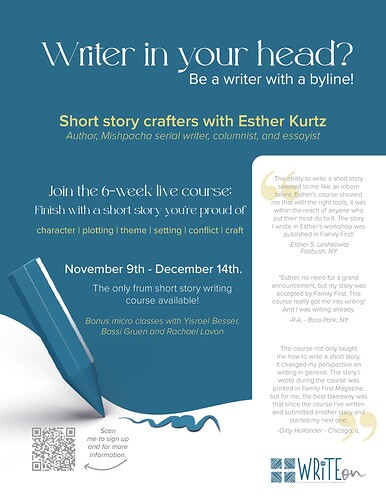
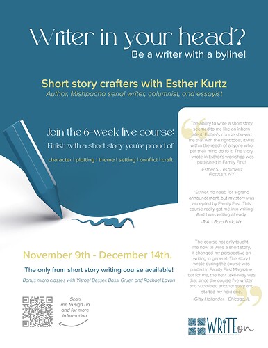
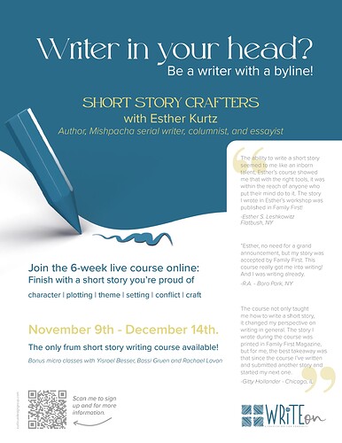
Hi I am in the middle of creating this ad and i know its quite busy with all the text… Any ideas on how to improve it? I need to send to the client pretty soon
thanks in advance for your help!
really nice! can you break the blue part? white background on top or middle somewhere. maybe with that nice curve? the font also looks very thin. will one be able to read it well?
Really nice ad! You did a great job with all the text! Maybe if you split up the text in the middle somehow. Now when I look at it I don’t know what to read first. It could be if you made the date and join the 6 week course stronger/ bigger it would help. Or you can try to move up the white curve on the bottom with the pencil to go before the date.
Really nice job! I think it looks great!
Really nice ad! Maybe try left aligning the text instead of centered. And maybe leave a bit more space between the text and testimonials.
OK thank you everyone!!
Looks good! You can offer both and see which the client prefers. Can you add a small shadow or thin border around the reviews on the right to separate the 2 whites. Also I would lower the pencil so the Join the 6 week course has more room.
I agree with Rivka to separate the 2 whites- I personally like the first one better- and think text could be separated by enlarging dates or something…


