Hi,
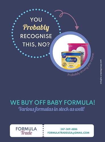
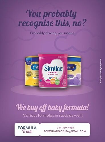
created 2 versions of the same ad.
Which do you think I hsould go with? and any ideas how to make it better?
I like the second one way better. It looks really good. One thing that’s bothering me is that the photos of the formula don’t really match the style of the ad. I wonder if you can image trace them in illustrator to make them look more cartoon-ish?
both designs are good! just v. hard to comment on which design is more effective coz i’m confused by the text! it’s written in a v. ‘yeshivish’ way… what is the thing driving you insane? a mixture of brands of formula?? i think it’d be better to be clear about the problem and why the solution is a solution. when i see the second one, i just see a range of nice shiny formula tins, what’s so insane-driving about that? and in the first one, it’s two tins so even less clear. i dont think this is a deign issue but a copy issue. esp. if his is a new concept, it should be spelled out clearly e.g. Do you keep trying new brands of formula only for it to not work with your baby? And then you can show the tins sitting in your house… and point out the issue. and what the solution is.
Instead of ‘we buy off’, maybe it should be ‘sell your formula to us!’ or at least ‘we buy your formula’. and i think it should say some criteria like only unopened or mostly full packs or something to make people not be worried about health and safety. unless this is meant to be a heimesh thing then i guess just ignore me and bear in mind i’m not even a copy writer :>
hatzlacha!!
I also think the second one looks better. and i agree with what rivkah said. I didnt chap what the advert was all about
Yea the second one looks really good! And also don’t rly like the copy….
The second one is great!
Just another idea for the copy… i would write something like “too much formula sitting around your house?” and then on bottom, “we’ll buy it off you”
It’s not such an original statement, but it will definitely give a clearer picture of what this is all about.
Thanks everyone for your comments! I’m also not afan of the copy and it was actually written by a yeshivish person @rivkah 
 but he really likes it so not sure if I should say anything…
Any feed back on the actual ad?
You could tell him that you got feedback from a bunch of people and they all didnt understand the copy
i actually used this formula trade a few times, so when i saw his ad in this weeks circular (although it was a unprofessional version) it caught my eye, and i was thinking that the wording is off… 
agree with everyone about wording… I really think copy needs to be redone.
Love the second one however i would change the coloring. A lighter purple might be better
I like the second one better but the first one has a more clear visual path.
Also I had no idea what the ad was for till I read everyone’s comments…
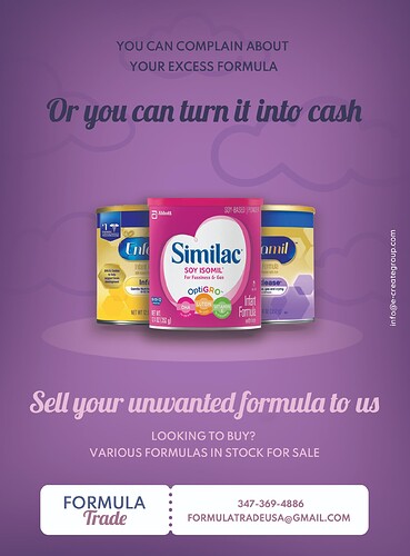
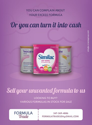
Wow much better! I would just make the title more contrasting somehow as the words and background are both pretty dark…
Yes! The copy is much better now! Someone mentioned maybe making the purple background a little lighter. Perhaps that would make the small text stick out a little more.
great to see the updated text! much clearer now. and now the formula tins fit nicely and it all makes sense lol  then i like your call to actions at the bottom.
agree with the 2 comments above
Yes looks awesome! really nice job!
looking good 


