Hi,
I would appreciate any feedback or suggestions for this tri fold brochure.
TIA!
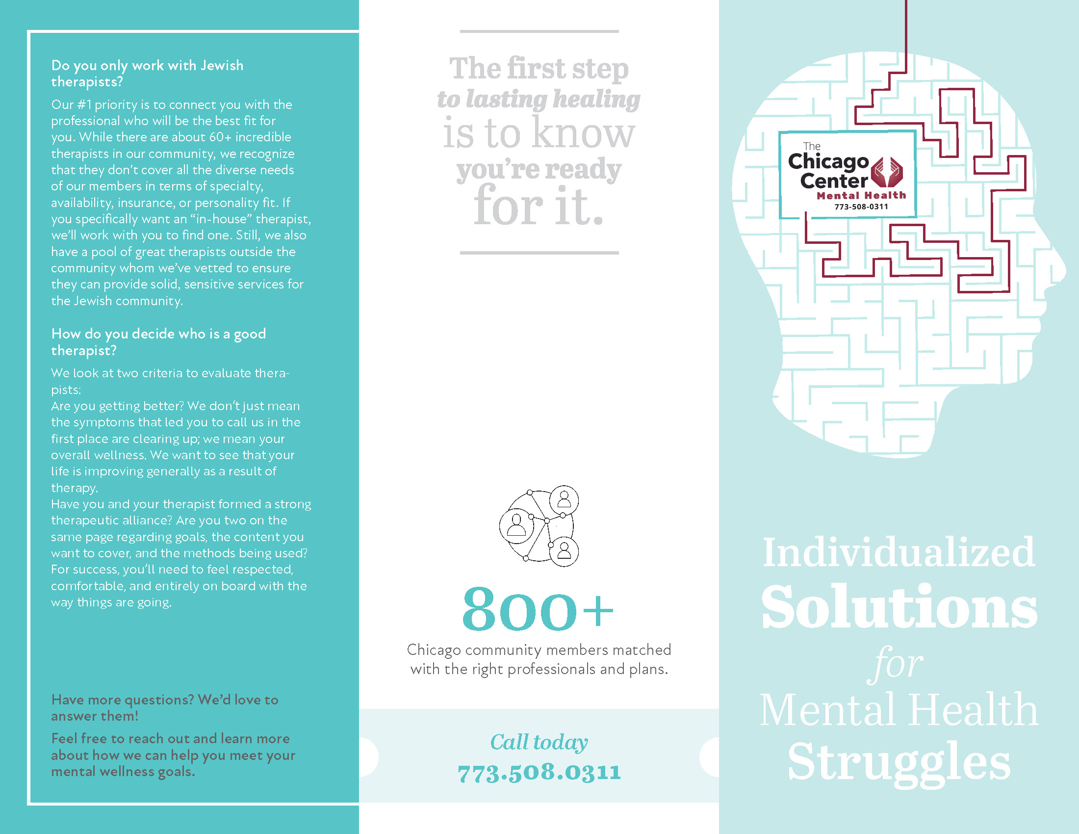
Inside:
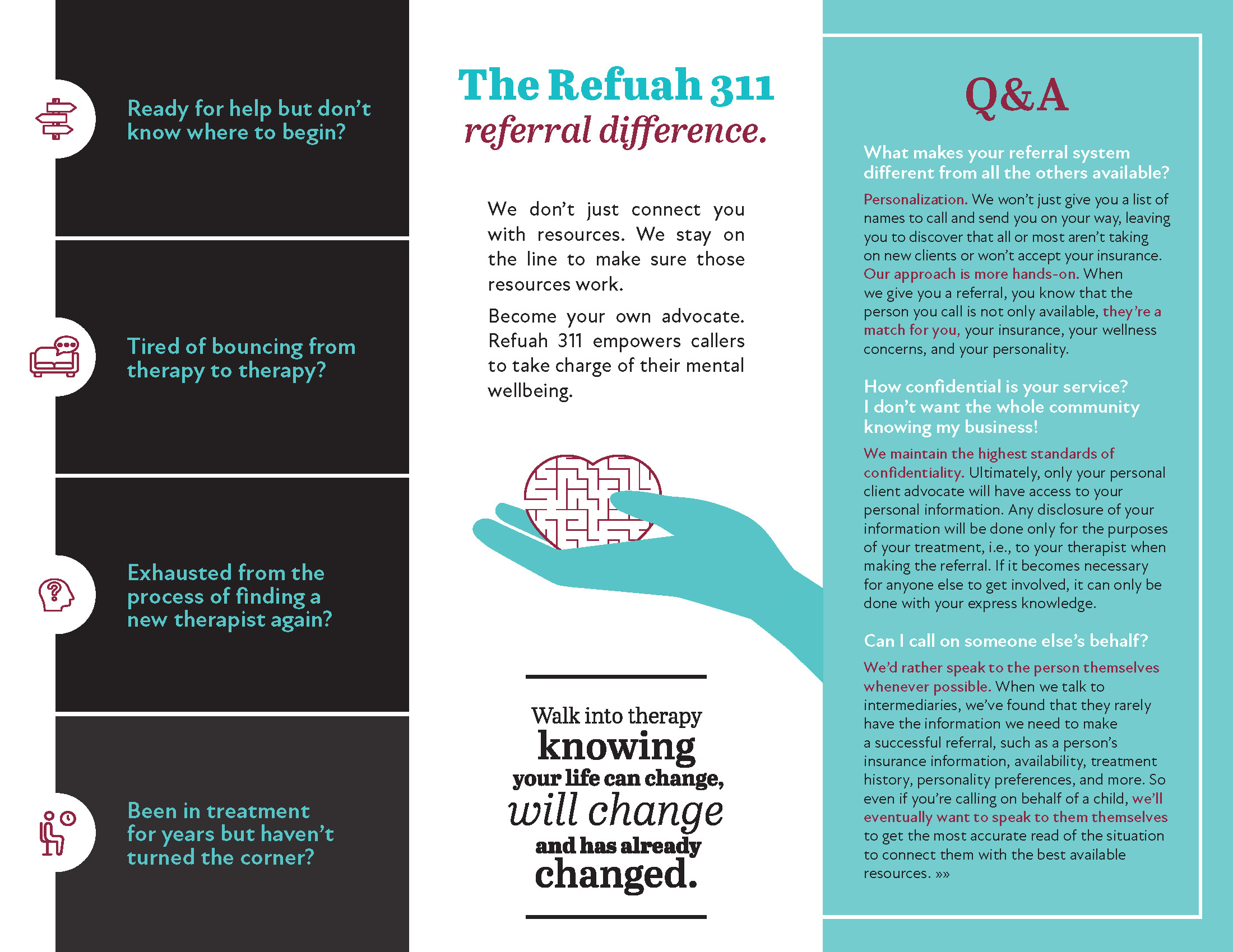
Outside:

Hi,
I would appreciate any feedback or suggestions for this tri fold brochure.
TIA!
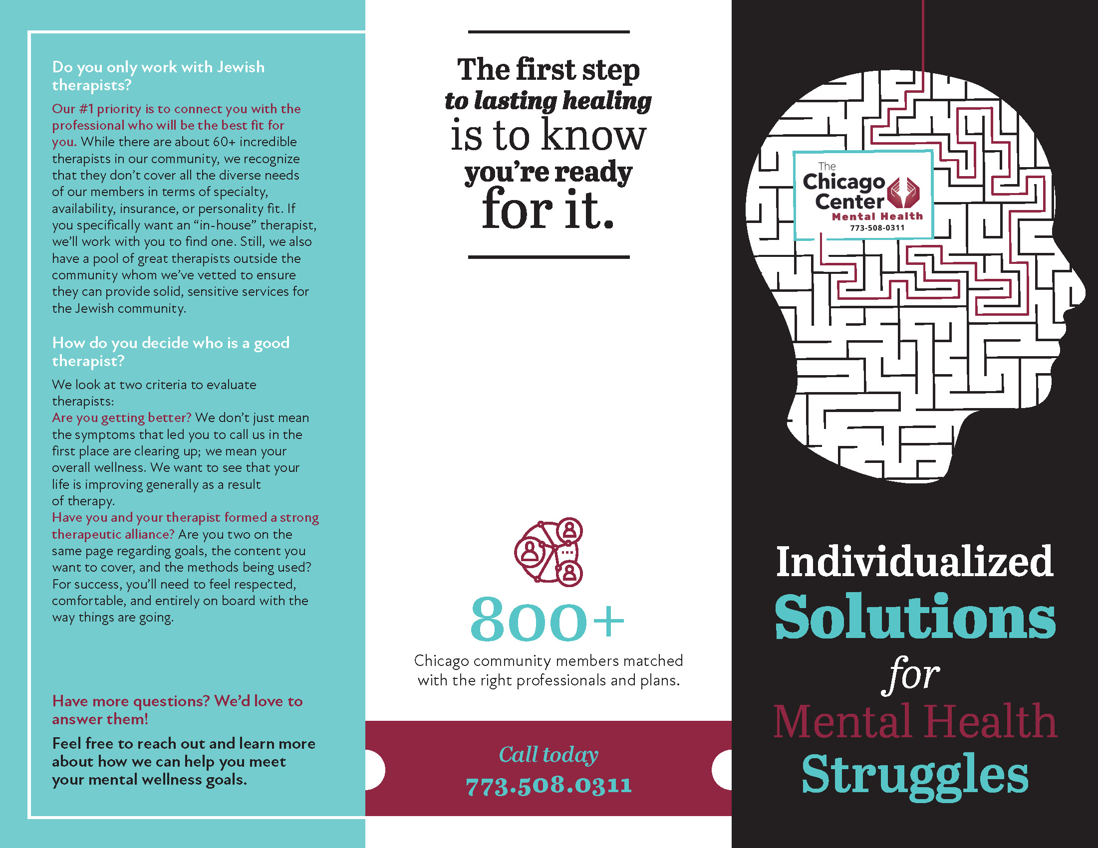
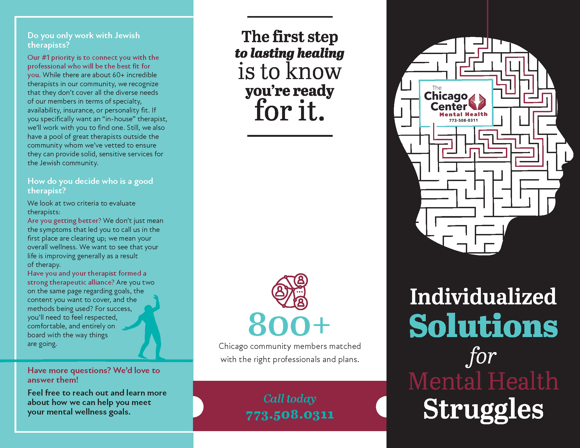
Inside:
The light blue doesn’t have enough contrast on both sides. The cover is a drop boring. Maybe highlight “solutions” with a color from your color scheme (torquise, red?, grey)
Inside:
Make the torquise text (in the light blue boxes) a drop bigger or bring the icons into the box - it feels too empty. You can still keep the circle shape on the left side even if you move the icons inside the box…
The answers to the Q & A are too long. Take out some text and bring each answer up closer to the question. Make the grey by both pull quotes stand out a little more by darkening it up…
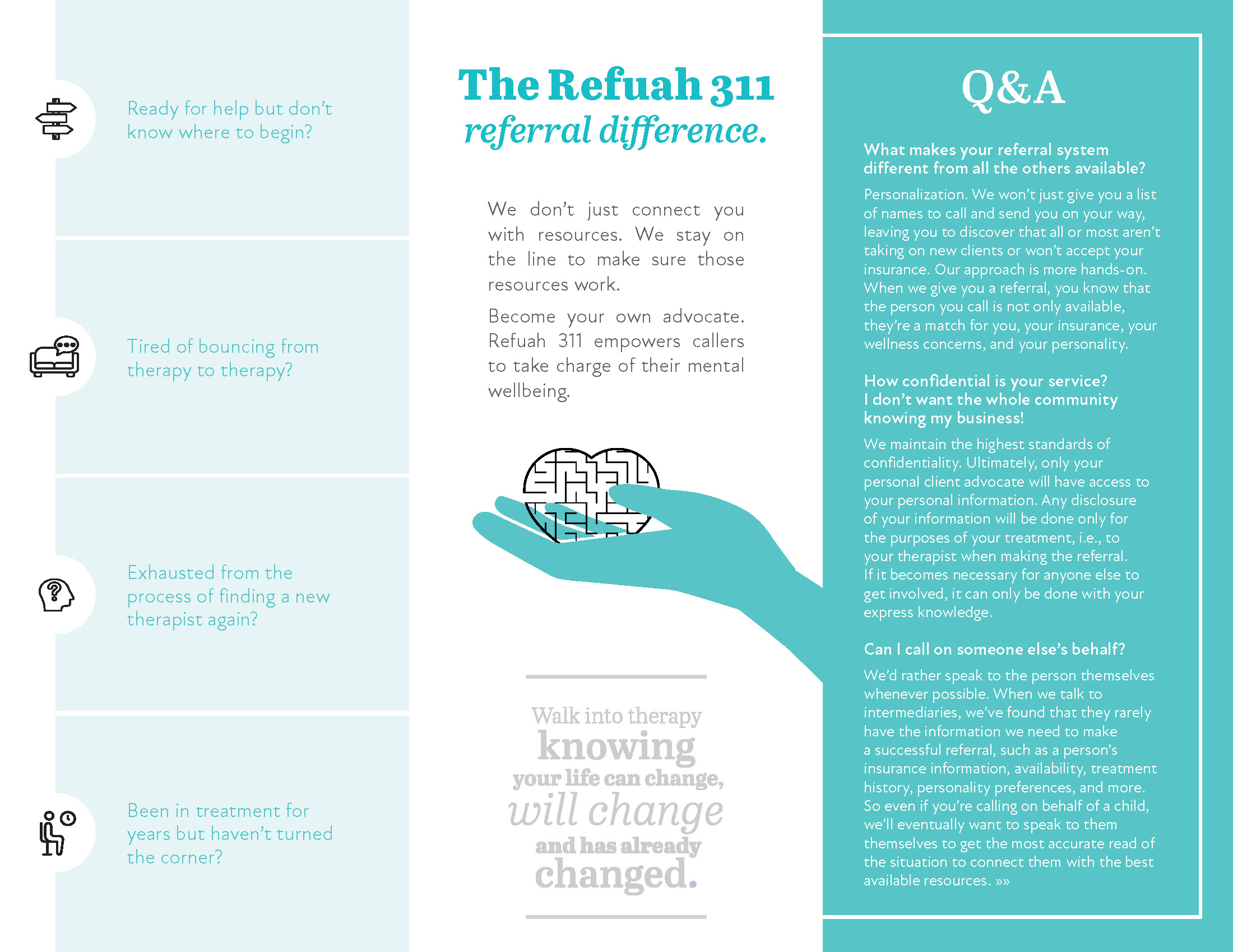
Connect the two fingers onto the hand or put white behind the heart maze…
Outside:
You have a widow by the answer of the last question…
Maybe add an email or website by “Have more questions?”
Good Luck!
Looking nice! I like the pull quotes! I agree that adding contrast would help a lot!..
Maybe make the questions in a darker turquoise color to separate the questions one from another. And the text near the icons can be bolder
Overall needs more contrast, and too much of the same colors. Would introduce another color or accents (think about the 60-30-10 ratio for colors)-you could use the red or perhaps an orange etc. Would also use a darker neutral color and more of it for the body text. The white and turquoise text is more highlighted or emphasized text, but when you have too much it has nothingo stand out against. Also more visual variation within the text-stronger subheads, highlighted pieces of info, pull quotes, etc.
Generally people respond better to actual photos rather than charts or clip-art style illustrations. Are you able to add some photos, something more personal to the cover and throughout? If not, would at least consider adding more meaningful artwork throughout to break up the text, even if they are small graphics. If you change your neutral color to black you could get some areas of strong contrast with black backgrounds.
Thanks so much everyone for your helpful feedback!
Which area do you suggest I give a black background to? You don’t think it’ll look too strong/ severe?
What do you mean by meaningful artwork? What type of graphics would I be able to add throughout the text?
Thanks so much!
Here I tried to add more contrast and use the
What does everyone say?
I really appreciate all of the help!
Thanks so much!
Inside:
Outside:
like it a lot better. i would make the head a bit smaller on cover. give more margin
Wow! It really is very nice now! I really like the little graphics and pull quotes!
I think the last box (inside) is less sharp than the other black boxes.
Thanks so much for your feedback!
Do you think I need to make another design option for the client, or this 1 is enough?
Can’t think of a different way of doing this 
Do you mean the Q&A panel?
Any suggestions?
Thanks!
I really like the 3rd colour you introduced 
I find the black turquoise boxes with the icon next to it a little hard on the eye to read but that could be just me
Big improvement from the 1st and thanks for sharing!
I think this one option is enough…
I meant the inside panel - left side, where it says “Been in treatment for years…” That box looks less sharp than the other black boxes…
Thanks!
Yes, I sent just 1 option, and they liked it, so… B"H!
Looks much better. Would make the turquoise text in the black boxes somewhat bigger and split onto a couple more lines.
One option is enough for a brochure.