
Can i get anyone’s feedback? Last minute card to send out to clients. Very different style than other years, i have to see if he likes it.
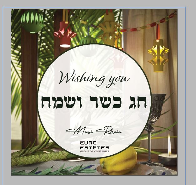
I like the first one
looks really nice!
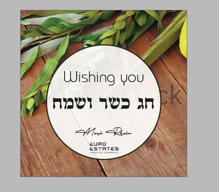
Second picture is much neater. Would bring “wishing you” a little closer to the text underneath.
Maybe the logo should go to the corner of the card and leave just the signature at the bottom of the circle?
I agree about the logo out of the circle since it’s left aligned I think it’ll look better on one of the bottom corners. I like the 2nd picture better
Nice card!
I think the second picture is very typical and looks almost templat-y, while the first picture adds a warm and personal feeling, which sounds like it is appropriate for this particular company, although I dont know much about the company.
I like the ‘wishing you’ font from the first one better.
I also like the first one better. It looks a drop pixelated but may just be my moniter or because it’s a screenshot…
Prefer the first picture, feels much more personal and welcoming. Would work on proximity a bit within the circle, too many visual groups in such a small space. First two lines should be a clearer group, and bottom area a second group, though there could be subgroups within the bottom group.
Thank you everyone!
Here is the final version. btw - i liked the logo in the corner better, but client wanted it in the circle.

Changes look good, even though they are minor makes a difference!