
Hi,
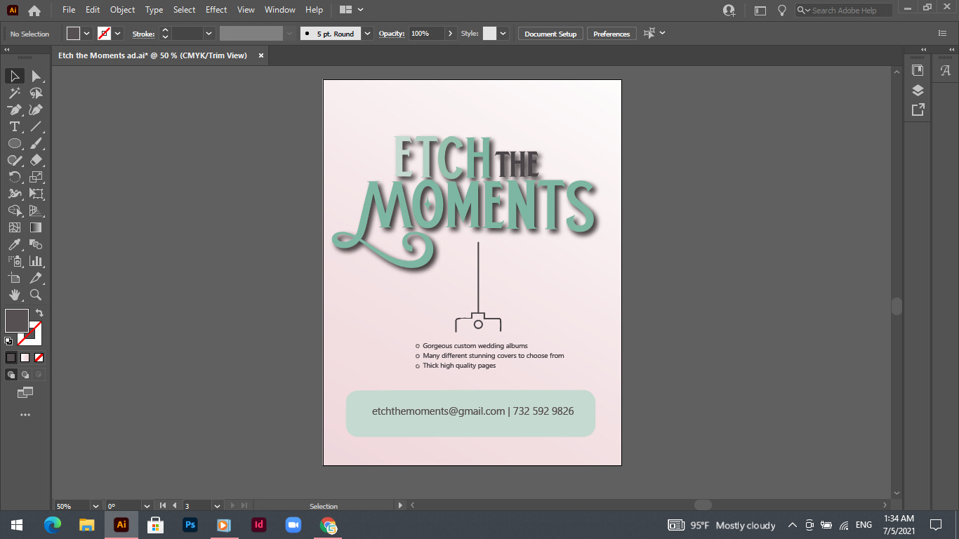
I am designing an ad for someone. The business name is called “Etch the Moments.” It is for a company that designs photo albums for all occasions. The lady wants me to write the company name in big bold cool lettering. If that is the focus of the ad, do I still put the logo on the bottom of the ad?
Probably not necessary unless her logo is something unique that she wants people to identify with for future ads so it can go along side the contact info
I would include it on small on bottom probably
and now here is the design I was working on! There are two different options - very similar but a few minor changes… First, which coloring is better? and any ways or tips to make this look more interesting? The client wants a very clean, modern look but I think this is tooooo boring. Also, any additional critique, I’ll gladly take 
Thanks!
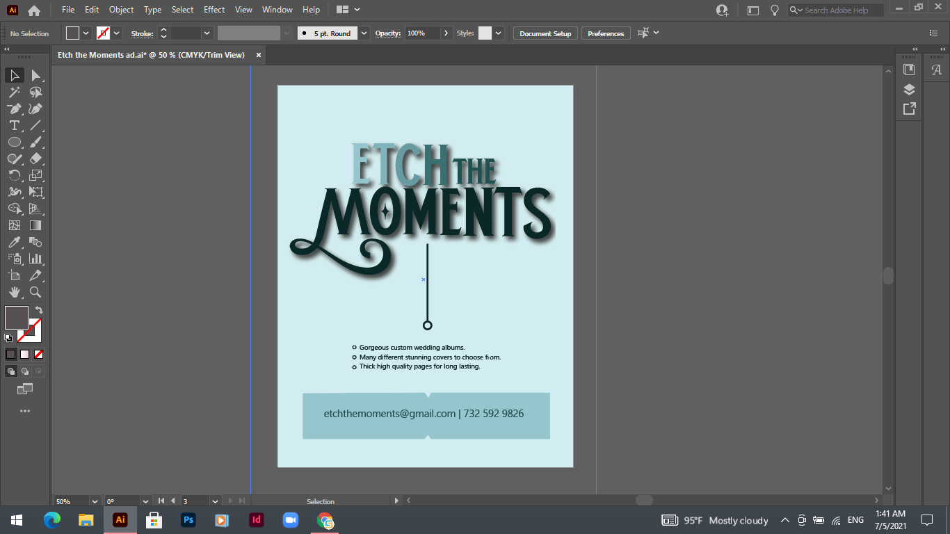
I’m liking the 2nd coloring better. How about lay the 3 pointers out horizontally, not one on top of the other, and add simplistic icons for interest. Also maybe remove the shadow from the words…
I’ll try that and see how it looks.
Thanks!
I like the blue better too
Nice typography! I’m actually not crazy about either of the color schemes…I prefer the blue of the too, but it feels too calm, not eye catching enough. Perhaps it is also because it is almost monochromatic. I would consider adding an accent of another color-maybe a gold, or a cream, something elegant that gives it a “punch”, makes it feel warmer and more enticing, and grabs attention. Maybe you could work in some kind of “glint” by the diamond in the O. You could also consider changing the color scheme based on some of the color palette websites that were in the newsletter, for example. Would keep it simple, 2 or 3 colors, but perhaps you can find something more unique and elegant and eye catching. That would also help with your “boring” issue! I think that adding the simple icons as suggested might be a good idea, or simple, brush-stroke style illustrations, or a single simple, elegant brushed illustration grouped with the main title. Might not be a bad idea to add the logo in the bottom center. May add some color and help generate a brand look, unless the logo is basically just a repeat of the main name in the middle. Looking forward to seeing updates! BTW, you might also enhance the typography in the blue box, something that stylistically matches more the main text.
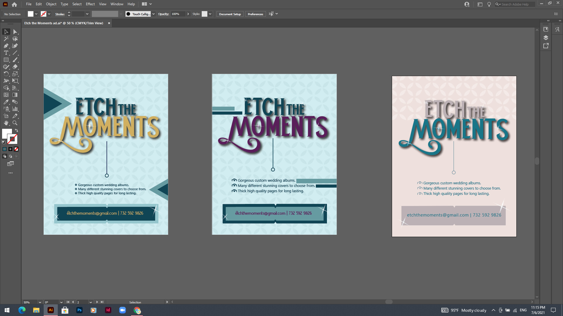
I like the 1st option
Maybe I would make the yellow a bit stronger so you can have a bigger contrast…
I agree, colorwise I like the yellow. Would it look nice if it had more of a gold effect? Maybe even a gold texture or gradient masked in to the text? Just a thought…I like the pattern that I think you added to the back. I personally prefer the stripes on the second one to the triangles on the yellow one, which feel a little out of place to me. I like the glint effect, you could probably do something really dramatic with that if you look for some tutorials on how to create a strong shine or glint… Coming along nicely!
Are these any better? There is a slight different between the two gradients on the first two artboards, the middle one has a “stich” in the word “ETCH”, and the third one I was trying to make it look sharp…What do people think??
Thanks!
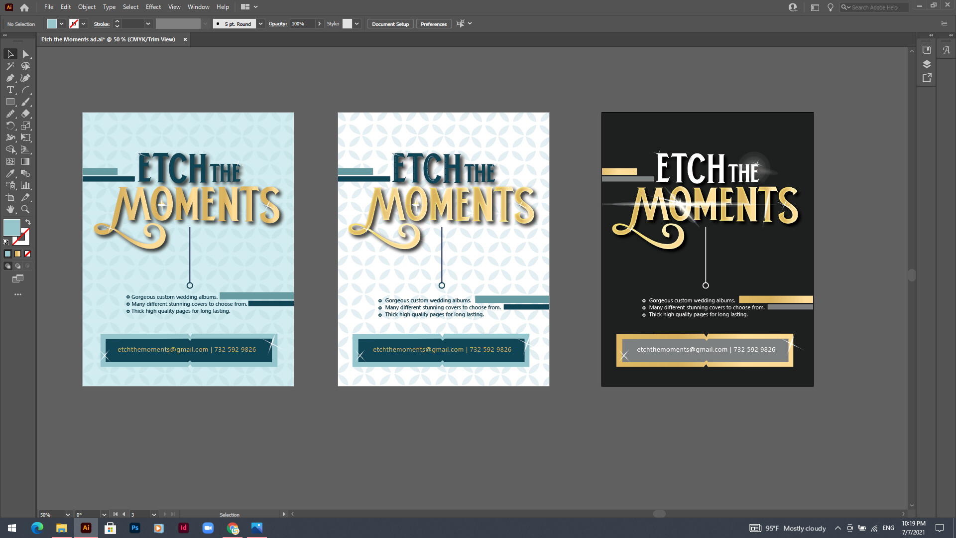
The gold definitely looks alot better-it makes the whole thing pop!
I like the one on the left the best
The black one is a nice sharp option!
These are all very nice, much better! The black one is sharp and the glint looks nice, just a bit typical in coloring. I personally prefer the white middle one, I think it has stronger contrast than the first one and therefore more eye catching, but really think any could work, perhaps send to your client and let her choose?
Thank you everyone for helping me out! I will send it to my client and see what she says…
Can I ask how you did the gradient for the gold? I often use gold, and like this coloring!
I think I just used a gradient from the swatches library… I don’t remember exactly - sorry!
I used once a gold gradient, which came out really nice. I looked it up somewhere online step by step. If you are interested i can give you the color codes.
You can download gradients here Gold Gradient Collection Vectors, Photos and PSD files | Free Download
Thanks everyone!!