Hi all!
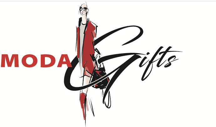
A client wants me to design an ad. But first things first, the magazine they are printing in doesnt allow the logo they have as its a woman. First I fixed it up to look ok. But she said I should just change the logo. Any suggestions on what I should do.
Its a ladies clothing store that also sells lots of Judaica gifts.
Thankx for your help. the logo she has now is attached.
Is she changing the logo to a complete new one or does she just want you to remove the pic of the woman?
She deff wants something instead of the woman. she said if need be i can come up with a new one.
but how would you connect clothing and judaica gifts in a logo??
What do they sell more of? If it’s just a little judaica, then clothing can be the focus and vice versa
Also it doesn’t have to have what she sells in the logo. It can also be a more vague reference, or you can make a logo using the m and g. Just an idea
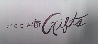
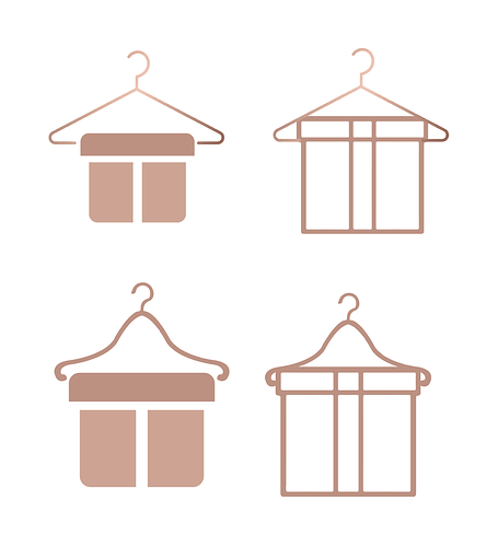
You can make for the “icon” a box (referring to the gifts) and then instead of a bow, do a hanger on top of the box
(I’m thinking of something cute, but not sure if you will chap exactly what I am envisioning…)
She said she wants full name so ppl dont get confused. And she sells more clothing.
oh smart to do an icon type of thing. Im not 100% sure i know what your envisioning, Breindy. But it sounds like something I might want to try. Can you do a quick sketch for me?
Also, there are other ways of drawing a woman without actually drawing a woman. if you know what i mean… like a silhouette for example
something like this…
(Obviously you can move around the icon (or make it bigger…etc.) - I was just trying to fit it in where the woman pic was)
Gotchya ya I think I like icon look. Its modern neat and clean that way.
no, not at all
I like the ones on the left better
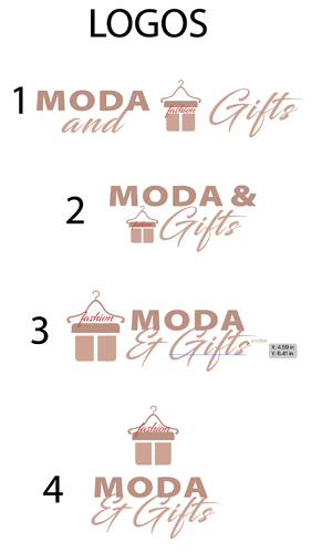
what do you all think of these logos. she wants the “and” in there, and that it should say fashion so ppl realize its not just gifts.
It doesnt make sense to write Moda & Gifts and also the fashion looks strange where it is (cuz its too small)
I think you should write “Moda Fashion” in sans serif and then “& Gifts” in script
Also if you want the logo to be two colors - it shouldn’t be mauve and hot pink - I think mauve and black would look really good and sharp…
and I like the layout of 3 or 4
its a cute idea…but if she rly liked the style of her first logo- maybe do the icon in more of that sketchy style to keep that same look…?
Do you need to add the &?
I also liked the layout of the first logo, and a logo does not necessary have to have an icon.
It is very clear from the name of the store what she sells, and throught typography and layout, the logo can be clear and effective even without a ‘picture’, unless of course it fits in perfectly with the layout and doesnt take away from the effect.
Keep us posted!
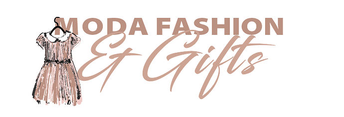
so she likes it, she said maybe she wants a dress on the hanger instead of the present box, and she liked this layout. What do you think of this?
My client likes the second one the best. one thing is that the dress looks very childish and Im having a hard time finding a more lady like dress without a figure. Can anyone help me find a better dress.
thank you

