
Hi. Any comments or feedback?
Thanks in advance.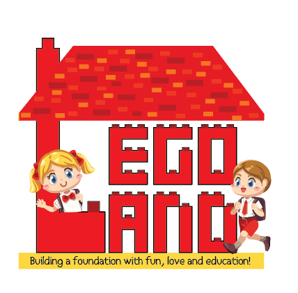
cute!
I would say you should get rid of all the bricks in the roof - when you make this logo smaller - it’ll look like one big mush. just keep it solid red
the kids are cute - the girl looks on top of the L a little - put it behind and how old is this playgroup for? Does the boy need a yarmulka?
Cute! The general rule of logo design is too keep as simple as possible, to limit the colors to defined pantone colors, usually 1-3, sometimes 4, and to pay careful attention to relative proportions. ON this one, since the house and text is so much bigger than the people and small text, when you shrink this to fit on a business card the people and small text will barely be reognizable, so that’s why I refer to relative proportion, not the overall size which can change. That said, the concept is very cute and quite workable, I like the first, stronger font option though the O looks a little too narrow and should be manually widened. Consider ways to simplify the people and enlarge compared to the other elements Simpler, fewer, larger shapes and perhaps three pantones, red, black and yellow which you can then tint down to get lighter versions. You can also use white negative space to add details.
Another overall issue could be that it isn’t so immediately clear from the logo that this is a school, especially since lego land is a famous amusement park and people might associate this logo with that or with a lego store. Can you play up the school theme? Maybe it would be a good idea to try a version where you would remove the people and use silhouettes of school supplies instead…they could be a bit bigger proportionally, done in solid black with white negative space detailing, and perhaps intertwined with the letters. Would also reinforce your three color color scheme. For the small text below, we generally try to avoid slogans as part of a logo since then they will have to stay there always, plus there is the size concern here. If you have to include it here see if possible to get it somewhat bigger or bolder compared to the rest of the logo, and would need somewhat more letter spacing. Then shrink the whole logo small to see if it is still readable.