
Any suggestions/advice for the typography?
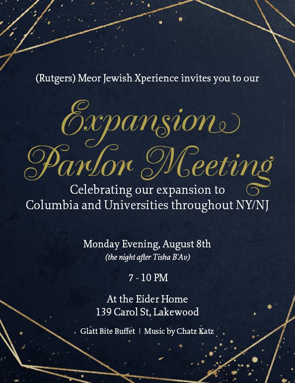
Did you try sans serif for the main text?
something with the spacing of the expansion… is off. theres alot of empty space above and its pretty tight especially by the g’s swirl on bottom
i really like the main body text - v. regal.
i agree with adina maybe centre the word expansion by eye rather than automatic b/c of that swash on the n.
and i agree with schlomith maybe a semibold sans serif, still white but all caps and use a lot of tracking/kerning to space out the letters.
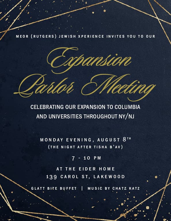
Also maybe find out if the (Rutgers) can be moved after Meor Jewish Xperience instead of before as it looks strange to start with a word in paranthesis
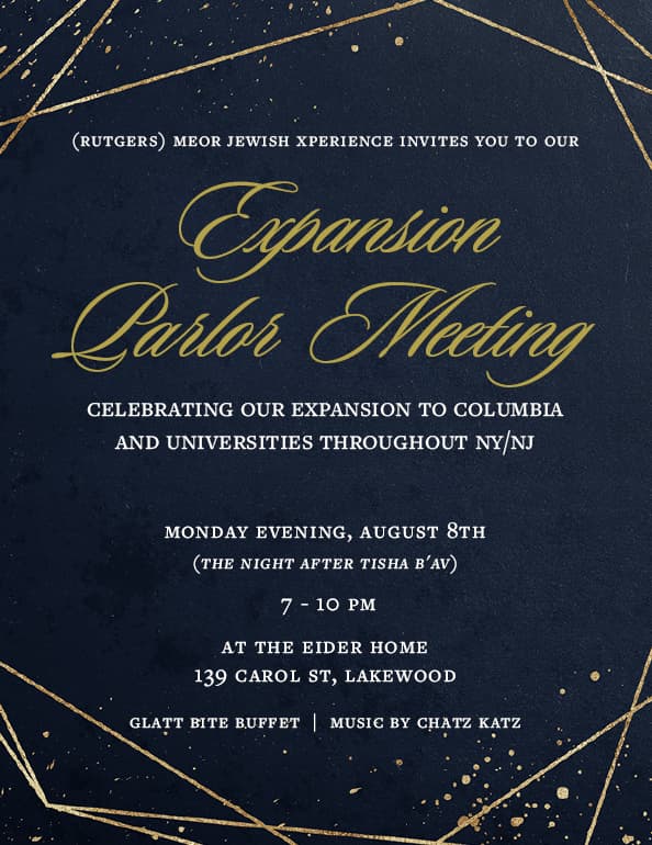
The spacing, and the font for expansive parlour meeting look a lot better!
maybe try a different sans serif font for the body text though - something less narrow
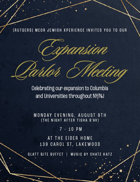
I think it looks better with this sans serif font
I like the all caps versions for the body text. I think the letters are spaced too far apart in the last version though (only in the bottom half of the text).
yeh i like your last version very much