
Hi,
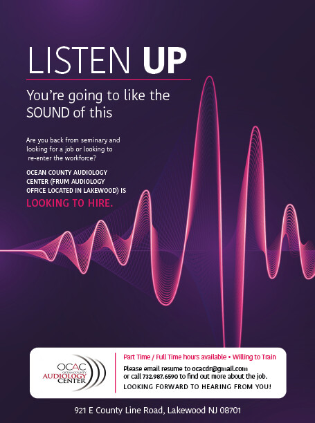
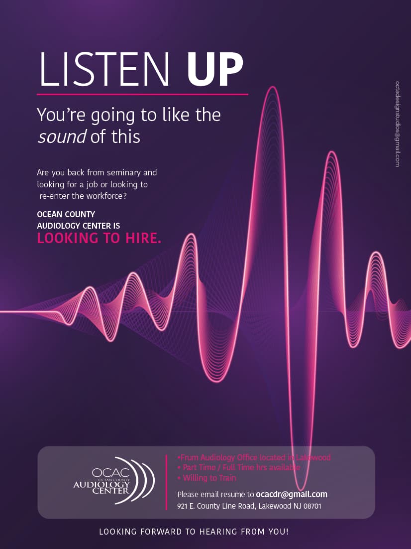
What do people think of this? Does the address look funny on the bottom?
Really nice!
I think the adress is fine where it is.
Would you try to lower the opacity on the white frame a little bit? Cuz I find that the strong contrast makes it a little bottom heavy.
Also, can you try to put the word “sound” in lowercase but in italic? I feel like the allcaps looks a little too forced, but thats just a personal opinion.
I really like this ad! Its so clean and eye-catching.
Wow! Nice job!
Agreed. The address looks fine.
I would add a bit of line spacing in the white section as well as some padding so it doesn’t look squashed.
Beautiful! Really like the style- sharp and pretty.
Agree with comments above. I don’t think the word sound needs any emphasis. You could also extend the bottom box to the same margin as the top text.
Maybe also move the sound wave image a bit down/to the right so the words have more breathing room?
Also maybe try bold regular case instead of all caps for the sentence ending Looking to Hire?
Hatzlacha! Looks amazing already!
Really nice! Looking hire should stick out more as it is the focus of the ad
1 Like
Thanks everyone!
I’m a few days late so maybe it’s irrelevant now but I feel like the company name (with the part that’s in parentheses) looks so wordy. Like it doesn’t belong there. Is it an option to change it?
Looks great! It’s cool seeing places I recognize and then knowing who did the design behind it 