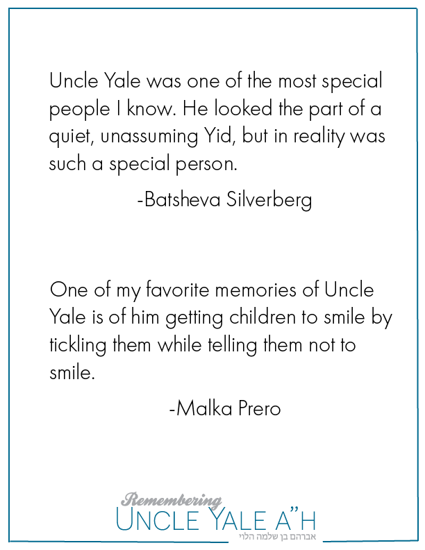
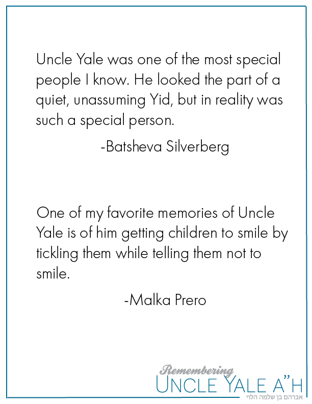
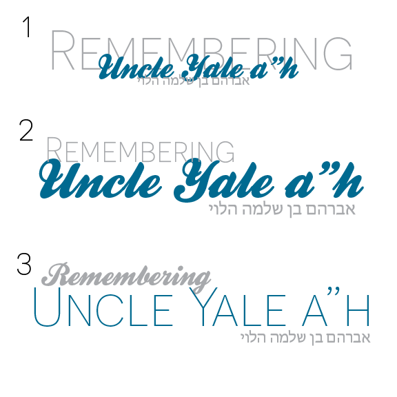
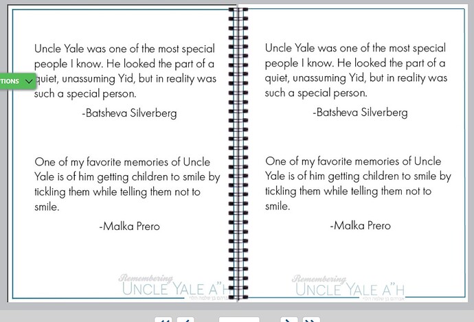
Which one do people like better? Anything I should/can change? (It’s a project I’m working on for myself)…The logo will be used on the corner of every page in a book (upload://xNfRmKgo64B1gm2VN8NolIVvmN7.png)
Which of these layouts do people like better? For the book page…!
I like the first option
From these “logos” I like #3 best, but can you move the whole word (Remembering) to the beginning of the U so that the g is before the Y of Yale?
From the two options in the first post, I like #1
I like the third one best also
thanks everyone! should I fade out the logo on the bottom of each page so it looks more like a water mark or leave it at the full opacity?
I like it at full opacity. It adds a little more color and interest to the page.
also, if its at full opacity the Avraham ben Shlomo Halevi looks part of the border.(or at least in the second picture where the logo is on the right.
I personally liked it better in the corner with the hebrew name being a sort of continuation of the border. I also think that at full opacity and in such a big size it sort of competes with the words on the page, I wonder how it would look at a lower opacity…
It looks good at lower opacity, and the page still has color since you added that blue border.
I’m just wondering - the text looks huge. Are you purposely doing that so you can have more pages in the book? If not, you can probably fit like another one or two paragraphs if you make it smaller (It can be like 12, 13 pt.'s)
Thanks, that’s what I thought too! Yes, I am purposely doing it big so that I have more pages…actually, here is a mockup what the book will look like finished (it’s more of a notebook than a book)…looking at the book this way, I’m actually starting to lean more towards the logo in the center of the page…
what do people think?
You can have the logo on the right side of the page for the right side of the spread and on the left for the page on the left…
would lower case a’'h as it looks like part of his name

