
thank you
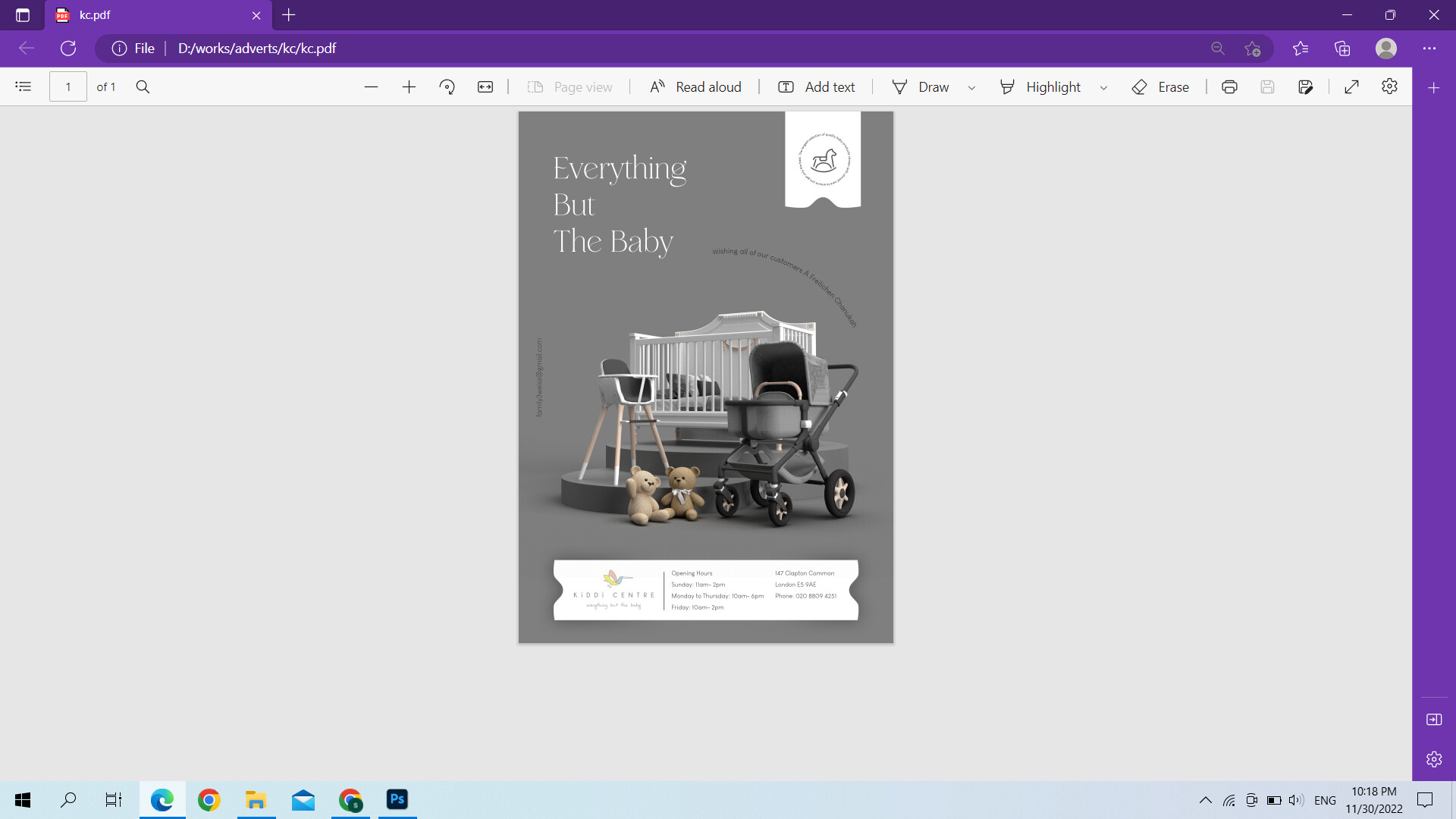
All of the text looks pretty small, especially the circle around the rocking horse. Your email address should be the smallest and all other text should be at least slightly larger
Can you add a bit of colour?
Layout looks amazing!! really nice and clean!
Great look overall!
I don’t love that ‘everything but the baby’ is sentence case. I would switch it to either uppercase or totally lowercase.
The arc with the freilechin chanukah message looks a little out of place on that angle. You can either angle it better to go around the crib and other things, or move it to the bottom maybe.
I agree with Gitty, I think it needs more color.
I agree with all the above comments
regarding color - I think you should take one of the colors from the logo and use as your background. Even though grey is sophisticated, in this case, it is making the ad look drab and its for a children’s store so it should look happy and sophisticated.
or maybe just the text ‘everything but the baby’ in pink?
lovely clean ad… i agree the small text is hard to read but great design!
Tried changing background color but did not like the way it looked. just changed the text. does it look a little better now? is it necessary to enlarge the text around the horse if it is not important text?
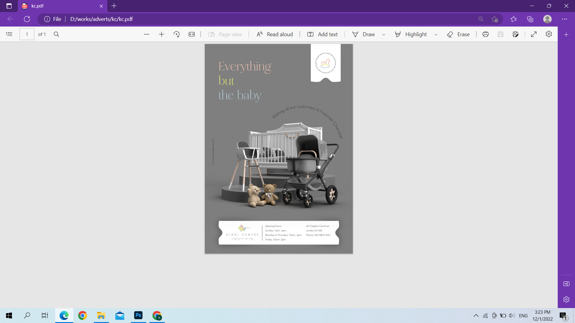
gorgeous! id say dont need to enlarge the horse text AS LONG AS you can technically read it when printed even if u have to squint a bit lol
Gorgeous ad!!!
I prefer the headline in the original white color. Maybe play around with it in different ways. decrease the leading? the baby in a script?
Also, maybe that arc sentence in pink or white?
Hatzlacha!
ok, will work on it, what about the horse, is that better in color or the original?
thank you so much
Love the color for the horse
thank you