It is a logo for coaching. has nothing to do with nutrition but she wants to stick to the name nutri power. client had no idea what she was looking for but wanted pink and was busy with gold mine. she said her goal is help people find the gold within them. what do you think about these ideas, and does anyone have any more ideas that i can try.
1 Like
what about a trophy? or medal?
thank you will try out something on those lines as well
i actually like the top one. it has the letters in it, and also a heart. its elegant, powerfull and relaxing.
Thank you. any way i could incorporate the “finding the gold” in that one?
maybe do a few thin lines to mark the heart.
something like this (is only a sketch)
something subtle
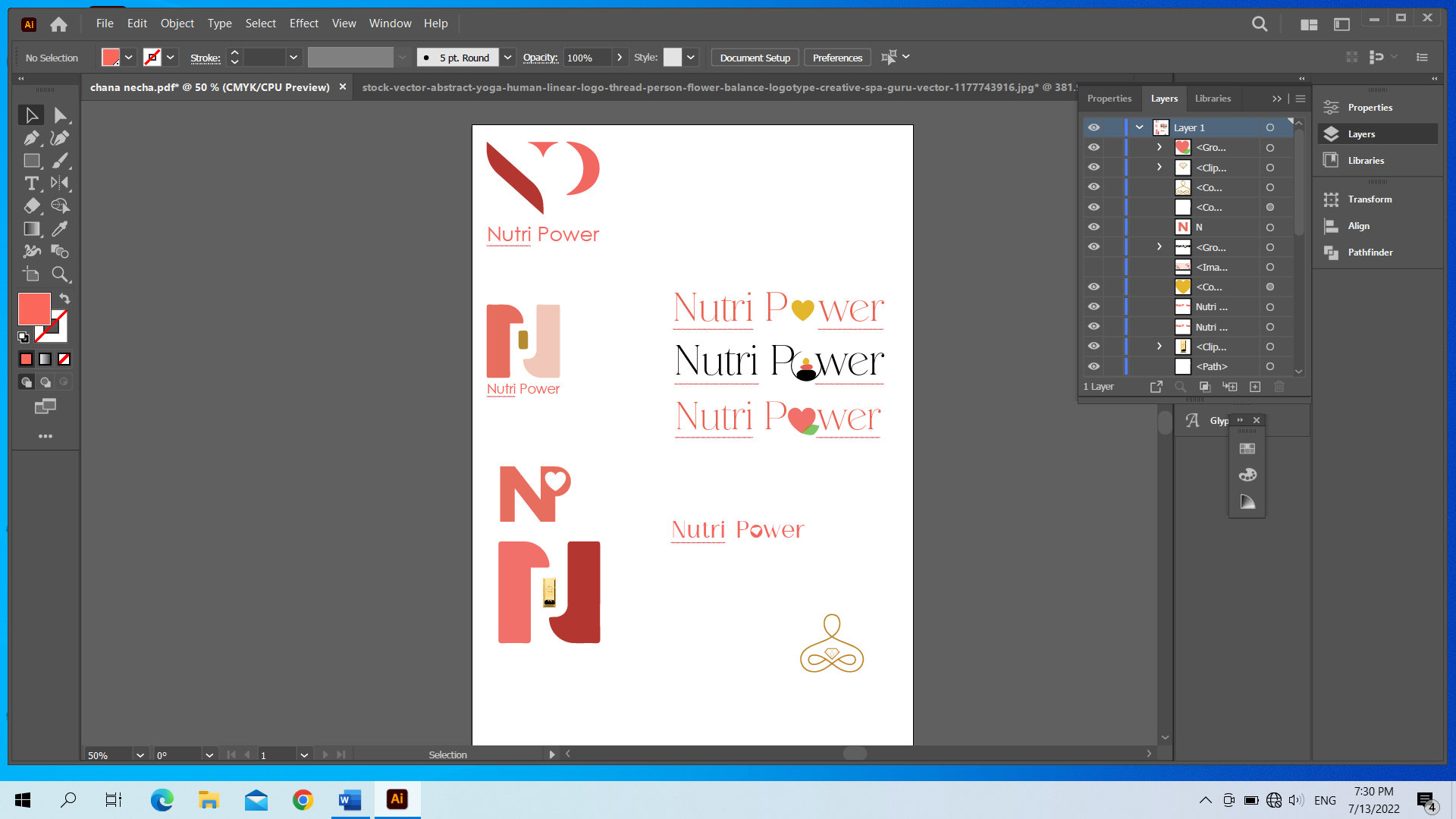
I like the second one from the left side. It has really nice negative space and I could imagine such a nice brand look - you can make a pattern from the parts that make up the N.
I’m just wondering if the graphic is too big for the text underneath it?
I also like the second one from the left side with the N and negative P.
At first i thought the center of the P was supposed to be a battery…
Thanks Breindy i will try some larger text. will also try your idea hadassyf
thank you so much everyone…
can i just ask if the name ‘Nutri Power’ has anything to do with the coach’s name at least? otherwise it just seems she’s working against herself from a marketing point of view and it also makes your job harder!
No, it has nothing to do with her name. She started off as a nutritionist using nutri power as her name. she now went into coaching (left nutrition completely) and so wanted to change the logo as no longer applicable. she did not want to change name though because she said that is how people know her. would you push (obviously nicely) a client to change a name in such a case?
i see… i would try and explain why it really could be to her benefit and if she still insists then you have no choice but to work with that. you could also explain the challenge of coming up with a logo for a name that is not connected to the field and that many times the brand name speaks for itself.
since she anyway has to readvertise that she is going from nutritionist to coach, she may as well rebrand the name too… it may be very confusing for past clients that it’s the same name but a different logo… if i were them, i’d think she is still doing nutrition but she just got a new look. A new name will show she is doing a new mission!
is her personal name an easy one to work with should she go with that? she could always say ‘formerly nutri power’ when she advertises the first time…
I actually spoke to her right now. she wants to stick to the name- she said to her nutrition is a healthy way of living. she now also feels that her service is the same giving people a healthy outlook on themselves.
ok cool so you helped her realise part of her core message 
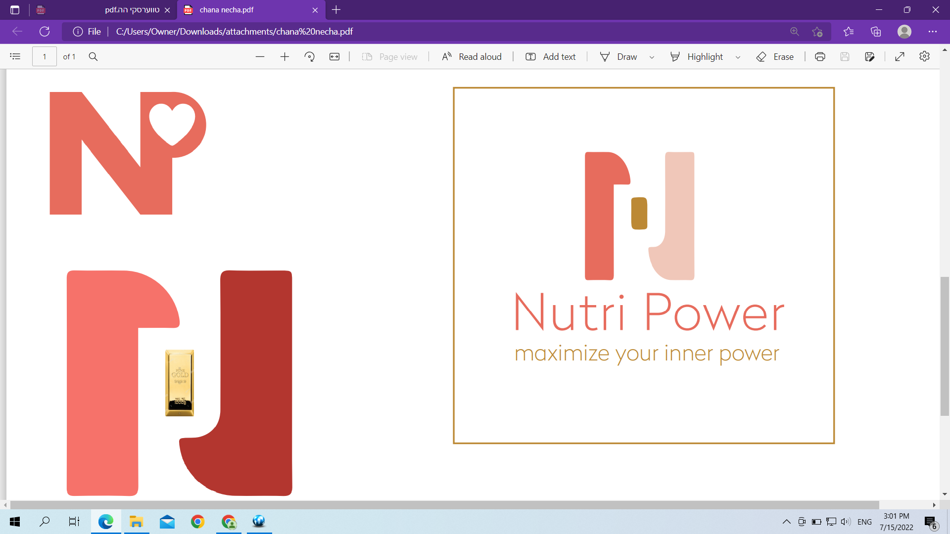
can you put a tagline beneath the logo then it gives you less pressure to sum it all up in the logo?
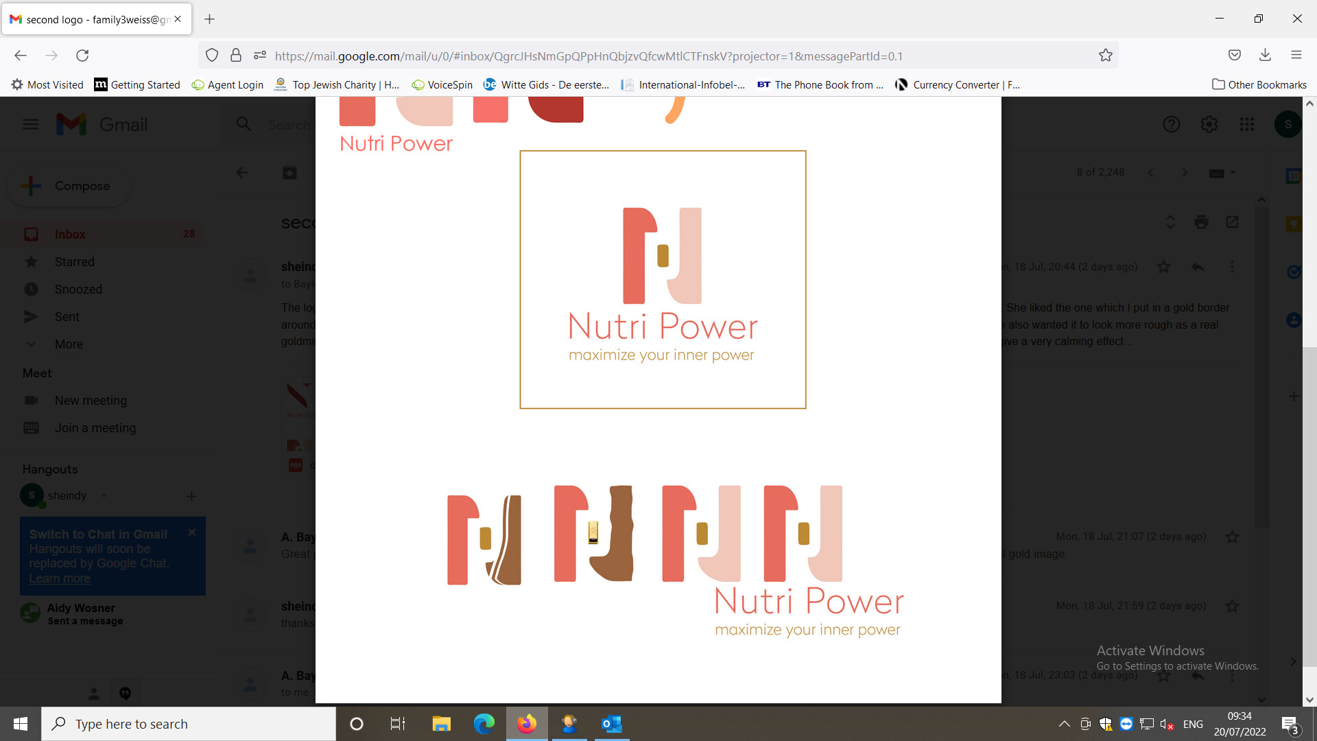
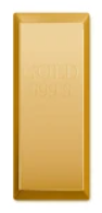
client is happiest with the logo that is in the gold box. she wants the small bar to be like a gold bar as seen to the left. how can i do that without loosing the clean look? she also wants some kind of grungy feel - so that it could look more like a gold mine with the gold in the center. any ideas how to work on that?
Maybe make the gold bar look more like this:
Then add a grungy texture to the N (you can add a new, slightly darker layer with the brush tool in Photoshop, and set the brush to something grungy looking)
And for the gold- if you don’t want to do a gradient, you can maybe try doing half lighter, half darker on a slant.
i like it with the tagline now
does it matter that the white space in the middle keeps looking like an R for me rather than a P?
i’m not sure how it could be fixed while keeping the N looking like an N… but just thought i’d point it out since it’s the first thing i see when i look at it, actually it looks like a P morphing into an R which could be good b/c Power ends with an R
I like the color scheme…