
Hi,
How does this ad look? What are people’s thoughts?
Thanks!
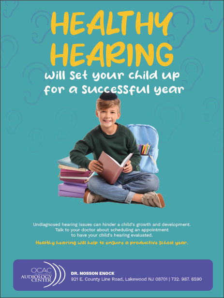
It looks really good and I love the colors! Maybe move the picture and text on the top a little lower to give more space on the top.
I wouldnt have the text above the yippa,
Either enlarge the image and have the image arranged in front of the text
Or lower the image
1 Like
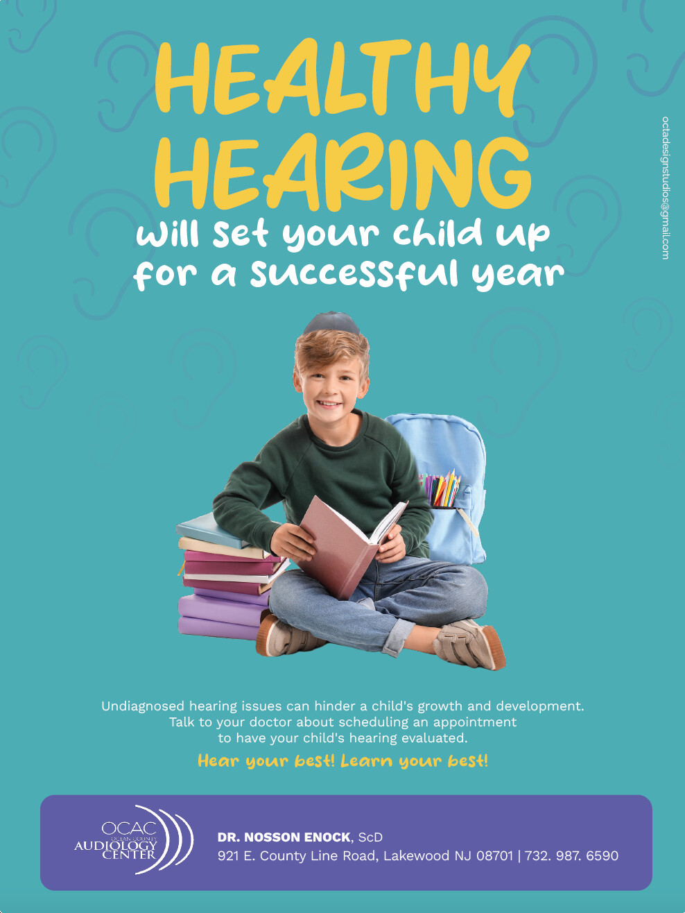
i really like it. great use of fonts!
The only thing that’s bothering me is his kippa… i feel it’s the central focus of the whole ad for some reason… maybe by moving the text off it, it would help
Looks nice! Can you make the ears in the background continue further down the page? I agree with putting the boy’s head in front of the text
Yes, I’m also finding the kippa a focal point 
Maybe change the colour to something softer, grey maybe?
For the rest, great ad!
Nice, I would tighten leading on your subtitle and shift it off the yarlmuka.
Thanks so much everyone!
Love it! The logo is very close to hitting the edge of the purple box… Can you photoshop the yarmulke to be less “popping up”?
agreed… i like the color though
yarmulka looks too placed on.
Needs to fit his head better, hair should be in front of it a bit as well
lower it down too
it looks really nice and professional. One of his shoes looks like it got cut off… I think there is a piece missing by his knee.
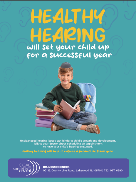
amazing, kippa sitting much better now. well done!
well done! Clean and clear!
Thanks 