Graphics feedback

Hi! I was asked to design a small card to be inserted into the meal bags for Bikur Cholim to let them know when a patient is discharged. Looking for some feedback and some help with how to make it look more organized and pleasing to the eye. Thank you in advance!
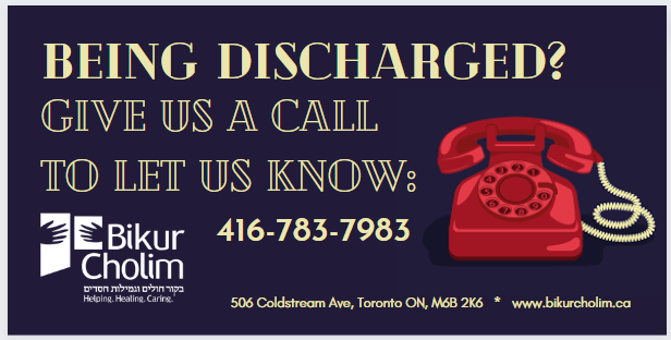
image

Another option

image

The first one is great!

both layouts look great to me, just a bit too dark shadow on ‘being discharged’ on the yellow one. i’d ask client which they prefer, yelllow more noticeable and cheerful potentially but first one seems calmer…

i would say b/c not so much text, make sure logo tagline is very readable otherwise people may not know why they are calling…

Love the overall look!
I like the dark background better but I like the phone from the second version best. The phone is a little too bold (cuz of the color) in the first one.

I also like the first one better, but they are both great!
I would say to tighten the leading of the “give us a call to let us know”.

And also, to align the logo to the bottom tagline