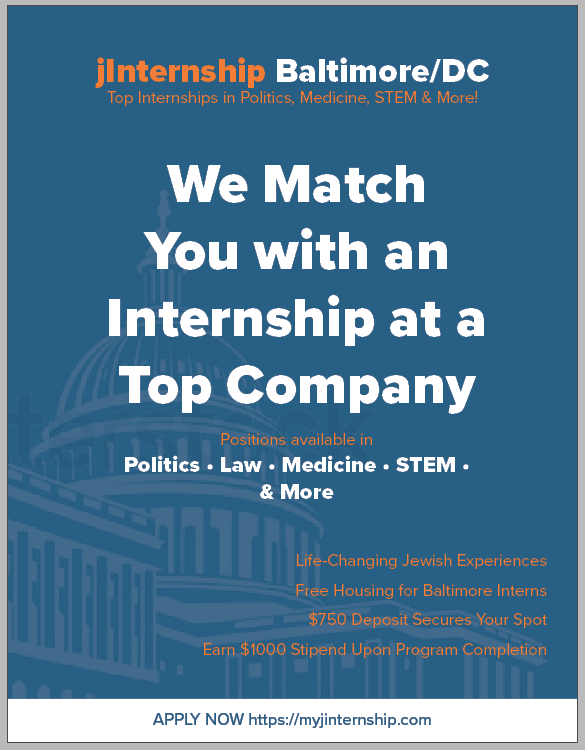
design looks good but the text is not speaking to me so much. i’d rather it be a question like ‘looking for an internship at a top company?’
and then underneath ‘we’ll find you the best positions in…’
i don’t like the ‘& more!’ i dont think it’s necessary at all… maybe you could say ‘positions including politics, law, medicine and stem’…
i don’t think you need the tagline under the logo at all since it’s all explained in the ad.
before ‘life changing jewish experiences’, maybe it should say what the section is e.g. ‘get ready for…’ or ‘Benefits include:’…
apply now should be more bold - maybe with some orange in there e.g. for words ‘apply now’ or an orange background just for words ‘apply now’ or an orange line on top and below the white strip. just feel it’s getting a bit lost… or maybe just needs to be larger
i would def change https://… to www.myjinternship.com - i tried it and it gets you to the right page and it’ll look better!!
hatzlacha!