
hi
i’m just starting out (really I’m a motion student so I don’t have as much background in regular graphics)
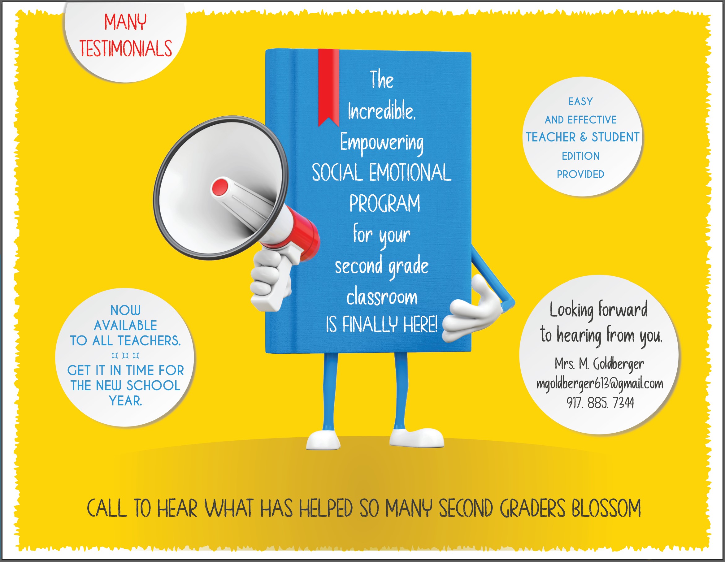
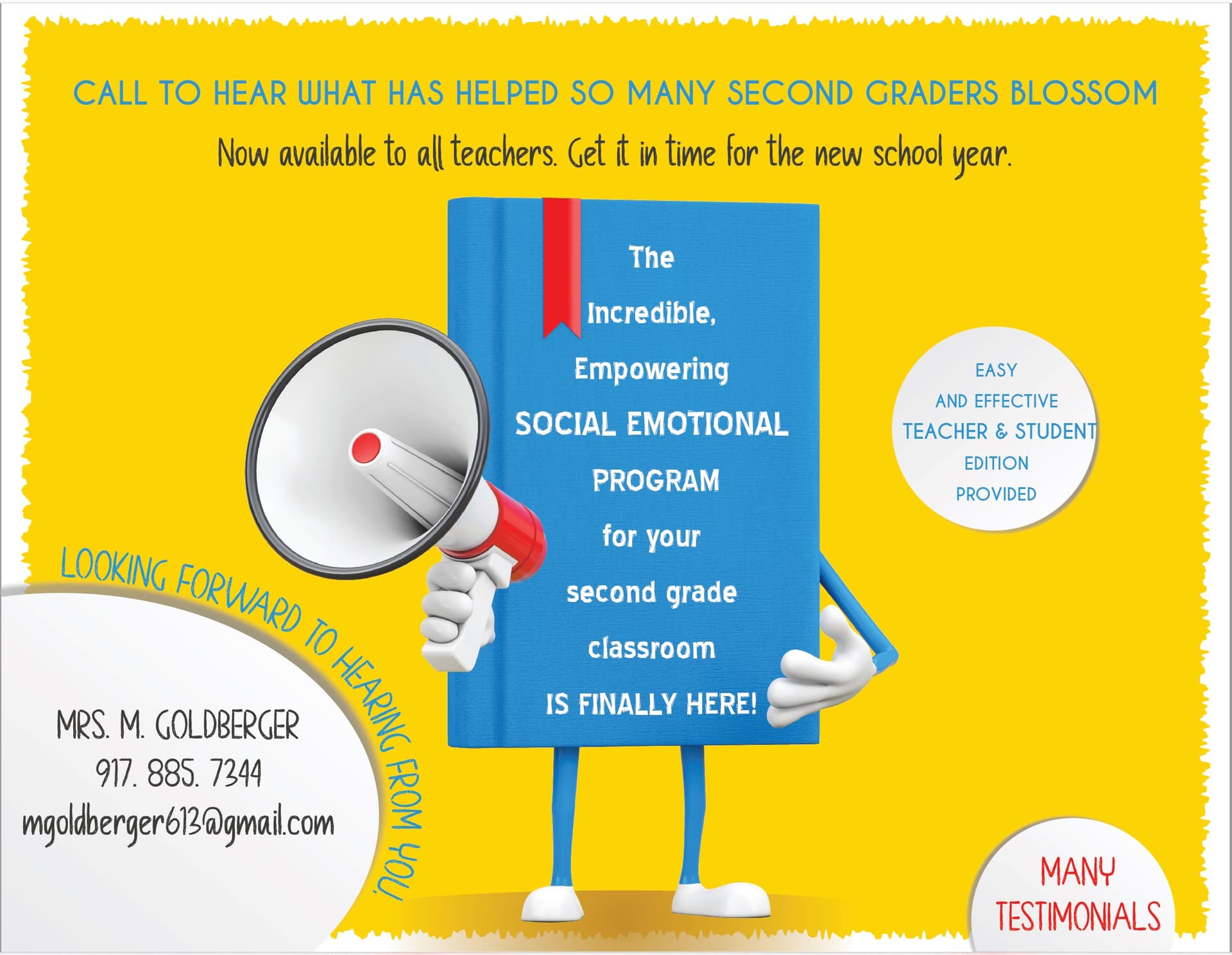
someone asked me to design a flyer for her - she wants to sell her program/curriculum to schools…
here’s what I came up with:
Screenshot sdc flyer_1|645x499
Any suggestions or feedback would be helpful! 
thanks!!
Well done!!
Can you make the leading much closer together inside of the book
I would make the “call to action” larger or have a color behind it. At the moment theres alot of text going in different ways so we need that to stand out
Very good! Its so bright and cheerful looking!
I think I would keep to only two fonts…(I think you have 3 there)
disclaimer- I’m not a graphic designer either…
Just from perspective of an outsider… feel like it needs more hierarchy… I think too many different things going on that I’m not sure what to read 1st…
I do like how bring and cheerful it is though…
looking good!
its confusing how some fonts are in All CAPS and some in Upper/lower case. Can you make it consistent? – the call today is fine in all but in the bubbles in needs to be consistent.
K thanks!
what about inside the book? is that confusing also?

Great job!