Feedback on campaign design

Hi,
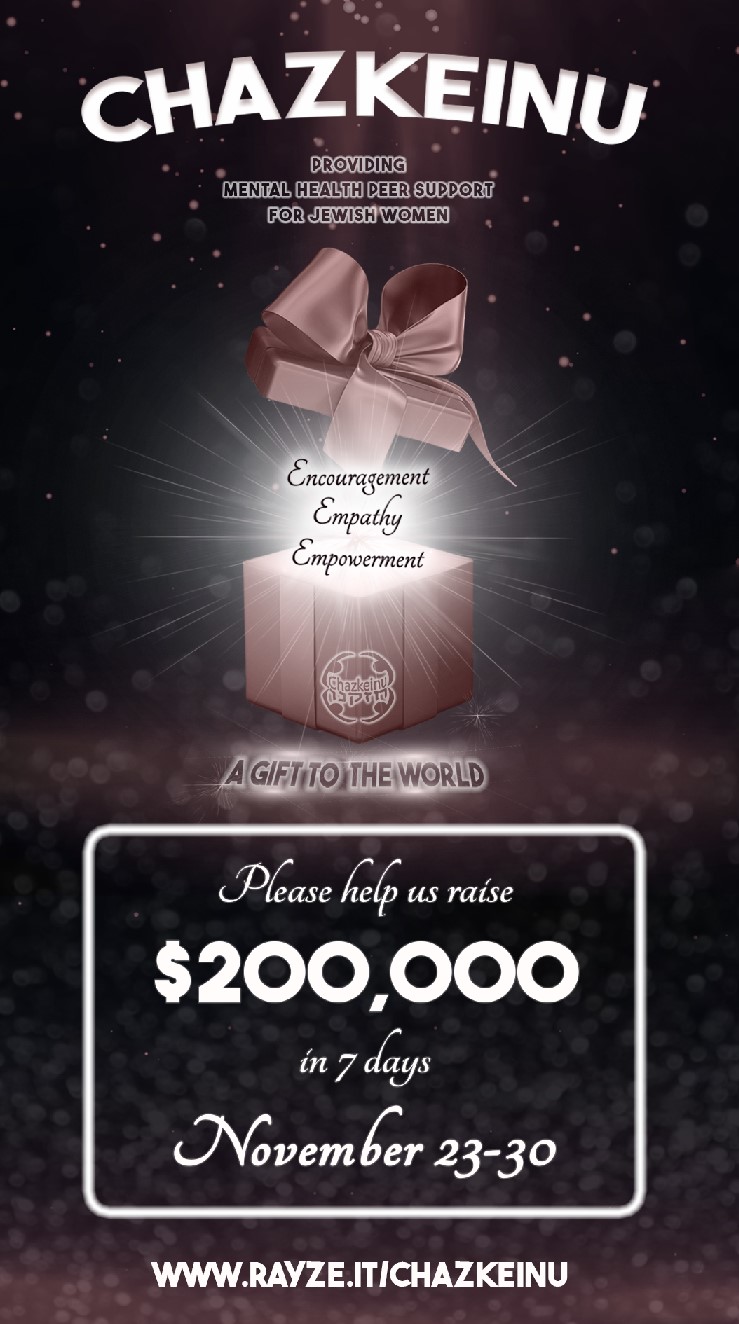
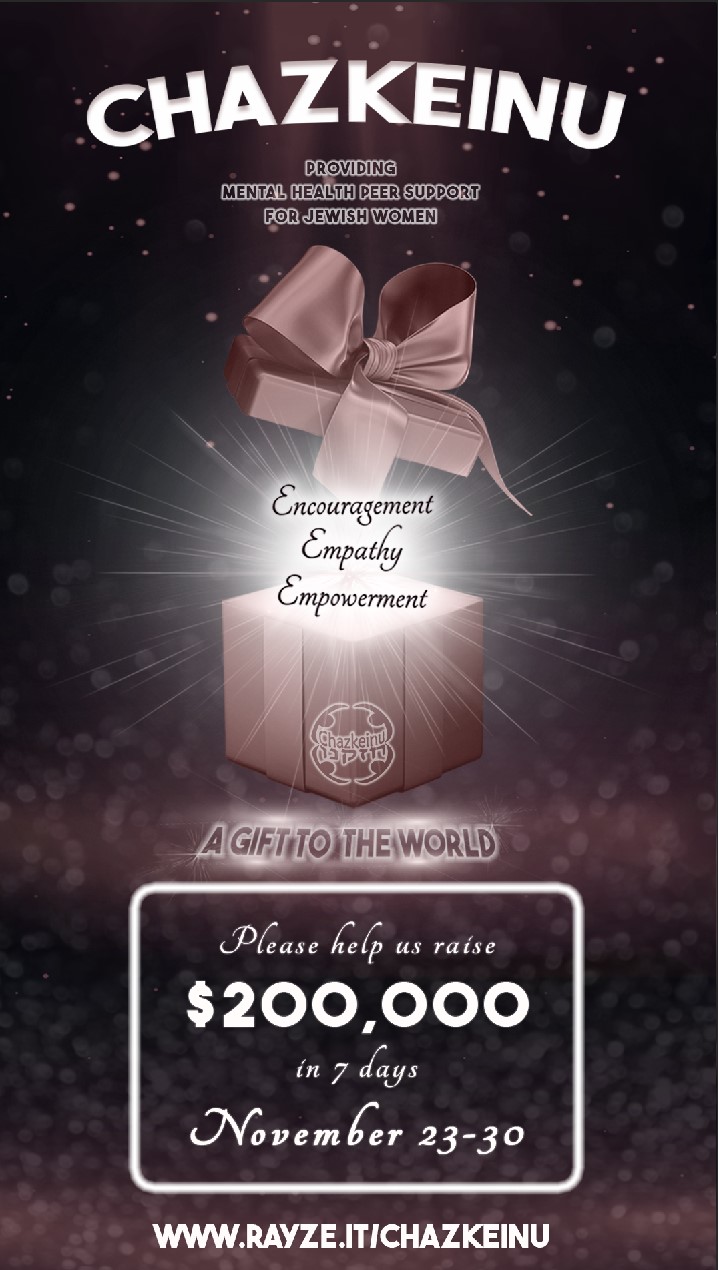
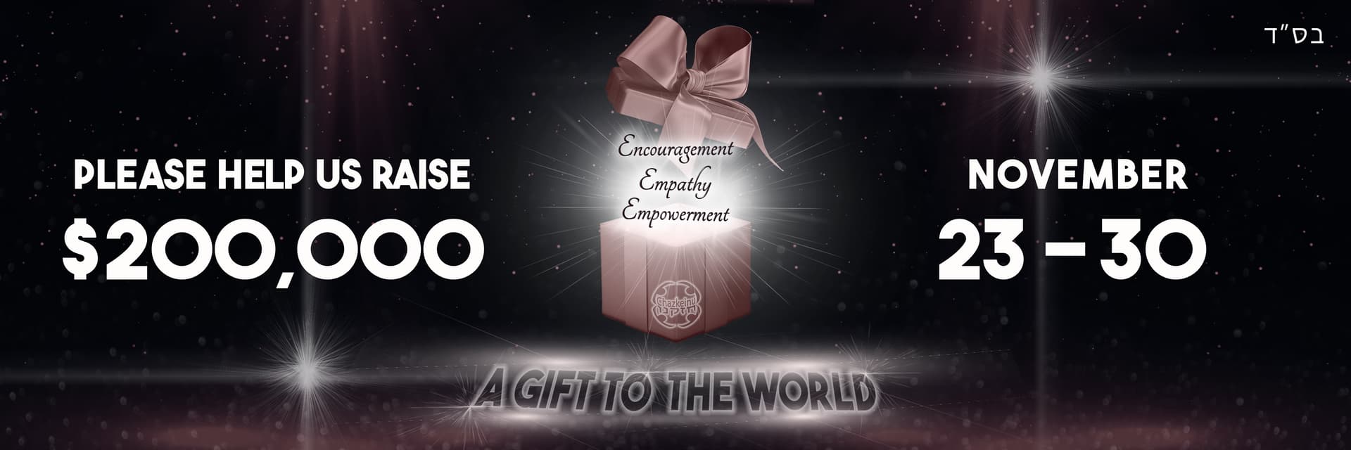
I designed this for a fundraising campaign. It’s basically the design that will appear on the flyer, banner, donation pages, etc…and i’ll add in the info after…
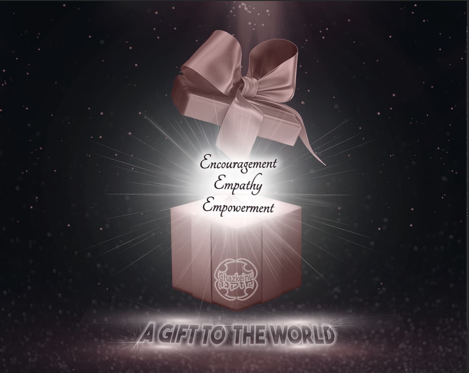
the idea the organization wants to show, is how they gift the world by encouraging, empathizing, and empowering women with mental health challenges.
They specifically wanted a gift box with the 3 words coming out. I still need to fix up the top right corner of the box a bit, but besides that, any critique??
also, can you read the 3 words on top easily?

thanks!

Looking pretty good!
I don’t like that the words “a gift to the world” is separated. can you move the present box back a little further back and then have the words in one sentence under the box?
Maybe the three words in the middle should be made bigger since it’s the main focus of the campaign…

i really like the box image and lights beneath the words… the three words are quite readable even though its a script font… i agree with breindy’s feedback…

I would do a separate E for each of the words instead of one big one. I find it easier to read and it helps the flow - especially if the E isn’t part of the logo or something and there’s no reason for it to be big… and I agree about not splitting the other text around the box. but. I really. like the box and lighting:)

Thank you so much everyone for your feedback! I really appreciate it!
This is the revised version that the client liked best, because she wanted a clearer font.
Next I’m adding other info so its not fully done yet, but we’re getting there :slight_smile:

looking great, thanks for sharing!

thanks!
Here’s the first version of the actual flyer. I’m waiting for their feedback now. They plan to use it for email and whatsapp both in this size. because its going to be on a phone screen though, I’m not sure if the gift part needs to be a bigger size so the 3 words are clear enough.
What does everyone think?
And also any critique?

These are the 2 options so far:

Thanks!

hi,
I’m finishing up with the banner, but I’m trying to figure out if it’s ok that the 2 sides are not looking so even… what does everyone think?

Looks great! to make it more balanced try adding some extra icon or something the side of the dates to give it more weight.

Nice! Maybe you can make the date larger or play around with different layouts ie, gift on the right side…

thanks for all the feedback and good ideas!
In the end, the client liked it like this and because its a gif and flashing on and off, I decided it looked fine as is.
This was the final banner :slight_smile:
*any tips on how to get it to be a smaller file (closer to 1GB or less) without it ruining the quality too much…
because its still abit too big for a web banner and not the best for a rayze it page- could slow it down…

Agifttotheworld.banner (1)

I meant 1 MB :slight_smile:

When exporting it, making the image size smaller helps.
You can also try using less colors (by the export options too), but make sure the quality is still good when doing that.

thanks!
I tried that but didnt help enough.
the 1 way i was able to make it close to 1MB was by taking away most of the fade transitions so that it would be less frames…