
Hi,
I would appreciate any feedback / critique.
Thanks!
love the concept but the bevel emboss txt doesn’t work so well for me or the gradient background
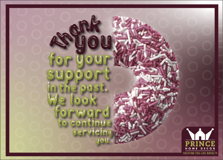
i know you ae trying to match the brand colors but that donut is not too appetizing!
I like the icing text, cute idea! I wouldn’t use the green color though…Also I think the words “servicing you” should be bigger. Maybe also instead of the slight feather by the donut to make it sharper? Not sure how it would look.
I may be the crazy one here… but at first, I thought the sprinkles looked like pills… took me a minute to realize it was a doughnut…
yes same here i thought they were pills too! although looking at it more i realised it was a donut … maybe the uncertainty will davka make people take notice of it more!!
maybe if you retain the rough edge of the donut image it will be clearer. or maybe try a more obvious donut. (or maybe its coz i just love a good british/israeli jam/jelly sufganiya  - but it’s not as pretty as your sprinkles donut for a home decor place!)
i love the concept with half text and half donut!
Thanks everyone! Totally agree about the donut looking like pills once it was mentioned…
Here are two options - which one do people like better?
and any other feedback / critique?
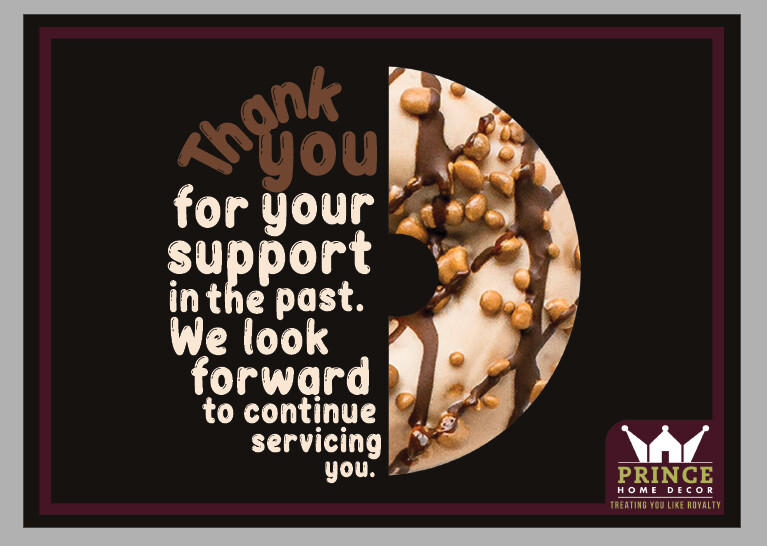

Love the second! Very clean and looks more like icing
Yes I can see why it can look like pills This last one is so much better! I like one with white background better.
I like the second better as well. Very creative idea, between the half donut and icing font!
I agree with e/o else. Love the 2nd. Donut looks more appetizing now…
Nice clean look…
Thanks so much!!
I really appreciate everyones feedback
funny i was gonna say i like the dark one, makes me really think chocolate and elegance but the light one is good too - gives more of a clean look. you could always give your client the choice…
just wondering if it would add or subtract to put a very subtle drop shadow behind the donut to lift it off the page? whilst keeping a sharp white straight edge…
I like the light one!