I Have created a logo with a circle and square under the first letter of each word.
When I make the circle the same width as square - the square looks a fair bit bigger.
How much smaller should I make the square to give a proportionate look?
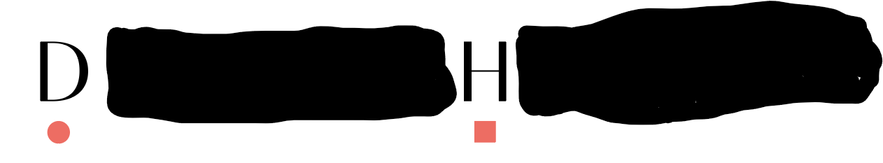
At the moment I have done .25 mm smaller.
Another query!
The square is centred to the H. But I have aligned circle with inner line of D - does it look right?
Thanks!