
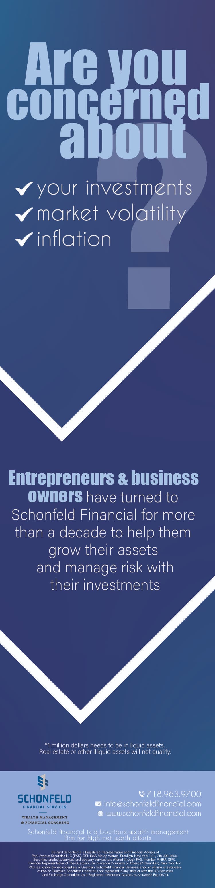
Hi! Any thought on this advertisment?
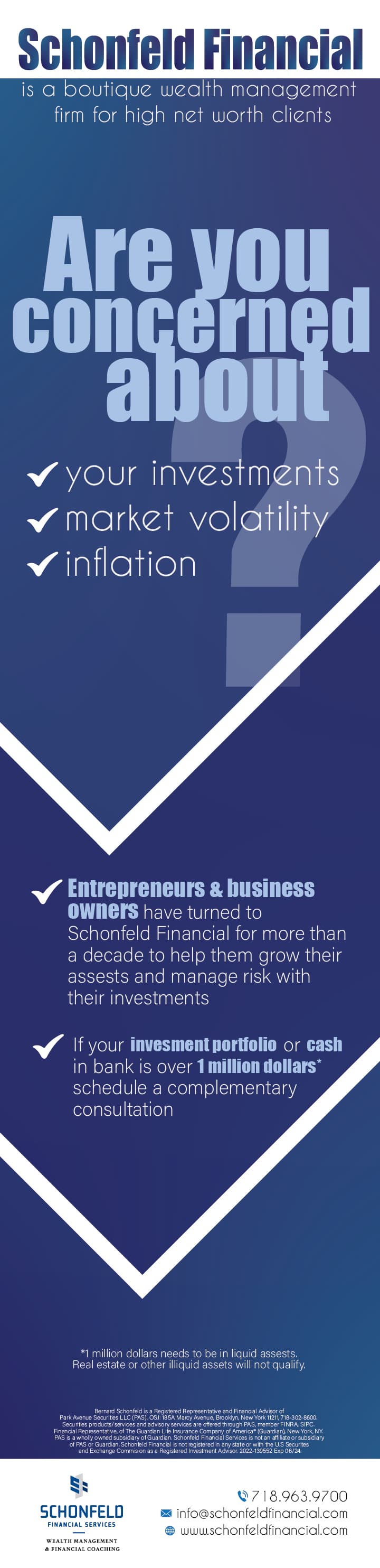
Looks really nice! i would just add more negative space before the paragraph at the top - ‘is a boutique wealth…’ and by the small print at the bottom. maybe also make the big question mark a bit more transparent as its a bit busy there…
Looks good!
I agree with the above comments made by Malky, but here are some more comments…
- The paragraph " is a boutique wealth…etc." doesn’t look centered (it’s more to the right side)
- What size is the bottom text? It look really tiny (especially the bottom paragraph)
- Can you align the contact info with the bottom line thats under the logo? if you can’t - its okay, but it would look better if you can.
- Maybe take out the little triangle sticking into the blue from the question mark…
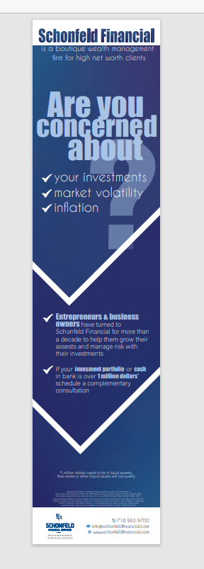
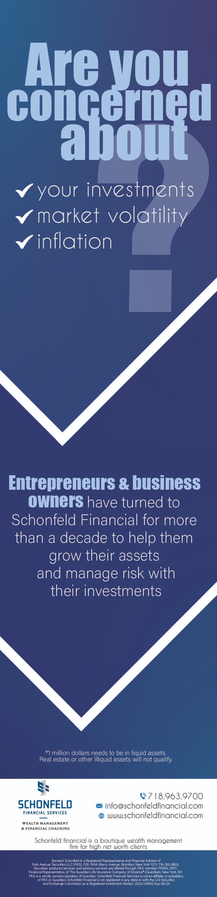
They actually dont want the top white part so heres another version. I don’t really like how the text in the middle part is looking. Any advice to make it look more pleasing?
Really nice ad!!
Just thinking maybe try making the top words Are you concerned… white. It might balance it better and make it stand out…
Love the check idea in the middle!
Maybe shift it down a bit to make the top section more of a focal point… and then it won’t be divided so evenly.
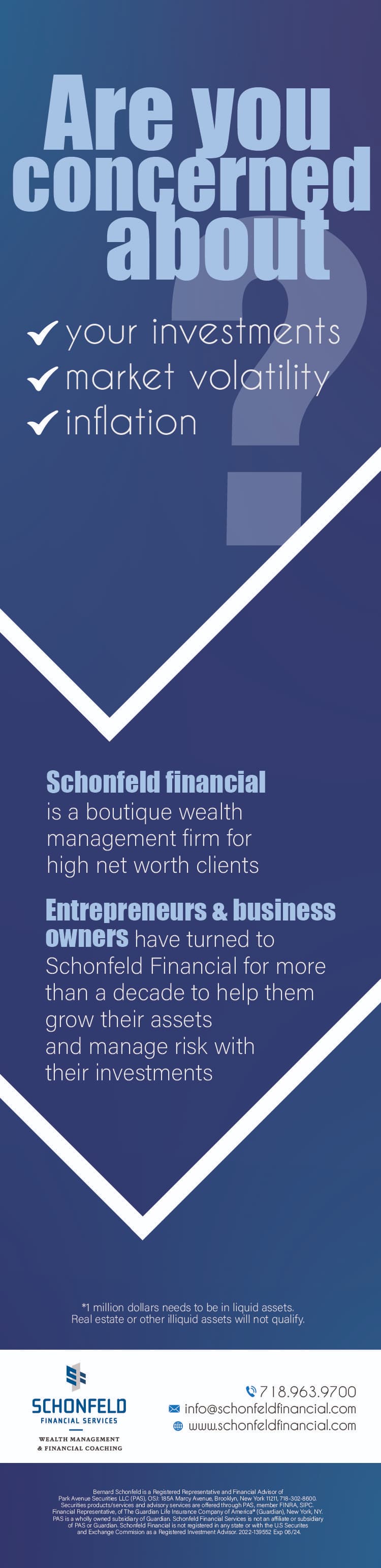
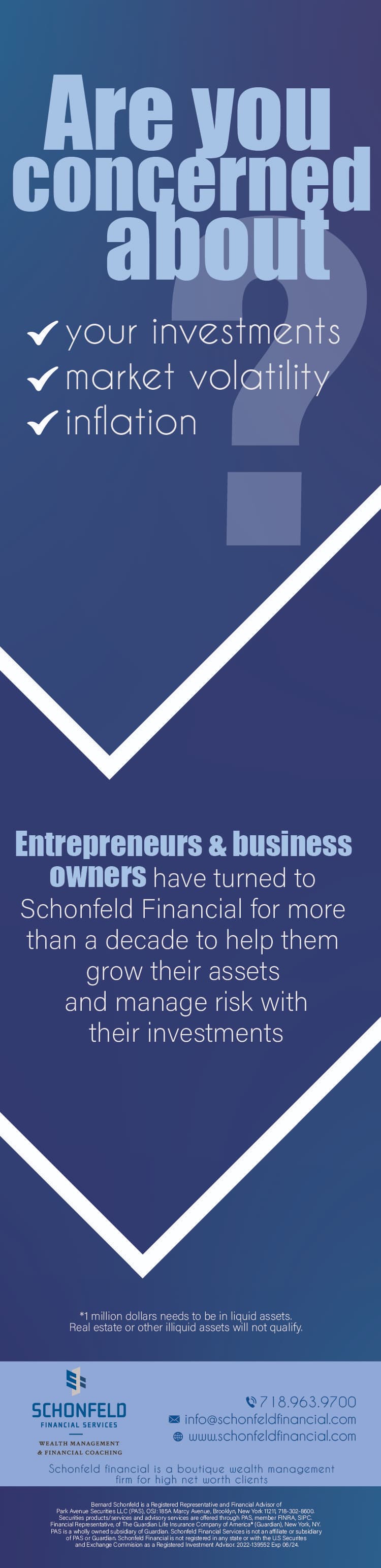
Heres some more options. The changes are more on the bottom area. They want the text about what the company is right under the logo.
I like the middle one the best, but I feel like that box with the logo is so squished…
Think if I just make it bigger it would help?
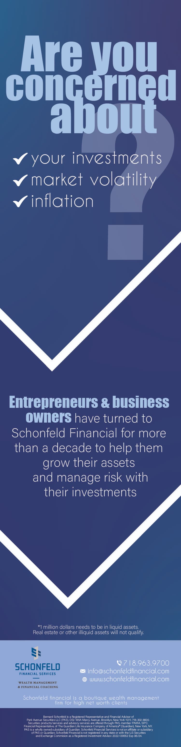
It does help - but I think it looks a little funny to have the information on top and bottom of the blue box. They look like they are meant to be grouped together because they are both very small text.
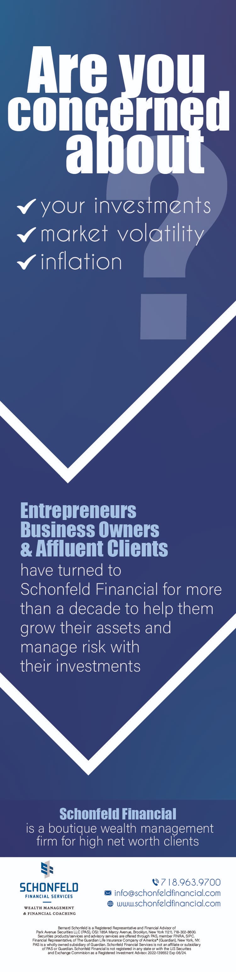
I like the first one best. Really neat!
I would capitalize the first letter from the words in the checklist