
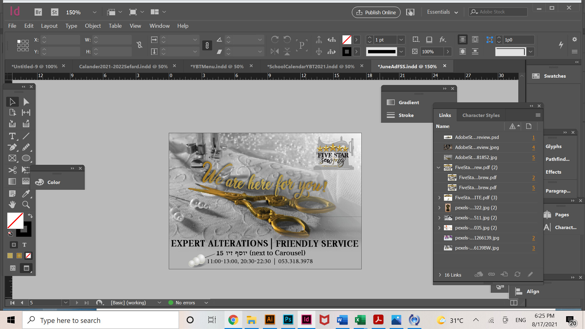
Cool sewing picture!
I think something there might look a bit old-fashioned, can’t put my finger on it.
Maybe take the gradient and shape off the text to make it look more modern.
WE ARE HERE can be in a regular font all caps and on the next line, FOR YOU in script (maybe in white color if it shows up well?)
Use of icons for the bottom text might add, too.
Lots of luck!
I am missing a wow effect. The contrast is not working too well. Also give the text at the bottom proper margins.
The script font on top of the scissors is not easy to read.
Good luck!
I don’t mind the old fashioned look, I assume you did intentionally. Might be more dramatic if you enlarged the imagery even more, cropping in an interesting way. Text on bottom needs more margins. Logo is a bit hard to make out and quite busy, are they set on that logo? Something simpler would work better and provide interesting contrast with the complexity of the artwork. Perhaps adding a solid area of black to the bottom and putting the text in gold and/or white would give more pop, maybe the logo could be included in that area as well. I don’t have a problem reading the script font as it integrates with the scissors, but maybe the wording could say something stronger, more meaningful, more specific to the company.
Looking nice.
Thanks so much! This is actually a more updated version-

I didn’t want to do a black rectangle across the bottom with text in it because I have done it for her in the past and wanted to change it up a bit. The only thing is I feel like I would want something down there to break it up…
The logo really doesn’t have the sewing machine underneath, she wanted it there because she used that icon for something else and wanted to integrate it here as a secondary logo icon. Though I am open for suggestions on where to place it.
if you dont want a black block, maybe an gradient background overlay would work. My only hesitation about that is that the ad is busy as it is.
maybe a white box at low opacity
may i recommend you use the snipping tool (on your computer) to crop your screenshots easily so we can see your samples on a larger size- and its amazing for pointing out different areas for commenting or correcting.
with regards to feedback i would add a grey gradient to the bottom area to knock back the busy background to allow your text to work without the busy background interfering.
Was great to see your work in the newslink!
Thanks you everyone! And thanks, that was before the fixing up the text on the bottom, but she didn’t want me to put it any more work into it because she liked it… So we’ll see for next ad!
One more question for it-
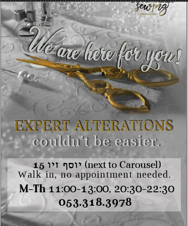
Any suggestions for making the “Expert Alterations” more legible if we want it to be in this gold?
Maybe put a thin white stroke around it…
add some white “shading”
The thin stroke or subtle white glow is one option. Are you actually printing with gold ink or foil stamping? I assume not for an ad. In which case you could make it a more vibrant gold-a brighter gradient, or possibly even masking into the letter an actual gold leaf texture.