
Hi,
I’m making an ad for someone who’s starting a lyric business and having a hard time making it look professional yet nice and friendly…
She didn’t know what to write so the wording can also be changed…
All critique and suggestions welcome!!!
thanks!
Shani!
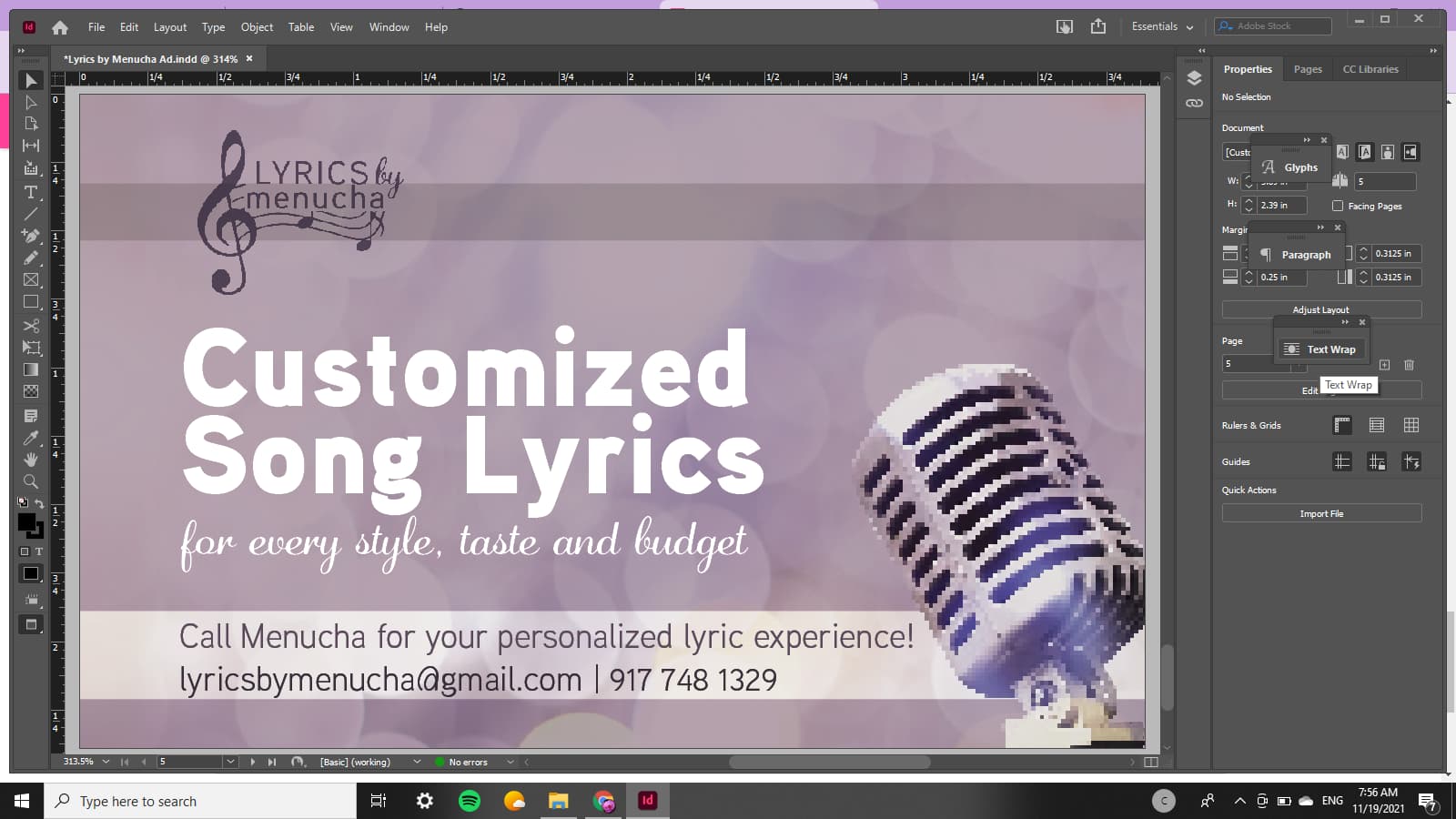
2021-11-15 (1)|690x388
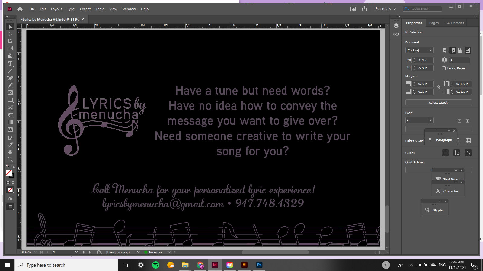
2021-11-15|690x388
I would say the second one is much better
I love the purple color that you used!
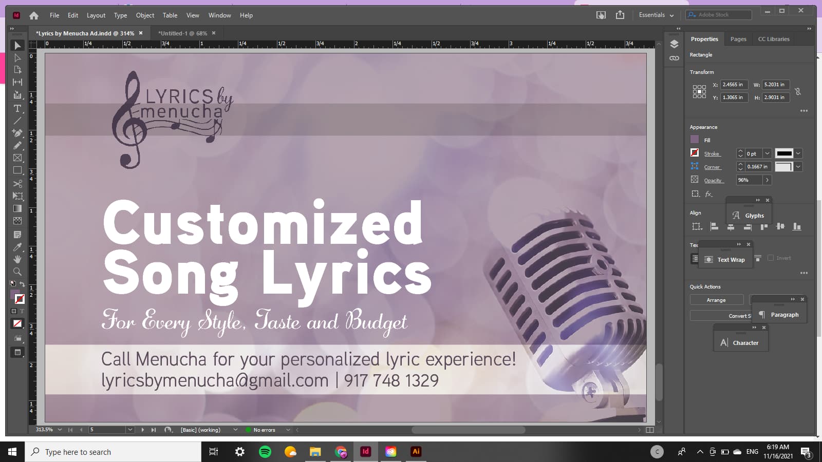
I think it would look much sharper if you don’t have so much text - give your message over briefly like for example " Creative Song Lyrics" in a bold or decorative font (maybe even all caps in the center of the page - maybe staggered…
The contact info should not be in script - a sans serif would look cleaner…
I would take out the bullet and put a line like this | instead and also remove the periods from the phone number but keep a space where there is supposed to be spaces…
I also like the 2nd! I think left aligning the text would help a lot! Maybe flip the picture so that it fits nicely
And agree about the contact info not being in script
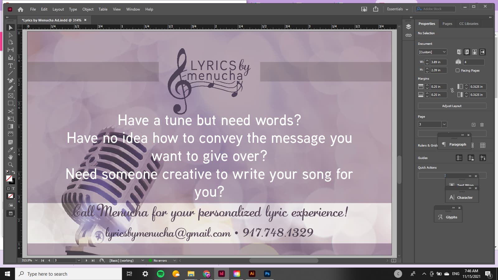
i like the modern photo of microphone but maybe would make it more of a feature and the text right aligned - like one third image two thirds text.
i think the text has to be reviewed very well by a few people b/c this is a lyrics business!! maybe it should be a clever rhyme!
i think ‘give over’ sounds ‘yeshivish’, it’s not the correct use…
i find it hard to design an ad without the text planned first so you are doing well to start already!
I agree with Rivkah that the first part that needs to be perfected is the wording. Since that is what she would like people to hire her for she needs to make it catchy and inviting
thanks everyone!
Totally agree about wording- thanks rivkah- will speak to her about that…
here’s what I did last night…
Looks nice! I would brighten the color up a bit, it looks a bit gray on my monitor.
Nice. Like the first layout better, balances better with logo to the left side. Can the script line be a bit bigger without looking funny so it can line up with the right side of the main title as well?
For the two lines in the white box, would try to loosen leading just a bit, even if text has to be half a point smaller. Would make the email and phone number line a little bit darker purple than the line above to stand out more and visually separate the lines so they don’t read like two lines of a sentence visually.
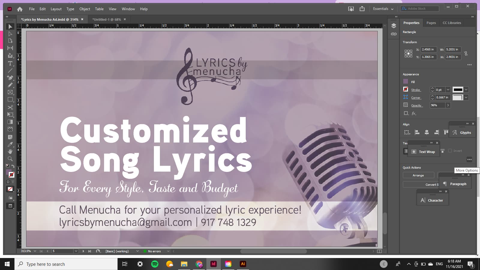
yes looking good - can you make the microphone go on top of the white band instead of under?
Nice, Shani!
Can you make the two groups look more separate? like bring up the “customized song lyrics… For every style…” so it doesn’t sit directly on top of the contact info.
Also, I don’t love the @ by the email address but you can keep it if you like it.
One more thing, can you add in another color to give it some more life? You can try a yellow, orange, teal turquoise…etc. Whatever looks best.
thanks everyone!! (thanks breindy love that moving up idea)
I think she likes it so im not gonna work on it anymore…
but THANK YOU THANK U!!!
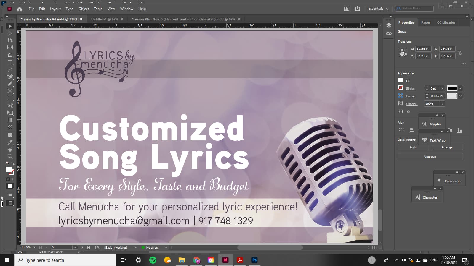
Glad that first one was the wrong one, too hard to read the text! Looks great, just wondering about the pixellation on the mic, unless it was done purposely?
lol! that was from the beg. but BH helpful feedback fixed it 
the pixelation is just cuz its on ‘‘typical display’’ in indesign and didn’t bother switching it to a better display before screenshotting it.
yay looks great!